Hi Colleen- you are off to a good start with toning these fruits. I think what they are lacking is a range of toning and this is easy to remedy. Consistently I see a small area of dark toning and then large swathes of similar mid-range and light tones. It is also evident on your red color arc exercise. Looking back at the arc toning exercise, there should be a range of 9 tones from the darkest tone on the right side transitioning lighter as you move toward the highlight (which is the color of the paper) and then transition back to tone 3 or4 as you head to the left side. I would lighten the area around the highlight and have more of a segue from the highlight to the lighter surrounding area. The other job would be to add more range of tone in the mid to dark areas. I question if the fruit on the right wouldn’t have a couple of more highlights evident around the stem area. I find the right fruit confusing because of the stem location. I feel like I am looking down at it from the top instead of from the side and I wouldn’t expect to see a reflected highlight from that view. The reflected highlight should not be as light as the main highlight so you can add a little tone to it. The cast shadows are nice. I would just angle the front edge back a little. The shadow is usually darkest nearest the subject and transition lighter as the move away from the subject, which you have started to do. I would make the shadows a little lighter as it moves away. Good job!

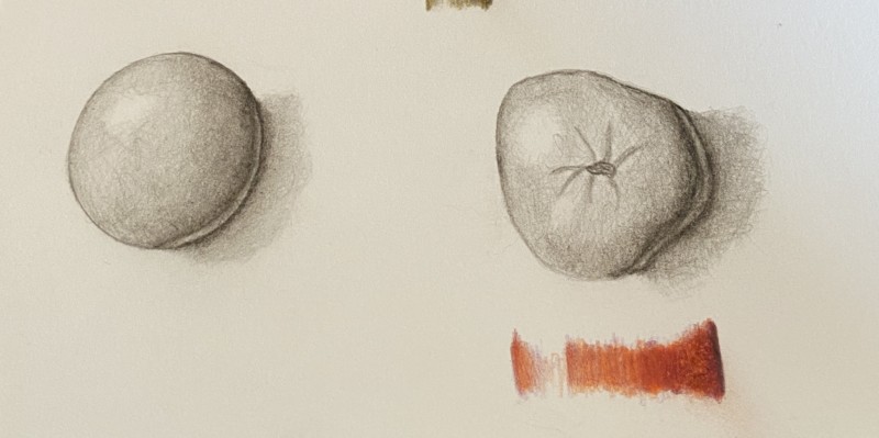
Hi Colleen- you are off to a good start with toning these fruits. I think what they are lacking is a range of toning and this is easy to remedy. Consistently I see a small area of dark toning and then large swathes of similar mid-range and light tones. It is also evident on your red color arc exercise. Looking back at the arc toning exercise, there should be a range of 9 tones from the darkest tone on the right side transitioning lighter as you move toward the highlight (which is the color of the paper) and then transition back to tone 3 or4 as you head to the left side. I would lighten the area around the highlight and have more of a segue from the highlight to the lighter surrounding area. The other job would be to add more range of tone in the mid to dark areas. I question if the fruit on the right wouldn’t have a couple of more highlights evident around the stem area. I find the right fruit confusing because of the stem location. I feel like I am looking down at it from the top instead of from the side and I wouldn’t expect to see a reflected highlight from that view. The reflected highlight should not be as light as the main highlight so you can add a little tone to it. The cast shadows are nice. I would just angle the front edge back a little. The shadow is usually darkest nearest the subject and transition lighter as the move away from the subject, which you have started to do. I would make the shadows a little lighter as it moves away. Good job!