It is great to see the daffodils starting to bloom and know Spring is on its way! Yellow/gold flowers are very tricky to do. You have to have a range of toning, but you don’t want to muddy the colors. It looks like you used Earth Green for the toning, which is a good choice you just need more of it. The right hand side of the column and the petals where they meet the column (especially on the right side) need more toning as those areas would be in shadow. I am confused by the stem. Is the part closest to the stem a sepal that’s is covering the stem? If so I would change it so it doesn’t look like it is part of the stem. The space where it comes out from between the two petals is also a spot that would require a darker toning as it would be shaded by the petals. It is a nice rendering Douglass and I think the appropriate toning will bring it to the next level
Thank you, Doug for your helpful comments. The part of the stem that is attached at the top is that difficult paper -like thing. I don’t know it’s name but it is really hard to convey….at least for me. I have a second, dying daffodil half done to post. It captured my interest because the colors change so and it gets so curly!
Hi Douglass- I thought that is what it was. In the future rotate your flower a little so your view does not have the tepal line up with the stem or if you decide that view of the flower is the best than you can “fudge” your drawing so the two parts don’t line up. move the tepal

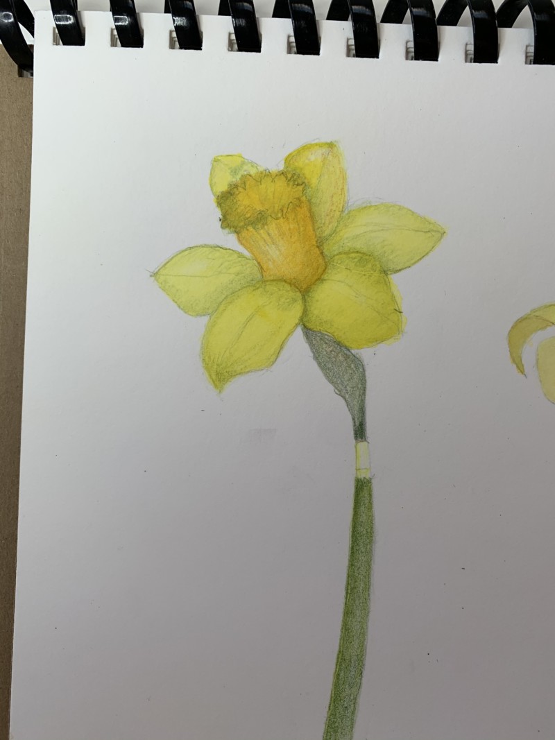
It is great to see the daffodils starting to bloom and know Spring is on its way! Yellow/gold flowers are very tricky to do. You have to have a range of toning, but you don’t want to muddy the colors. It looks like you used Earth Green for the toning, which is a good choice you just need more of it. The right hand side of the column and the petals where they meet the column (especially on the right side) need more toning as those areas would be in shadow. I am confused by the stem. Is the part closest to the stem a sepal that’s is covering the stem? If so I would change it so it doesn’t look like it is part of the stem. The space where it comes out from between the two petals is also a spot that would require a darker toning as it would be shaded by the petals. It is a nice rendering Douglass and I think the appropriate toning will bring it to the next level
Thank you, Doug for your helpful comments. The part of the stem that is attached at the top is that difficult paper -like thing. I don’t know it’s name but it is really hard to convey….at least for me. I have a second, dying daffodil half done to post. It captured my interest because the colors change so and it gets so curly!
Hi Douglass- I thought that is what it was. In the future rotate your flower a little so your view does not have the tepal line up with the stem or if you decide that view of the flower is the best than you can “fudge” your drawing so the two parts don’t line up. move the tepal