Very nice, Hendrika! My suggestion here is to work a little more on that reflective highlight. Fade it into the fruit a bit more so it doesn’t look like a white line. And I think darkening your shadow just a little bit right at the place where it meets the fruit will help this illusion. The reflective highlight should not appear as bright as the highlight on the top left; it should be at about level 4 or 5. Great vibrant color here, and nice surface texture!
thanks Vern – I’ll implement your suggestions! I found the surface texture really difficult – my orange looks bruised and old, but I was trying to get the little bumps…
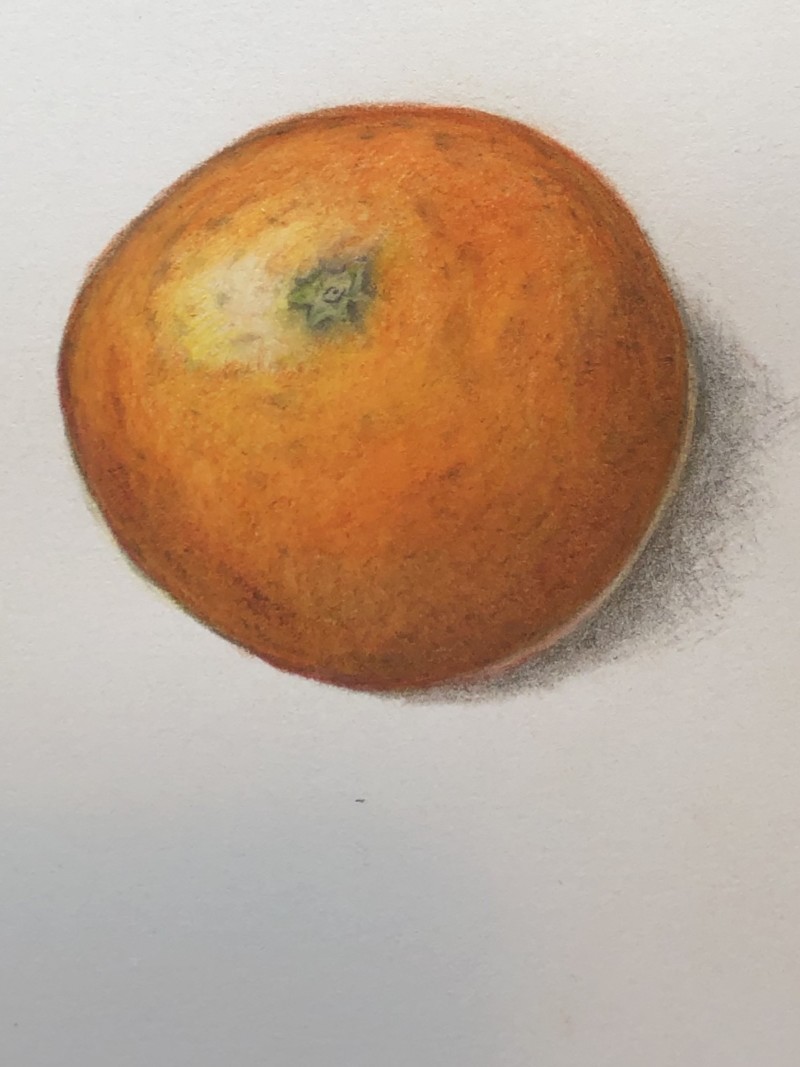
Hendrika, I think the surface is so good and also the little stem top. Very brave! I’m intimidated by those bumps!
thanks Sheila!