I love the color here and the gradient between red and yellow. And the stems look like they are having a conversation with one another. 🙂 I think you could saturate more with some pencil to smooth out your tone shifts and really gradually close in on those highlights so that we feel the roundness of these crab apples. I think the place where the two overlap could be sharpened just a bit so there is no question which form is in front. You can do this with a verithin pencil to define the edge, and even try a reflective highlight on the fruit in front. I think you could also quiet your cast shadows just a little bit, by making sure they are darkest next to the form and then fade out into the color of the paper: sometimes Gray is a nice color for subtle shadows. You can also burnish them with ivory to smooth them out. Nice work!

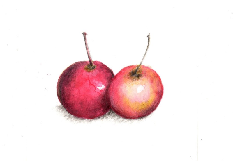
I love the color here and the gradient between red and yellow. And the stems look like they are having a conversation with one another. 🙂 I think you could saturate more with some pencil to smooth out your tone shifts and really gradually close in on those highlights so that we feel the roundness of these crab apples. I think the place where the two overlap could be sharpened just a bit so there is no question which form is in front. You can do this with a verithin pencil to define the edge, and even try a reflective highlight on the fruit in front. I think you could also quiet your cast shadows just a little bit, by making sure they are darkest next to the form and then fade out into the color of the paper: sometimes Gray is a nice color for subtle shadows. You can also burnish them with ivory to smooth them out. Nice work!