Hi Jennie- this is a great drawing! Conifer cones can be a real challenge! When I see your original drawing and it’s current version it looks like you darkened the lines separating each segment. Katy can correct me if I am wrong, but I thought she was suggesting you add more toning to the “v” and the right side of each segment. This would enhance the form of the individual segments. You still want to maintain the toning on the entire cone so it retains it’s form. Nice work!
Much better! Now I think you should focus on more variation in the darks Think about making the dark, darks on the shadow side darker than the darks in the highlite area. Also vary the darks more in the body of the pinecone. They read too much like an outline now. Hit the point where the scales meet with a bit of cool dark color.
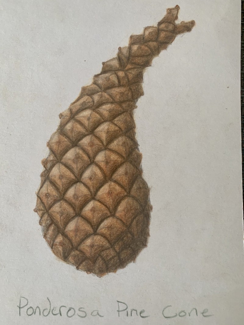
Revised with feedback from Katy.
Hi Jennie- this is a great drawing! Conifer cones can be a real challenge! When I see your original drawing and it’s current version it looks like you darkened the lines separating each segment. Katy can correct me if I am wrong, but I thought she was suggesting you add more toning to the “v” and the right side of each segment. This would enhance the form of the individual segments. You still want to maintain the toning on the entire cone so it retains it’s form. Nice work!
Much better! Now I think you should focus on more variation in the darks Think about making the dark, darks on the shadow side darker than the darks in the highlite area. Also vary the darks more in the body of the pinecone. They read too much like an outline now. Hit the point where the scales meet with a bit of cool dark color.