TO answer your question about the color and darkness on this celery, I think sometimes it is fine to leave something light and fresh in color. You could work with just a touch of a sensitive line of darker on some of the edges, but really this looks great
Beautifully done. I love the greens and yellow-greens. It looks so fresh.
20 February 2017
Jeanne, I know what you mean about the black verithin not mixing well with some colors, especially warm ones like this yellow-green. That black verithin has a cooler, bluish tone sometimes and can be tricky. I agree that this light, fresh color doesn’t need much more as far as dark tones go–maybe try your edge lines with sharp dark sepia instead of verithin, since it is a bit warmer. Really beautiful, and way to make a common “fridge subject” subject really come to life! 🙂
Vern, Thanks for explaining why the black doesn’t work. I didn’t think about the different color of blacks. I enjoy your calling it a “fridge subject” and will use that in future descriptions of things one finds to draw in the fridge!

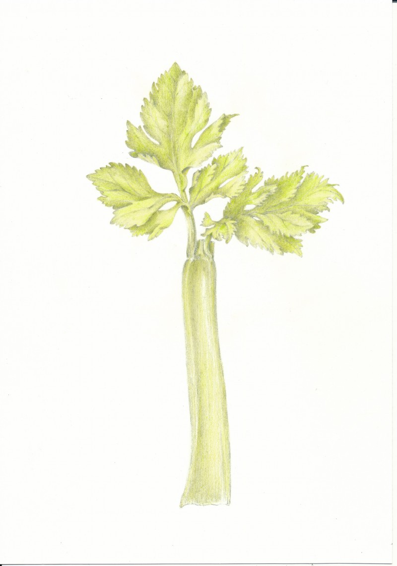
What a great idea to get beautiful yellow green, interesting leaves and stalk…Celery! Well done!
Hi Patty, Thanks for all kind words and comments. Working on an onion to go with this one!
Love this composition. Feels like a tree!
TO answer your question about the color and darkness on this celery, I think sometimes it is fine to leave something light and fresh in color. You could work with just a touch of a sensitive line of darker on some of the edges, but really this looks great
I like that idea – touch of line on some edges. Thanks Wendy.
Beautifully done. I love the greens and yellow-greens. It looks so fresh.
Jeanne, I know what you mean about the black verithin not mixing well with some colors, especially warm ones like this yellow-green. That black verithin has a cooler, bluish tone sometimes and can be tricky. I agree that this light, fresh color doesn’t need much more as far as dark tones go–maybe try your edge lines with sharp dark sepia instead of verithin, since it is a bit warmer. Really beautiful, and way to make a common “fridge subject” subject really come to life! 🙂
Vern, Thanks for explaining why the black doesn’t work. I didn’t think about the different color of blacks. I enjoy your calling it a “fridge subject” and will use that in future descriptions of things one finds to draw in the fridge!
Nice to know it is reading that way. Lights are hard to value!