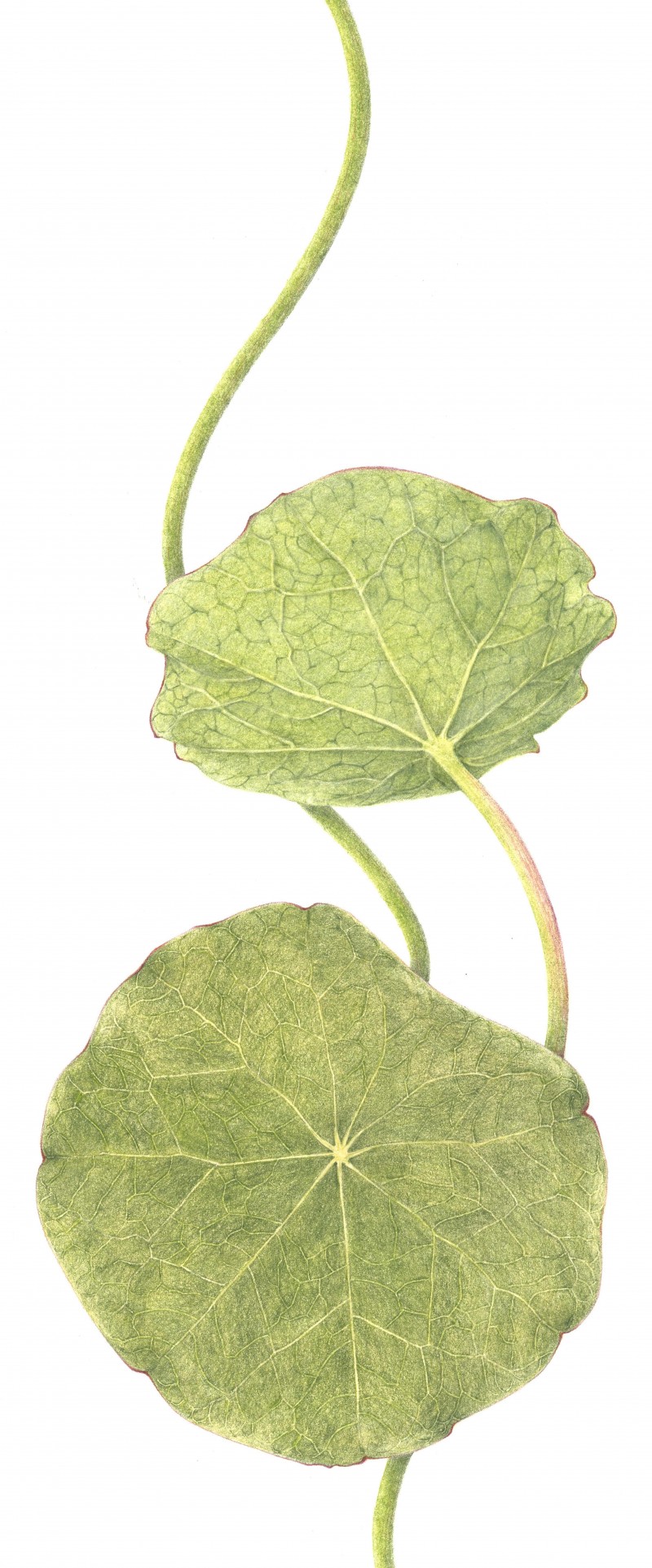
Jeanne, I really enjoy the vertical composition here. It has a lot of movement and an almost “watery” feel. I saw that you were asking about the veins in leaves like this, and I think you rendered them very well here. While radial leaves like this don’t have that “open book” structure that we learn about in Lesson 3, the veins still mostly conform to the same rules–you have shown on the back of the leaf how the veins are raised up a bit off the leaf surface, and on the front, how the veins gradually get thinner and disappear as they reach the edge of the leaf. My only suggestion here is that perhaps the secondary, darker veins on the back of the leaf could be a little more subtle. They have a “crackly” sort of look right now, which may not be your intention. I have to say again how much I love this composition, though. 🙂 Beautiful.
Thanks so very much Vern for your response. I think working on a much larger scale can be easier sometimes. You are correct in that the back shoud read as smooth. I might try going over those veins with ivory burnishing and see what happens. I hesitate to try to lift. Although maybe that would work with a little tape and lifting the color with a pencil point over the tape. Will experiment. The compostition is driven by the way those stems grow. Curvy and windy. I have the flower and seed “pod” to post when I get back to some flowers.

Jeanne, Your drawings are beautiful – I especially love the nasturtium leaves.
Thanks Eileen! I so enjoy those plants.
Wow! Really nice. And I love the composition!
You really do get the sense of which is the backside and which is the front side. Well done!
Thank you Marci.
How beautiful!
Beautiful veins. I really like the composition also.
Thank you Holly and Liz.
Jeanne, I really enjoy the vertical composition here. It has a lot of movement and an almost “watery” feel. I saw that you were asking about the veins in leaves like this, and I think you rendered them very well here. While radial leaves like this don’t have that “open book” structure that we learn about in Lesson 3, the veins still mostly conform to the same rules–you have shown on the back of the leaf how the veins are raised up a bit off the leaf surface, and on the front, how the veins gradually get thinner and disappear as they reach the edge of the leaf. My only suggestion here is that perhaps the secondary, darker veins on the back of the leaf could be a little more subtle. They have a “crackly” sort of look right now, which may not be your intention. I have to say again how much I love this composition, though. 🙂 Beautiful.
Thanks so very much Vern for your response. I think working on a much larger scale can be easier sometimes. You are correct in that the back shoud read as smooth. I might try going over those veins with ivory burnishing and see what happens. I hesitate to try to lift. Although maybe that would work with a little tape and lifting the color with a pencil point over the tape. Will experiment. The compostition is driven by the way those stems grow. Curvy and windy. I have the flower and seed “pod” to post when I get back to some flowers.