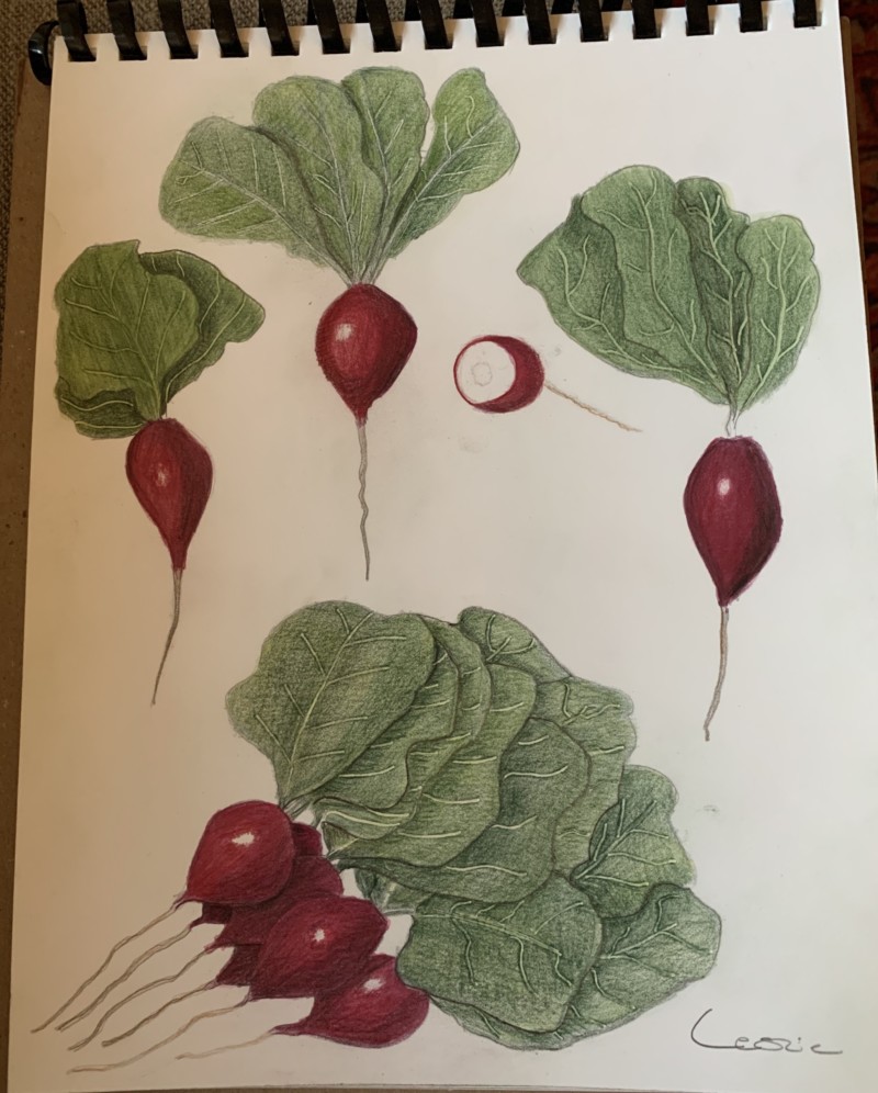
Hi Leslie- great composition on this page! You certainly got lots of practice on leaves! I would like to see some more variation of greens on the leaves. There are also some areas on the leaves where they meet and overlap that would benefit from some dark toning. The color saturation on the radishes is great. Because your highlight is so white and there is no light toning around them the radishes read as being super shiny! If possible I would lighten the area around the highlight and also add a little color to the highlight to soften it.
Thank you Doug! I’ll work on those leaves – would you work in some more yellow tones? They seem a little gray. I was afraid I had oversaturated my radishes because they are super dark red. More like beets. I thought about maybe running an eraser over them to lighten them up a bit. Do they look too dark to you?
Hi Leslie- I agree with you that the leaves have a grayish cast to them. A green with yellow in it would help brighten them up. I often Google images of botanical artwork to see how other artists are interpreting certain subjects. There is a great Pinterest posting of radishes where the leaves reminded me of your drawing. It would be worth checking out to see how the nice dark punches of toning and highlights make their leaves really successful. You could lighten the area around the highlight and not lose the overall rich color of the radish. You will see many examples of that too when you research the leaves.
20 August 2020
Re: saturation, I think that the saturated color is great, but I would work more on the transition toward the highlight. The current highlights sort of appear suddenly and jump from that beautiful midtone saturated red to white very quickly. I would work up to that white color slowly, so that the area just around the highlight is just a little bit lighter and there’s a smoother transition. Love this page!
Hi Leslie- great composition on this page! You certainly got lots of practice on leaves! I would like to see some more variation of greens on the leaves. There are also some areas on the leaves where they meet and overlap that would benefit from some dark toning. The color saturation on the radishes is great. Because your highlight is so white and there is no light toning around them the radishes read as being super shiny! If possible I would lighten the area around the highlight and also add a little color to the highlight to soften it.
Thank you Doug! I’ll work on those leaves – would you work in some more yellow tones? They seem a little gray. I was afraid I had oversaturated my radishes because they are super dark red. More like beets. I thought about maybe running an eraser over them to lighten them up a bit. Do they look too dark to you?
What Doug said, and What a great page! Would you consider giving me another cut section in the middle right in that blank space of the page?
I think their saturation is great, Leslie.
Hi Leslie- I agree with you that the leaves have a grayish cast to them. A green with yellow in it would help brighten them up. I often Google images of botanical artwork to see how other artists are interpreting certain subjects. There is a great Pinterest posting of radishes where the leaves reminded me of your drawing. It would be worth checking out to see how the nice dark punches of toning and highlights make their leaves really successful. You could lighten the area around the highlight and not lose the overall rich color of the radish. You will see many examples of that too when you research the leaves.
Re: saturation, I think that the saturated color is great, but I would work more on the transition toward the highlight. The current highlights sort of appear suddenly and jump from that beautiful midtone saturated red to white very quickly. I would work up to that white color slowly, so that the area just around the highlight is just a little bit lighter and there’s a smoother transition. Love this page!
Thanks everyone for the suggestions! I’m going to work on all of this some more.