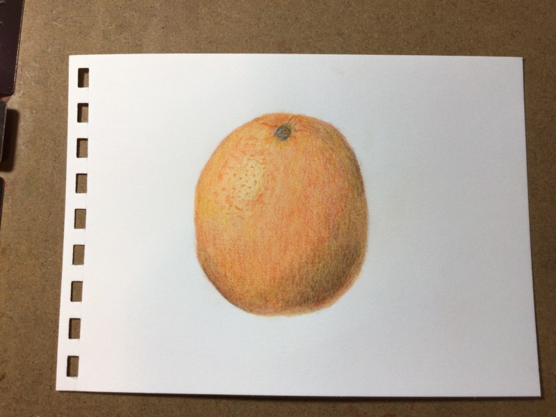
You have been busy Elizabeth! I would round off the edges more – especially the left side which is very straight. At first I was thinking it was an orange and the color was too muted and needed more saturation. If it is a grapefruit the color looks good, but in either case the color is muddied. When the subject is an orange, gold or yellow color you should use a color other than dark sepia for the grisailles layer. Red/violet works well for the grisailles when the subject is orange, pink, light reds, etc. Some of the greens work for the grisailles when the subject is yellow, gold or even some whites.
28 October 2021
Yes, give Earth Green, Venetian Red, or even Burnt Sienna a try for grisaille colors on orange! Love that texture in the highlight here.
You have been busy Elizabeth! I would round off the edges more – especially the left side which is very straight. At first I was thinking it was an orange and the color was too muted and needed more saturation. If it is a grapefruit the color looks good, but in either case the color is muddied. When the subject is an orange, gold or yellow color you should use a color other than dark sepia for the grisailles layer. Red/violet works well for the grisailles when the subject is orange, pink, light reds, etc. Some of the greens work for the grisailles when the subject is yellow, gold or even some whites.
Yes, give Earth Green, Venetian Red, or even Burnt Sienna a try for grisaille colors on orange! Love that texture in the highlight here.