Hi Liz, looking good so far. Keep in mind that you can have some leaves on top lighter and brighter in color, and darker leaves below to have depth and good contrast. Love to see this developing
Thanks Wendy – I was wondering about the light areas – on the actual leaves they are very subtle, but I think I need to make them lighter to really show the 3 dimensionality. Does seem okay?
Liz – your drawing of the pointsettia is beautiful – I’m so impressed that you are tackling SO many leaves! One leaf for me is a challenge ! I’m also intrigued that you put a watercolor wash on first and then start to tone – I want to try that to see how it works for me.
31 January 2017
@lizssf I think this is coming along very nicely, and I think just keep that in mind, what Wendy suggested above, that the leaves that are on the “bottom/bottom-right/shadow side/underside” of the elements in the composition may want to be a little darker than the rest, just to give that overall 3-dimensionality and depth to the entire drawing. It seems like you have already begun this–the red leaves on the very top are lighter than the one on the lower left. Really beautiful.

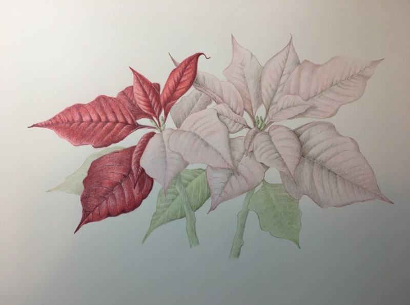
The colours and shading are just stunning!
Thanks Vanessa!
Hi Liz, looking good so far. Keep in mind that you can have some leaves on top lighter and brighter in color, and darker leaves below to have depth and good contrast. Love to see this developing
Thanks Wendy – I was wondering about the light areas – on the actual leaves they are very subtle, but I think I need to make them lighter to really show the 3 dimensionality. Does seem okay?
Liz – your drawing of the pointsettia is beautiful – I’m so impressed that you are tackling SO many leaves! One leaf for me is a challenge ! I’m also intrigued that you put a watercolor wash on first and then start to tone – I want to try that to see how it works for me.
@lizssf I think this is coming along very nicely, and I think just keep that in mind, what Wendy suggested above, that the leaves that are on the “bottom/bottom-right/shadow side/underside” of the elements in the composition may want to be a little darker than the rest, just to give that overall 3-dimensionality and depth to the entire drawing. It seems like you have already begun this–the red leaves on the very top are lighter than the one on the lower left. Really beautiful.
Really very lovely, Liz. Can’t wait to see the finished product!
Thanks Wendy – I’ll keep that in mind as I work.
I really like the way the paper feels after the watercolor wash – you should try it.
Thanks Vern. I’m thinking of doing all the leaves lightly and then going back to finish them so I can see the overall color and tone.
Thanks Marci. Me too! I am taking my time on this so i don’t go too heavy too fast.
Love the highlights.