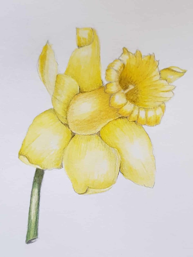
Marijke, this looks nice, especially the depth down in the middle of the corona. It looks very much like Wendy’s drawing… I recommend getting a real daffodil and studying its structure a bit closer so your drawing looks more realistic. I especially think you could work on the places where the petals and the bottom of the corona meet. There are some nice overlaps there, and I think you could emphasize those a bit more. Nice curling petal on the top left!! You got some nice shadow colors with yellow, which can be tough, but you did a nice job. Did you use Light Yellow Ochre? Burnt Ochre? Burnt Sienna? Just curious. 🙂 Looking great; keep it up.
Vern, thank you for taking the time to make some comments on my drawing. You are right that a real daffodil is beter, but there are no at this time. So I practice now the technique and later I will draw a real daffodil.
For the shadow I used Light Yellow Ochre and Burnt Ochre.