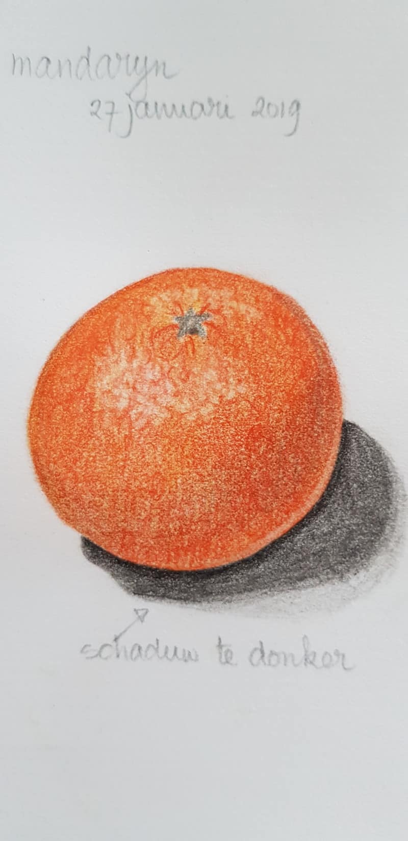
Marijke, I really enjoy the texture you achieved on the top of this orange rind. I think your color could use some more variation and mixing, so it doesn’t feel like one flat color. I suggest some Cadmium Yellow, Burnt Ochre, and maybe burnish with some ivory to smooth out some of the texture. I think the little stem area could be a little bolder; maybe put a subtle overlap there where the sepals sit on top of the rind. Your shadow here is a little overpowering. I recommend quieting this down a bit and let it fade into the paper so it doesn’t feel like a shape. Try using pencils like Gray Verithin, Gray, and burnish with ivory to keep shadows subtle and ghostly. Great work. How about cutting an orange open and adding a cross-section or a slice? 🙂
Marijke, I really enjoy the texture you achieved on the top of this orange rind. I think your color could use some more variation and mixing, so it doesn’t feel like one flat color. I suggest some Cadmium Yellow, Burnt Ochre, and maybe burnish with some ivory to smooth out some of the texture. I think the little stem area could be a little bolder; maybe put a subtle overlap there where the sepals sit on top of the rind. Your shadow here is a little overpowering. I recommend quieting this down a bit and let it fade into the paper so it doesn’t feel like a shape. Try using pencils like Gray Verithin, Gray, and burnish with ivory to keep shadows subtle and ghostly. Great work. How about cutting an orange open and adding a cross-section or a slice? 🙂
Thank you for your comments. I will work on that.