After reading Doug’s comments, I tried to fix my drawing, but made a mess out of it. Here’s another try. I tried to make the reflected highlight less stark than in was before, and tried to make the orange sections a little brighter. Thanks for the suggestions, Doug. I think I like this better.
Yes the glisten of the sections is so great now. Makes it so citrus-cell-fleshy. Nice job. I agree – I think you can tone that orange sphere more. Also, can’t remember if you have done – but these are so fun on Kraft paper. On citrus, Vern and I were discussing how moving our hand quickly to draw little “smiley face” shapes can define the bumps/texture in citrus rind well. Basically the little sideways “C”s

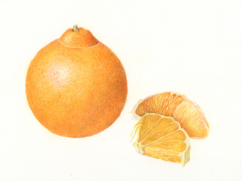
After reading Doug’s comments, I tried to fix my drawing, but made a mess out of it. Here’s another try. I tried to make the reflected highlight less stark than in was before, and tried to make the orange sections a little brighter. Thanks for the suggestions, Doug. I think I like this better.
The sections look great, more commanding!
Thanks Sheila. I wonder whether I need to deepen the value on the right side of the orange. It’s looking a little flat to me.
Yes the glisten of the sections is so great now. Makes it so citrus-cell-fleshy. Nice job. I agree – I think you can tone that orange sphere more. Also, can’t remember if you have done – but these are so fun on Kraft paper. On citrus, Vern and I were discussing how moving our hand quickly to draw little “smiley face” shapes can define the bumps/texture in citrus rind well. Basically the little sideways “C”s