beautiful, Pam! Love the colors, texture and details What colors did you use in the shadows on the orange and the whitish part on the edges of the sections?
Laurie, many colors, lol. I started with a light layer of purple violet in the darkest shadow areas, and then also layered in yellow ochre, in those areas and faded them in toward the highlight. Then mostly a bunch of oranges, and then around the highlight I used a very light layer of Venetian red.
On the edges of the sections I used one of the lighter warm grays (I don’t remember which, some yellow ocher, some cream, ivory, and a little prismacolor lavender gray.
ooh yes to the richer shading here – and the purple underlay really makes the bright oranges glow so well. It is bugging me a tiny bit that the brightest part of the highlight reads toward the centre of the fruit.
Thanks for sharing, Pam- it really helps to hear those details. Really appreciate it. It’s all so beautiful and I want to keep looking at it, take it in and also learn from it.
Sam, hmmm. I’ll have to think about the highlight. I drew at as it was, but maybe this is a place where I should take artistic license, and change it to make it read better.

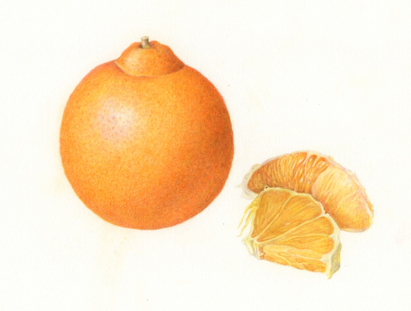
Deepened some of the shadows.
beautiful, Pam! Love the colors, texture and details What colors did you use in the shadows on the orange and the whitish part on the edges of the sections?
Laurie, many colors, lol. I started with a light layer of purple violet in the darkest shadow areas, and then also layered in yellow ochre, in those areas and faded them in toward the highlight. Then mostly a bunch of oranges, and then around the highlight I used a very light layer of Venetian red.
On the edges of the sections I used one of the lighter warm grays (I don’t remember which, some yellow ocher, some cream, ivory, and a little prismacolor lavender gray.
ooh yes to the richer shading here – and the purple underlay really makes the bright oranges glow so well. It is bugging me a tiny bit that the brightest part of the highlight reads toward the centre of the fruit.
Thanks for sharing, Pam- it really helps to hear those details. Really appreciate it. It’s all so beautiful and I want to keep looking at it, take it in and also learn from it.
Sam, hmmm. I’ll have to think about the highlight. I drew at as it was, but maybe this is a place where I should take artistic license, and change it to make it read better.
Love the cut sections!
Today I am really appreciating the lighter orange glow/midtones that form a beautiful circle around the highlight. Expertly shaded.