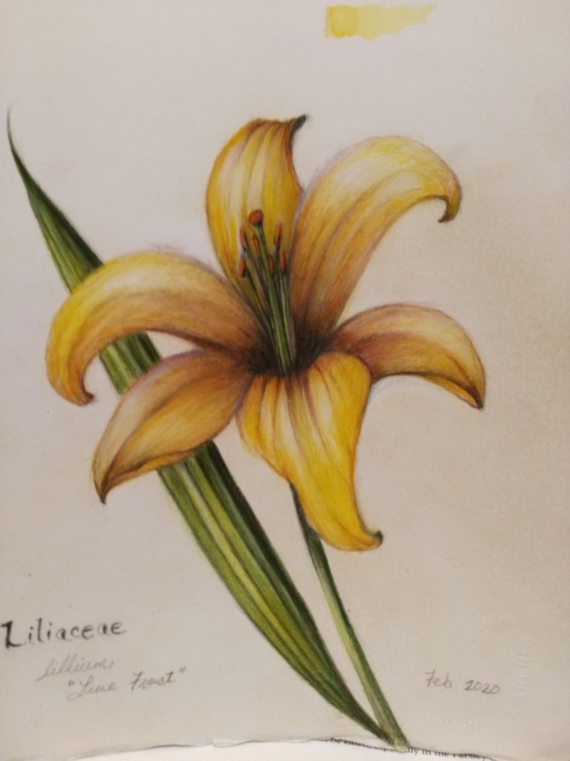
Hi Maureen- this looks much more accurate now! I would even add a little more toning in a couple of spots. The petal on the lower left and the one above it. I would add a little more toning on the lower petal just where it meets the well area. On the petal above it I would transition mid-range tones up from the dark area of the well. Tone up just a little way. It seems that petal would be in shadow more than the one across from it which would be catching more light, but they are both toned the same. You mentioned using burnt ochre as an option for the well toning, but I don’t think it would be dark enough on it’s own. It could be the first additional coat and then try burnt sienna on top of that and chrome oxide green as the darkest color. I don’t think the dark sepia was a bad choice, but it can be trickier on light colored subjects. Play around with it, but you may find that the burnt ochre and sienna and green don’t give you the muddy effect you mentioned. You can always lift some of the dark sepia with a kneaded eraser. Yellows/golds are tricky colors to capture and greens often work for the grisaille and future toning color. The areas I suggested only need minimal toning! It is looking great!
Hi Doug, Thanks so much for your detailed advice, I am excited to try the darker greens for shading , somehow had limited myself to earth green only for grisaille. Appreciate this
I had time to play with chrome oxide green shading today, posted the results for your input. It was really fun pushing the colours to a more vibrant level.
07 March 2020
Yeah this is looking good, Maureen! Can’t wait to see what you do with the green toning. 🙂 I really like the contour lines of the petal at the bottom center–they really show us the movement of the petal very well. Yellows are tricky!!!
Hi Maureen- this looks much more accurate now! I would even add a little more toning in a couple of spots. The petal on the lower left and the one above it. I would add a little more toning on the lower petal just where it meets the well area. On the petal above it I would transition mid-range tones up from the dark area of the well. Tone up just a little way. It seems that petal would be in shadow more than the one across from it which would be catching more light, but they are both toned the same. You mentioned using burnt ochre as an option for the well toning, but I don’t think it would be dark enough on it’s own. It could be the first additional coat and then try burnt sienna on top of that and chrome oxide green as the darkest color. I don’t think the dark sepia was a bad choice, but it can be trickier on light colored subjects. Play around with it, but you may find that the burnt ochre and sienna and green don’t give you the muddy effect you mentioned. You can always lift some of the dark sepia with a kneaded eraser. Yellows/golds are tricky colors to capture and greens often work for the grisaille and future toning color. The areas I suggested only need minimal toning! It is looking great!
Hi Doug, Thanks so much for your detailed advice, I am excited to try the darker greens for shading , somehow had limited myself to earth green only for grisaille. Appreciate this
I had time to play with chrome oxide green shading today, posted the results for your input. It was really fun pushing the colours to a more vibrant level.
Yeah this is looking good, Maureen! Can’t wait to see what you do with the green toning. 🙂 I really like the contour lines of the petal at the bottom center–they really show us the movement of the petal very well. Yellows are tricky!!!