I picked up these items on a cross country walk across a city park. Sam, do you think I should add shadows? I’m afraid I’ll muddle it…or they’ll go wonky.
I love this, Sara. (Lol stickish stick!) I know what you mean about adding cast shadows and their potential to distract from the actual subjects. I do think that this page is a great candidate for cast shadows, as it’s a collection of objects that very well could be sitting on the paper’s surface. If you decide to add cast shadows, here are some tips: 1. The light source should be consistent for ALL the elements on the page. 2. Practice on tracing paper first! That way, you’ll get a chance to adjust things if you feel like you need to. 3. Make the shadows SO SUBTLE that we barely know they’re there. Use things like: gray watercolor, gray Verithin, to get the shadows started, and then add just a touch of dark sepia in only the darkest places. 4. Remember that even cast shadows should have a “gradient” to them. They should start darkest where they touch the subject, and then gradually fade out into the color of the paper. They should not have a hard “edge” or appear as a dark “shape.” 5. Try to resist “long shadows.” Keep them simple and subtle. Remember that the plant is the star of the show, and the cast shadow shouldn’t compete for our attention. 🙂 I love these acorns!!!
Beautiful page Sara! I love it. I wouldn’t want to add the cast shadows either, but I trust Vern and usually try to do what she says unless I’m feeling extra stubborn. 🙂 She is always right…

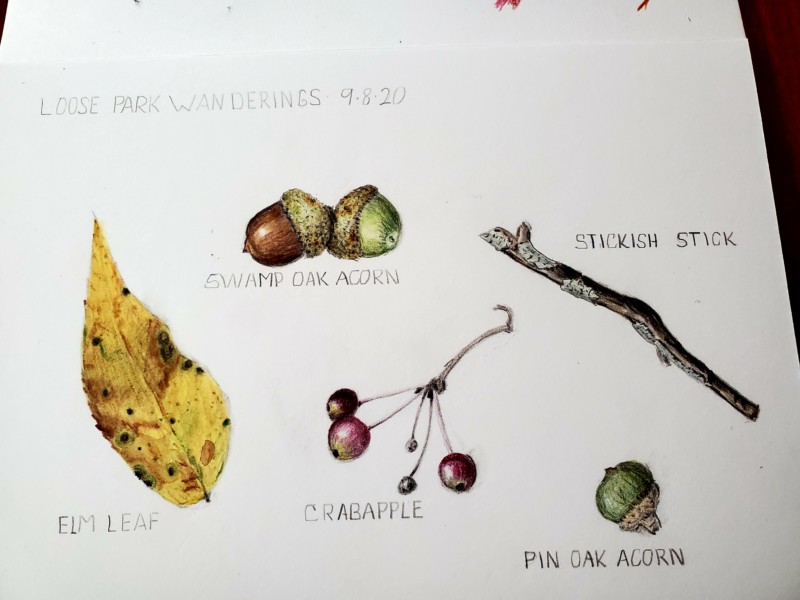
I picked up these items on a cross country walk across a city park. Sam, do you think I should add shadows? I’m afraid I’ll muddle it…or they’ll go wonky.
Love these!
I love this, Sara. (Lol stickish stick!) I know what you mean about adding cast shadows and their potential to distract from the actual subjects. I do think that this page is a great candidate for cast shadows, as it’s a collection of objects that very well could be sitting on the paper’s surface. If you decide to add cast shadows, here are some tips: 1. The light source should be consistent for ALL the elements on the page. 2. Practice on tracing paper first! That way, you’ll get a chance to adjust things if you feel like you need to. 3. Make the shadows SO SUBTLE that we barely know they’re there. Use things like: gray watercolor, gray Verithin, to get the shadows started, and then add just a touch of dark sepia in only the darkest places. 4. Remember that even cast shadows should have a “gradient” to them. They should start darkest where they touch the subject, and then gradually fade out into the color of the paper. They should not have a hard “edge” or appear as a dark “shape.” 5. Try to resist “long shadows.” Keep them simple and subtle. Remember that the plant is the star of the show, and the cast shadow shouldn’t compete for our attention. 🙂 I love these acorns!!!
Beautiful page Sara! I love it. I wouldn’t want to add the cast shadows either, but I trust Vern and usually try to do what she says unless I’m feeling extra stubborn. 🙂 She is always right…
Very nice page! I love all the fall colors. I like that you have a green and brown acorn together. I’m also like’n the lichen!