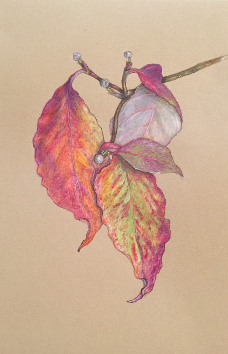
Beautiful composition and colors Sheila! I would look at the shadow areas again to see if you couldn’t darken them a little. Is the back side of the leaf that pastel toned?
Wow, these colors!!! I agree with Doug; on Kraft paper, you really have to push those darks even further than you would on white paper. I think just a few punches of more dark in a few places will look stunning.
Beautiful composition and colors Sheila! I would look at the shadow areas again to see if you couldn’t darken them a little. Is the back side of the leaf that pastel toned?
Beautiful!
Wow, these colors!!! I agree with Doug; on Kraft paper, you really have to push those darks even further than you would on white paper. I think just a few punches of more dark in a few places will look stunning.
We’re such broken records: add darks, add darks, add darks. 🙂