Activity
-

Pam added a Photo 2 years, 8 months ago
-
Pam commented on Joann DiLego's Photo 2 years, 8 months ago
Joann, such a fun drawing, and I love your notes! It’s a great drawing, and I really like all of the detail, and how you are showing habitat. You are starting to get some nice 3D form. You could get even more 3D form by adding in some more values. I’m seeing mostly midtone and in most of this drawing. If you add in more dark values it will take…[Read more]
-
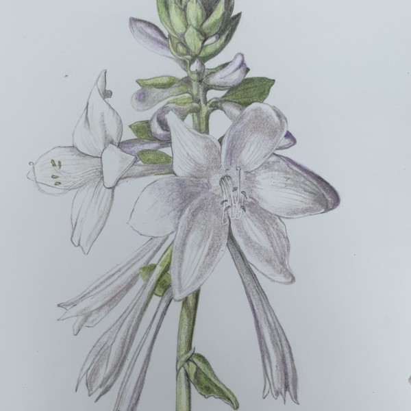
Pam commented on Ishbel Galloway's Photo 2 years, 8 months ago
Oh Ishbel, this is great! I love seeing these hosta flowers enlarged. You did a lovely job using sensitive line and feathering at the edges of that front flower. The flower on the left looks a bit too outlined to me. I would like to see you do what you did with that main front flower to that left flower. Beautiful work, Ishbel!
-
Pam commented on Richard A stjean's Photo 2 years, 8 months ago
Nice vibrant colors, Richard. This looks a lot like one of Wendy’s drawings. Did you use it as a reference? It’s okay to practice and learn from other’s drawings, but there is nothing better or more instructive than working from a live subject. Now that you’ve practiced with this drawing, I would love to see you work on another peach that you can…[Read more]
-
Pam commented on Jane Axamethy's Photo 2 years, 8 months ago
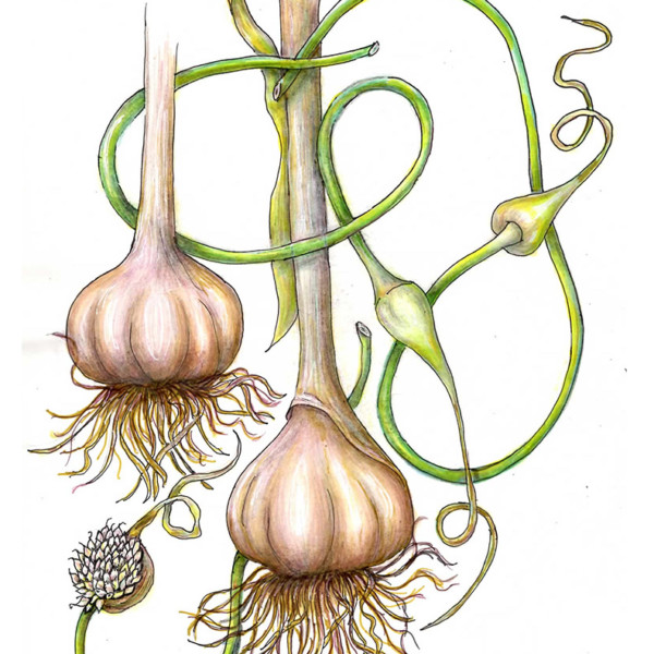
What a fun and whimsical composition. It’s very pleasing. I really like how dark you got where the roots attach to the head of the garlic – it helps to give that 3D illusion that we strive for. I think you could push that 3D illusion a bit more by darkening the right sides and bottoms of those garlic heads (keep toning a sphere in mind). Can’t wai…[Read more]
-

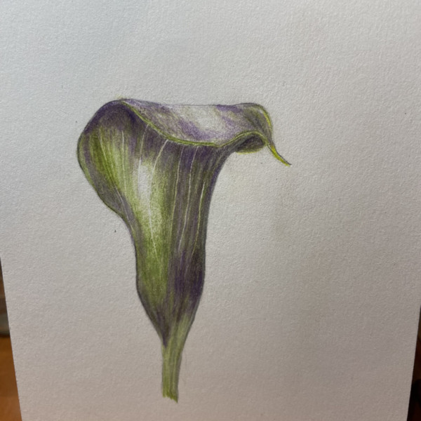
Doug Milne commented on Karen Minden's Photo 2 years, 8 months ago
The top edge looks great Karen and the top highlight is more what I would expect. Are there visible ridges or veins on the top part that folds forward? I could not tell from the picture. If there are you might want to include them. Nice job!
-
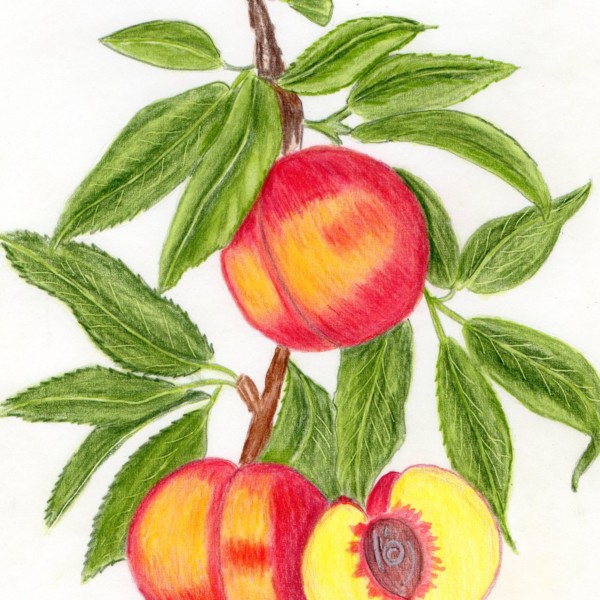
Doug Milne commented on Richard A stjean's Photo 2 years, 8 months ago
This is a nice composition Richard and nice job on the leaves. I would go back and add more toning to the leaves where they overlap and where there would be shadows cast by the peaches, etc. The peaches themselves are missing a highlight and the range of tones that are going to give them form. That form should be established on your drawing before…[Read more]
-
Doug Milne commented on Ishbel Galloway's Photo 2 years, 8 months ago
Beautiful composition Ishbel! I feel like the white flowers have an unfinished look. Many white flowers have a hint of color, light greens, blues, lilacs etc. Is there some color you could introduce especially in the center well area to give it some definition and pop?
-
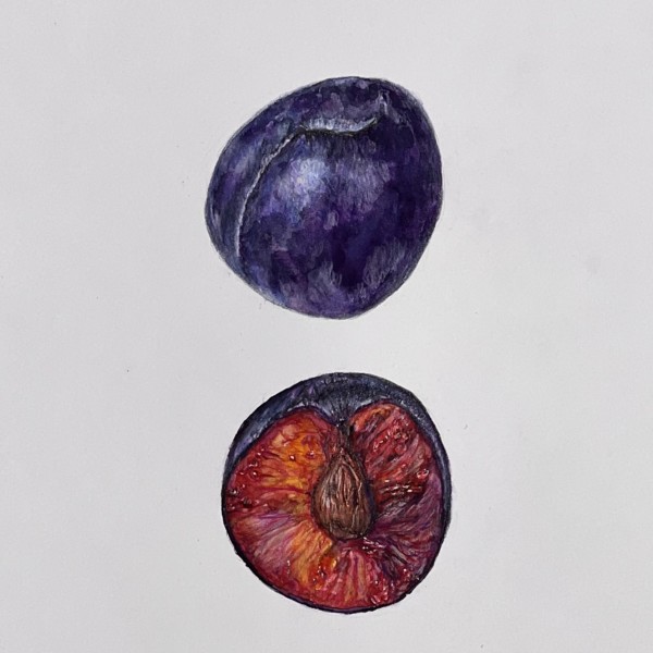
Doug Milne commented on Rita Haft's Photo 2 years, 8 months ago
Wow Rita- that inside view of the plum is so delectable!!!! The colors and texture are so good!!!!! As always your color saturation is amazing! This is screaming for you to do a fruit series!!!
-

-
Joann, such a fun drawing, and I love your notes! It’s a great drawing, and I really like all of the detail, and how you are showing habitat. You are starting to get some nice 3D form. You could get even more 3D form by adding in some more values. I’m seeing mostly midtone and in most of this drawing. If you add in more dark values it will take…[Read more]
-
-
Doug Milne commented on Jane Axamethy's Photo 2 years, 8 months ago
This is very striking Jane! Love the composition and how you incorporated all the various stages of development! Normally we advise artists not to outline the subjects, but in this instance this looks like a pen drawing that you have added color to and it is so pleasing!!! Wonderful job!!!
-

Ishbel Galloway added a Photo 2 years, 8 months ago
-
Beautiful composition Ishbel! I feel like the white flowers have an unfinished look. Many white flowers have a hint of color, light greens, blues, lilacs etc. Is there some color you could introduce especially in the center well area to give it some definition and pop?
-
Oh Ishbel, this is great! I love seeing these hosta flowers enlarged. You did a lovely job using sensitive line and feathering at the edges of that front flower. The flower on the left looks a bit too outlined to me. I would like to see you do what you did with that main front flower to that left flower. Beautiful work, Ishbel!
-
-
Richard A stjean added a Photo 2 years, 8 months ago
-
This is a nice composition Richard and nice job on the leaves. I would go back and add more toning to the leaves where they overlap and where there would be shadows cast by the peaches, etc. The peaches themselves are missing a highlight and the range of tones that are going to give them form. That form should be established on your drawing before…[Read more]
-
Nice vibrant colors, Richard. This looks a lot like one of Wendy’s drawings. Did you use it as a reference? It’s okay to practice and learn from other’s drawings, but there is nothing better or more instructive than working from a live subject. Now that you’ve practiced with this drawing, I would love to see you work on another peach that you can…[Read more]
-
-
-
Wow Rita- that inside view of the plum is so delectable!!!! The colors and texture are so good!!!!! As always your color saturation is amazing! This is screaming for you to do a fruit series!!!
-
I love that! Am so taken by the skin. It is very realistic but also has a very strong pictorial quality about it!
-
-
Jane Axamethy added a Photo 2 years, 8 months ago
-
This is very striking Jane! Love the composition and how you incorporated all the various stages of development! Normally we advise artists not to outline the subjects, but in this instance this looks like a pen drawing that you have added color to and it is so pleasing!!! Wonderful job!!!
-
What a fun and whimsical composition. It’s very pleasing. I really like how dark you got where the roots attach to the head of the garlic – it helps to give that 3D illusion that we strive for. I think you could push that 3D illusion a bit more by darkening the right sides and bottoms of those garlic heads (keep toning a sphere in mind). Can’t wai…[Read more]
-
-
Pam commented on Hélène Chiasson's Photo 2 years, 8 months ago
Helene, that leaf on the left is just beautiful! You nailed it. Love all of Doug’s advice.
-
Pam commented on Richard A stjean's Photo 2 years, 8 months ago
Richard, it’s been really fun to watch you progress. This is really nice! Your toning is nice and smooth, and you are getting rich, saturated colors. Your highlights look great, and you are getting a nice range of values and 3 dimensional form. I think you could push that 3D form with darker core shadows on your fruits, but you have done a g…[Read more]
-
Pam commented on Elinor Hart's Photo 2 years, 8 months ago
Nice, Elinor. Such a tough subject. You did a good job with all of those overlaps on those yellow flower branches. Yellows are really hard, and I think your shadow colors are successful. I would just echo Doug’s advice. Good job!
-
Karen Minden added a Photo 2 years, 8 months ago
-
The top edge looks great Karen and the top highlight is more what I would expect. Are there visible ridges or veins on the top part that folds forward? I could not tell from the picture. If there are you might want to include them. Nice job!
-
-
Hélène Chiasson commented on Hélène Chiasson's Photo 2 years, 9 months ago
Thank you Doug for such a quick response and also for your comments. I will work on them!
- Load More
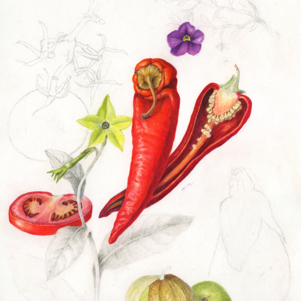
Not finished, but I thought I’d share what I demo-d during our Nightshades workshop. It was so much fun! I hope to finish this some day. Maybe next time we teach this workshop 🙂
It looks pretty cool as is!
Thanks Maureen!
Amazing!