Activity
-

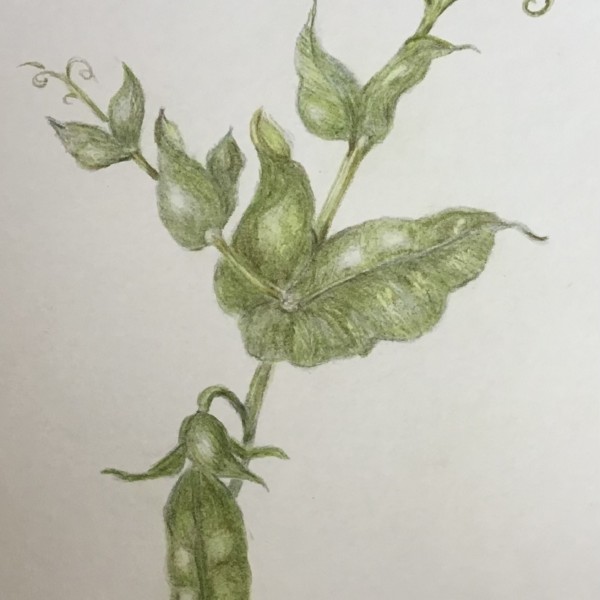
Pam commented on Cathie Hunter's Photo 2 years, 9 months ago
Oh Cathie, this is such a fun subject with all of its curlicues, beautiful curves, interesting leaves, and of course, that adorable seedpod. It’s a very nice graceful drawing, and you created a lovely realistic green. I think you may want to add in some more darks to help show the 3 dimensional form of each element and the whole subject. I can see…[Read more]
-

sheila y. commented on sheila y.'s Photo 2 years, 9 months ago
Thanks, Pam. Hmm, I hadn’t thought of that, but now I will 😎 -
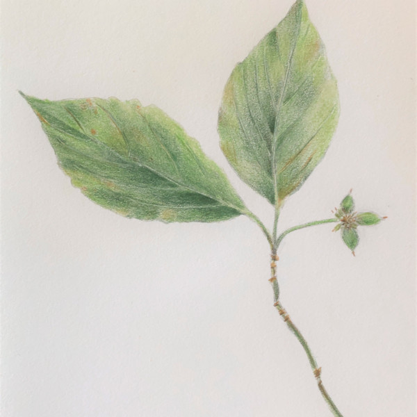
Pam commented on Heidi Brim's Photo 2 years, 9 months ago
Heidi, I’m loving the color mixing on these leaves – really beautiful. I can see you starting to get nice and dark down by the midvein on the left sides of the leaves – that’s the right idea to begin showing the 3D form. Continue to push those darks and highlights, taking all of Dougs advice, and this lovely drawing will be even better.
-
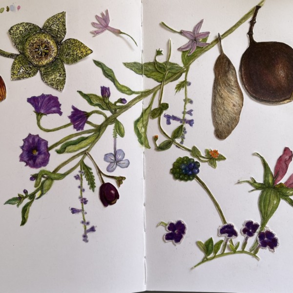
Pam commented on sheila y.'s Photo 2 years, 9 months ago
Another lovely collage, Sheila. Is there going to be a poem to accompany it?
-
sheila y. commented on sheila y.'s Photo 2 years, 9 months ago
Hi Doug, thanks for the suggestion. I’ll see what I’ve got around here. -

Zara Harraden commented on Zara Harraden's Photo 2 years, 9 months ago
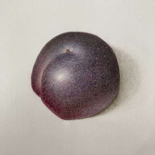
I’ve only just had chance to improve the plum! I have softened the shadow edge and darkened the reflective highlight…
-
Zara Harraden added a Photo 2 years, 9 months ago
-
I’ve only just had chance to improve the plum! I have softened the shadow edge and darkened the reflective highlight…
-
Zara, Yes! Well done!
-
Wow Zara! You nailed the colors and texture of this plum!!! It was beautiful before and now with the changes it is on a whole other level!!!!
-
-
Cathie Hunter added a Photo 2 years, 9 months ago
-
Oh Cathie, this is such a fun subject with all of its curlicues, beautiful curves, interesting leaves, and of course, that adorable seedpod. It’s a very nice graceful drawing, and you created a lovely realistic green. I think you may want to add in some more darks to help show the 3 dimensional form of each element and the whole subject. I can see…[Read more]
-
-
Doug Milne commented on Heidi Brim's Photo 2 years, 9 months ago
Hi Heidi- you are off to a good start, but you need to add some toning and saturation to bring these leaves to the next level. Except for the little bit of dark toning on the left side of the main vein there is not enough difference between the two sides of each of your leaves. As with everything we draw we need to establish the form of an object…[Read more]
-
Doug Milne commented on sheila y.'s Photo 2 years, 9 months ago
Hi Sheila- I like it the way it is. If anything I would look at adding a minimal couple of small things to continue the bottom end of the downward diagonal. Love the colors!
-
Heidi Brim added a Photo 2 years, 9 months ago
-
Hi Heidi- you are off to a good start, but you need to add some toning and saturation to bring these leaves to the next level. Except for the little bit of dark toning on the left side of the main vein there is not enough difference between the two sides of each of your leaves. As with everything we draw we need to establish the form of an object…[Read more]
-
Heidi, I’m loving the color mixing on these leaves – really beautiful. I can see you starting to get nice and dark down by the midvein on the left sides of the leaves – that’s the right idea to begin showing the 3D form. Continue to push those darks and highlights, taking all of Dougs advice, and this lovely drawing will be even better.
-
-
sheila y. commented on sheila y.'s Photo 2 years, 9 months ago
I have a few little drawings for the bottom left, but somehow the space felt better. Any suggestions?
-
-
I have a few little drawings for the bottom left, but somehow the space felt better. Any suggestions?
-
Hi Sheila- I like it the way it is. If anything I would look at adding a minimal couple of small things to continue the bottom end of the downward diagonal. Love the colors!
-
Hi Doug, thanks for the suggestion. I’ll see what I’ve got around here.
-
Another lovely collage, Sheila. Is there going to be a poem to accompany it?
-
Thanks, Pam. Hmm, I hadn’t thought of that, but now I will 😎
-
-
Pam commented on Maureen Doram's Photo 2 years, 9 months ago
Maureen, This drawing has such beautiful curves and gracefulness. I LOVE your leaves – beautiful light and dimension. I like how you really studied those individual petals on your flower, and are showing their form. I think that the overall form of the flower is getting a bit lost, and flattening it out a bit. This is such a common struggle,…[Read more]
-
Pam commented on Becky Bruno's Photo 2 years, 9 months ago
Becky, this is beautiful. I also love how you photograph your pieces on fabric. Are you planning to frame your pieces incorporating these fabric patterns?
-
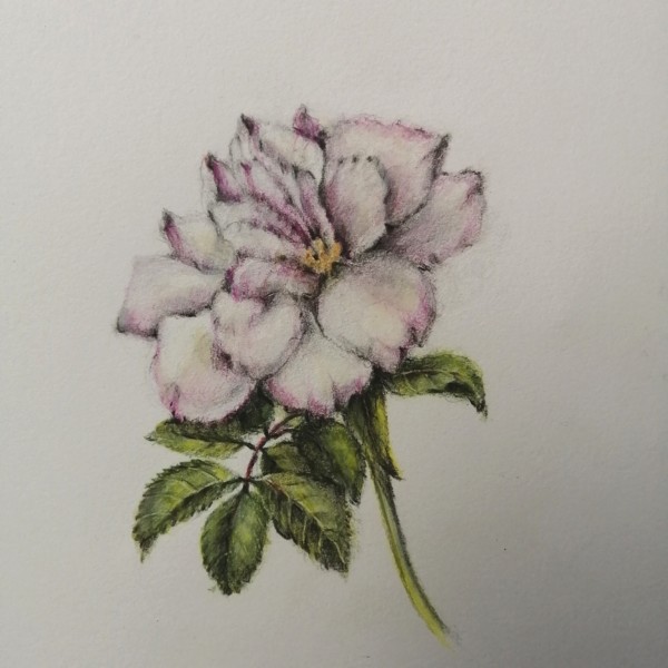
Maureen Doram added a Photo 2 years, 9 months ago
-
Maureen, This drawing has such beautiful curves and gracefulness. I LOVE your leaves – beautiful light and dimension. I like how you really studied those individual petals on your flower, and are showing their form. I think that the overall form of the flower is getting a bit lost, and flattening it out a bit. This is such a common struggle,…[Read more]
-
@pgthompson Thank you for your insights, you’re right in that it is so tricky to keep the overall form. I really did fall in love with each petal, I’ll see if I can figure out some deeper toning with tracing paper first. I think a watercolor wash to darken shadows would be helpful too.
-
-
Doug Milne commented on Becky Bruno's Photo 2 years, 9 months ago
Great job Becky! Your tomato looks so plump and juicy! Your color selection and saturation are really well done! Shiny tomatoes usually have multiple highlights which you have captured beautifully! There are a couple of spots where I see white lines such as the very bottom and in some of the creases where segments meet. I would not expect…[Read more]
-
-
Great job Becky! Your tomato looks so plump and juicy! Your color selection and saturation are really well done! Shiny tomatoes usually have multiple highlights which you have captured beautifully! There are a couple of spots where I see white lines such as the very bottom and in some of the creases where segments meet. I would not expect…[Read more]
-
Becky, this is beautiful. I also love how you photograph your pieces on fabric. Are you planning to frame your pieces incorporating these fabric patterns?
-
-
Zara Harraden commented on Zara Harraden's Photo 2 years, 9 months ago
@pgthompson thanks so much for taking the time to give me such great feedback! The colours are a mix of dark indigo, red-violet and madder at the bottom (also dark sepia), it took quite a lot of layers to get the right colour of the plum. I did think the reflective highlight was too light but was unsure, and I thought I can always add more later…[Read more]
-
Maureen Doram commented on Maureen Doram's Photo 2 years, 9 months ago
@doug-milne Yes, a little violet or Italian red might work nicely! Always good to hear from you, thanks Doug!
- Load More