Activity
-

Doug Milne commented on Catherine DeFoor's Photo 2 years, 11 months ago
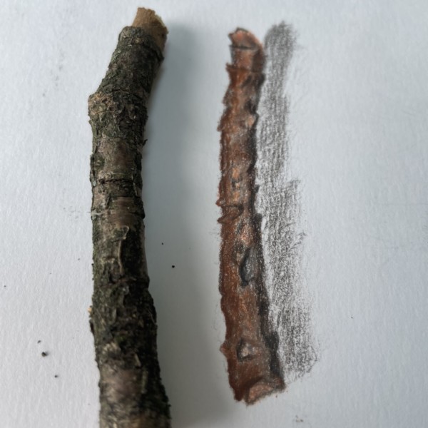
Hi Catherine- another interesting branch segment! It is important to have our illustrations be as accurate as possible in size and shape. You can measure the branch or even trace the branch as it is lying on your paper. Yours needs to be longer, wider and I would definitely try to illustrate that angle and jog near the top. You will see on…[Read more]
-
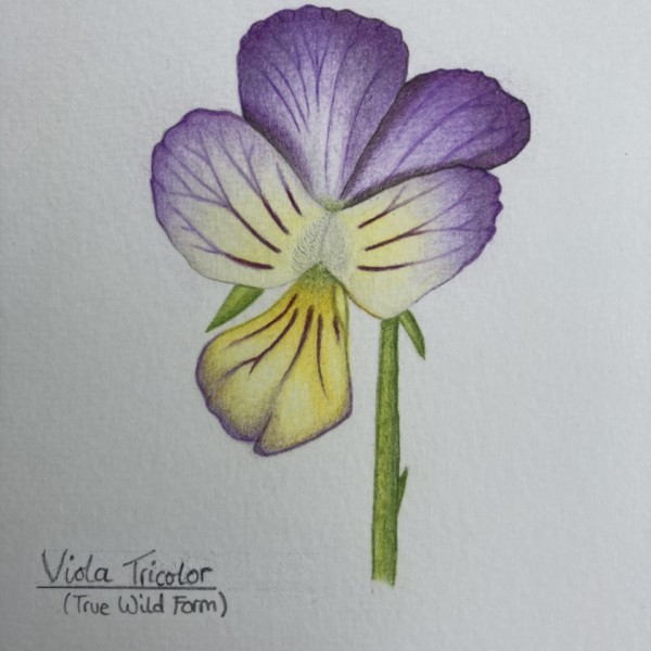
Zara Harraden commented on Zara Harraden's Photo 2 years, 11 months ago
I grew the plant from seed, and I loved the dainty flowers so much I couldn’t resist drawing one of them!
-
-
I grew the plant from seed, and I loved the dainty flowers so much I couldn’t resist drawing one of them!
-
Beautiful colors Zara! They are spot on! I think a little dark toning at the center would help punch up the center which looks unfinished to me. I would also add some toning on the stem below the flower petal. The petal would cast a shadow on the stem as probably would the center petal. In addition, the stem also needs a highlight and range of…[Read more]
-

How fun to draw a flower that you grew and nurtured from a little seed! I’m loving your vein details, and how you are showing how they branch off, and get thinner and thinner toward the outer edge of the petals. Very nice. Take Doug’s advice and get some more 3D form in there, and it will be even better. Great job.
-
-
Catherine DeFoor added 2 Photos 2 years, 11 months ago
-
Hi Catherine- another interesting branch segment! It is important to have our illustrations be as accurate as possible in size and shape. You can measure the branch or even trace the branch as it is lying on your paper. Yours needs to be longer, wider and I would definitely try to illustrate that angle and jog near the top. You will see on…[Read more]
-
Hi Catherine, So nice to see you working on these branch studies! I love how you are really getting all those fun details in there. It’s amazing how much there interest there is in such a seemingly simple subject like a branch, right? When trying to get all of those details into a drawing, it’s easy to get so interested and lost in those details…[Read more]
-
-
Richard A stjean commented on Richard A stjean's Photo 2 years, 11 months ago
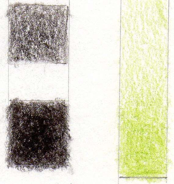
lesson 2
-
Richard A stjean added a Photo 2 years, 11 months ago
-
lesson 2
-
Nice tones Richard! What you want to work on next is making sure you get nice smooth, even toning. You should not be able to see the white spots and variation of tone within each square. It takes time, but you want to start with an even, smooth base layer and keep adding on layers making sure they are also even and smooth.
-
Richard, I’ve found that making sure you have a really sharp colored pencil, and then a really light touch helps to get nice even toning. I even make myself hold my pencil way back toward the back end when I’m toning so that I can’t press too hard. I just let the pencil barely touch the paper while I’m toning, especially for those first few layers.
-
-
Richard A stjean added a Photo 2 years, 11 months ago
-
-
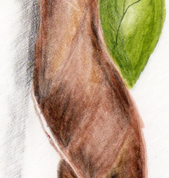
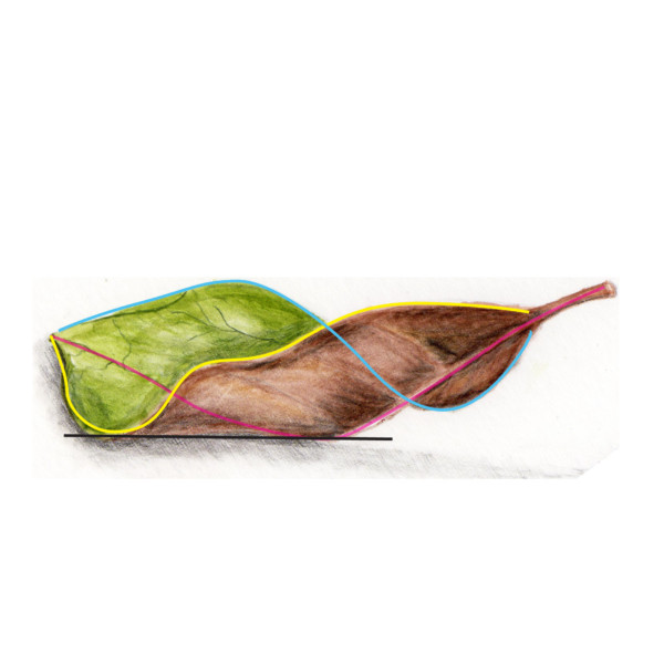
Hi Richard, I want to use your leaf as a great example of how to make sure that the margins and center veins “follow through”, and how to make sure that the tangent line where a fold happens is straight and not curved. This is something that a lot of people struggle with, and you did such a nice job. If you follow the yellow line that I drew on…[Read more]
-
-
Richard A stjean added a Photo 2 years, 11 months ago
-
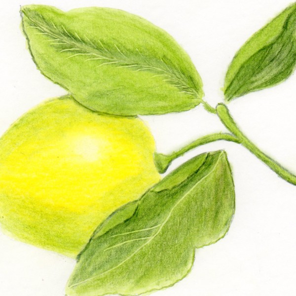
Hi Richard- The colors are so bright and fresh and I really like the composition! As you know from Wendy’s videos and books that she tries to depict her subjects as accurately as possible. Taking time to study each subject and see how the leaves attach to the stem, what are the veins like, how to illustrate the texture in the lemon, etc, etc. A…[Read more]
-
Richard, I love these bright bold colors! And you are off to a great start with beginning to show the form on your lemon. I like your nice soft highlight, and the start of some toning where the form turns away from the light. Can you see how that is starting to make it look 3D? Good job! Are you imagining your light source as coming from the upper…[Read more]
-
-
Zara Harraden commented on Rita Haft's Photo 2 years, 11 months ago
I love this! It’s like you’ve captured the personality of a sunflower perfectly!
-
Margaret Hahn added a Photo 2 years, 11 months ago
-
It has been fun to watch the progression on this piece Margaret! Great job!
-
Margaret, This is such a fun composition, and it turned out even better than I thought it would. It’s just such a wonderful, interesting drawing. Love it!
-
-

sheila y. commented on sheila y.'s Photo 2 years, 11 months ago
Thanks, Pam. Doug made that suggestion when I posted the first image. I always appreciate all of you guys feedback. -
Pam commented on sheila y.'s Photo 2 years, 11 months ago
So interesting how changing the position of that leaf on that diagonal helps to move the eye around the composition. I really like the change!
-
Pam commented on Becky Bruno's Photo 2 years, 11 months ago
Nice Becky! Aren’t radishes fun? Way to go tackling leaves. You are off to a great start. You are paying good attention to the way those leaves bend and curl, and I immediately recognized them as radish leaves. I think if you darken up that right side of that front leaf, and narrow up and darken those thick light veins on that same leaf, it will…[Read more]
-
Pam commented on Rita Haft's Photo 2 years, 11 months ago
There is a wonderful almost frenetic energy to this drawing that I love. I think you could add even more drama by taking Doug’s advice and toning the shadow areas darker to really show the 3 dimensional form.
-
Pam commented on Cathie Hunter's Photo 2 years, 11 months ago
Cathy, this is great. Those added darks are fantastic!
-
-
So interesting how changing the position of that leaf on that diagonal helps to move the eye around the composition. I really like the change!
-
Thanks, Pam. Doug made that suggestion when I posted the first image. I always appreciate all of you guys feedback.
-
-
Doug Milne commented on Zara Harraden's Photo 2 years, 11 months ago
Wow Zara! You nailed the colors and texture of this plum!!! It was beautiful before and now with the changes it is on a whole other level!!!!
-
Doug Milne commented on Becky Bruno's Photo 2 years, 11 months ago
Hi Becky- your radish is beautifully rendered and the leaves are really well done! The one leaf I would revisit is the one in the middle. I would not expect to see such a strong highlight on the right side of the leaf and the wide, white veins are distracting. They don’t jive with all the other veins which are so well done! Food for thought – it i…[Read more]
-
Doug Milne commented on Rita Haft's Photo 2 years, 11 months ago
Interesting view Rita! It is a very stimulating drawing, because of your wonderful rich, saturated colors! I notice there is not a lot of variation from the areas that would be in the light and the areas that would be more in shadow – especially on the petals. Adding some more toning would help emphasize the form.
-
Becky Bruno commented on Becky Bruno's Photo 2 years, 11 months ago
Radish from our market. Leaves are a huge step for me!
- Load More