Activity
-

Pam commented on Peta McDonald's Photo 2 years, 11 months ago
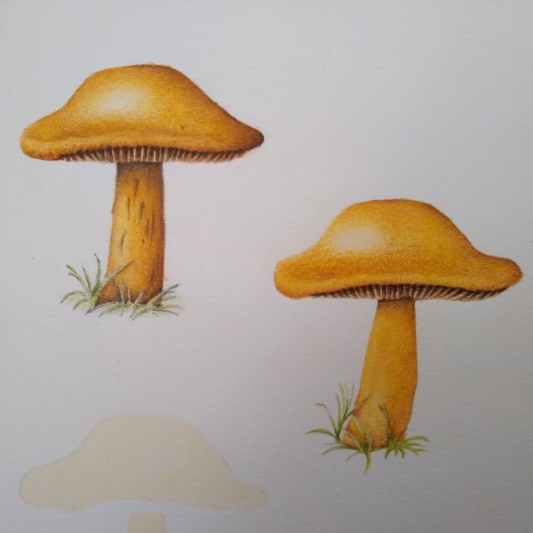
These are so cute! I love the little peak of the gills. You can really feel the waxy texture of the surface of the cap, and your highlights are lovely. I especially love that highlight along the cap’s edge – very successful. Nice shading under the capes, and I really like the detail on the stipe. And that little tuft of leaves on the bottom is…[Read more]
-
Pam commented on Rita Haft's Photo 2 years, 11 months ago
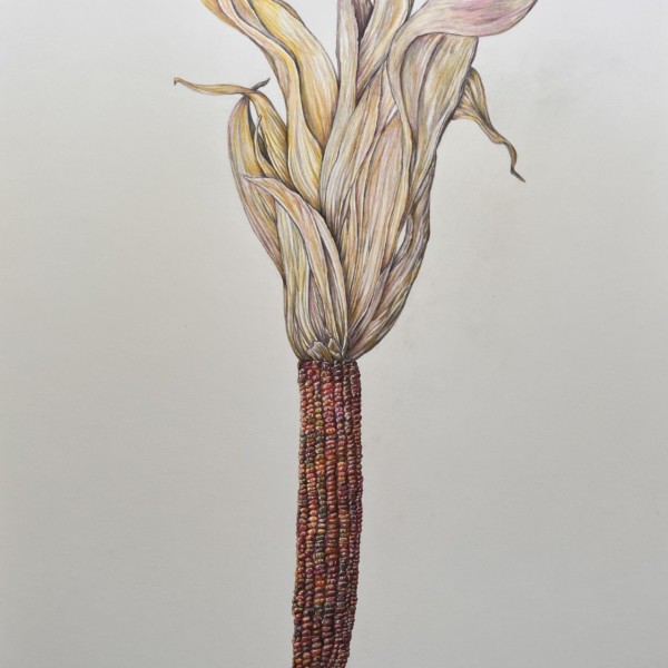
Oh Rita, This is great! All of those little kernels are drawn beautifully with lovely highlights and shadows. You rendered great detail, while still maintaing 3D form on the cob – wonderful! The dry leaves are really nice too. I love the variety of colors. I think you could push the 3D form of that group of leaves a bit more by toning that whole…[Read more]
-

-
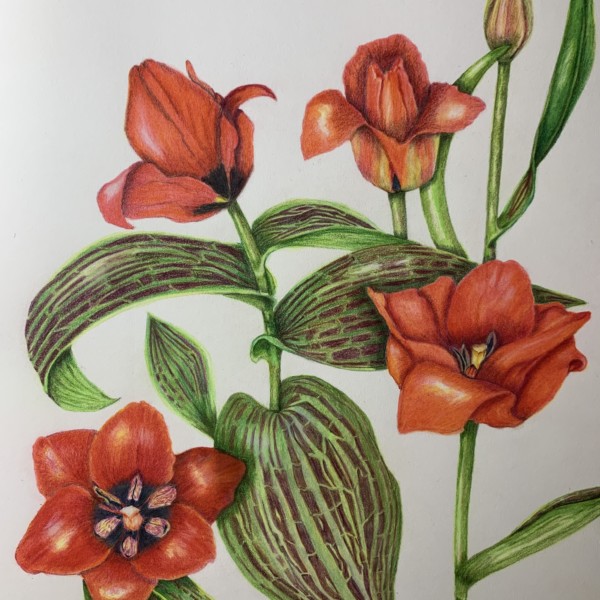
Theresia, this is beautiful! I love the bright saturated colors. Those variegated leaves are so interesting, You did a lovely job of showing the twists and curves of those leaves. You might want to consider toning down the highlights on some of your petals. The flower that is open on the upper right: the highlights on the left and right petal are…[Read more]
-
Thank you Pam! Should I see the whole blossom as one object like a sphere? So I place the main highlight like I would ( more or less) on the sphere? That’s good advice as I got a little confused about the possibilities of highlights a plant can offer with their various amount of petals, I guess! 🙃 I keep the curvy stem in mind (definitely!) My t…[Read more]
-
Oh, sorry Pam. I see what you mean. You mean the small tulip above on the right. It’s a straight line through the whole paige! That’s very boring. Right! Won‘t happen again. Thanks!
-
-
Peta McDonald added a Photo 2 years, 11 months ago
-
These are so cute! I love the little peak of the gills. You can really feel the waxy texture of the surface of the cap, and your highlights are lovely. I especially love that highlight along the cap’s edge – very successful. Nice shading under the capes, and I really like the detail on the stipe. And that little tuft of leaves on the bottom is…[Read more]
-
(capes — caps)
-
You know I love these, Peta! Are you familiar with Margaret Saylor’s work? She gave a delightful presentation on her mushroom field sketches at last year’s American Society of Botanical Artists conference. I think you might dig her work (no pun intended).
-
@maureenclare Oh wow… I just looked her up. You are exactly right that I love those a lot. Do you think she’s watercolour + pencil? It can be really overwhelming seeing the phenomenal work of botanical artists. It’s so hard to know where to begin! Commonly facing choice paralysis here. This particular fungus is really rounded and bright yellow…
-
@petapumpkineater I think you did a fantastic job with these mushrooms! They look like they could be in a field guide. As for Margaret Saylor, I think she uses graphite pencil and watercolor. (She’s also a delightful personality as mushroom people tend to be!) I got some drawing in today of what I hope are budding maianthemum stellatum and some…[Read more]
-
-
Doug Milne commented on Renata's Photo 2 years, 11 months ago
Hi Renata- The leaves have a beautiful range of greens and a great sense of movement! Looking forward to see how your drawing progresses!
-
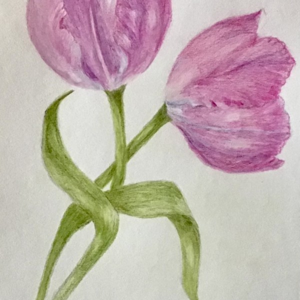
Doug Milne commented on Cathie Hunter's Photo 2 years, 11 months ago
The tulip on the left is particularly good Cathie. One of the reasons it is successful is the highlights. They are not as strong on the tulip on the right and I think it would help to look at that again. Both tulips and the stems and leaves could use some dark toning. It would especially help the tulip on the right. It is hard to differentiate the…[Read more]
-
Doug Milne commented on Rita Haft's Photo 2 years, 11 months ago
Gorgeous Rita!!! You really challenged yourself and it certainly paid off!!!!!
-
-
Gorgeous Rita!!! You really challenged yourself and it certainly paid off!!!!!
-
Oh Rita, This is great! All of those little kernels are drawn beautifully with lovely highlights and shadows. You rendered great detail, while still maintaing 3D form on the cob – wonderful! The dry leaves are really nice too. I love the variety of colors. I think you could push the 3D form of that group of leaves a bit more by toning that whole…[Read more]
-
This is so rad!!!
-
I love this! the contrasting textures are so compelling!
-
Oh my word!!! I can’t even imagine how much time it took to do each of those little kernals! Might have to study this picture for a while. It’s incredible!
-
-
Katy Lyness commented on sheila y.'s Photo 2 years, 11 months ago
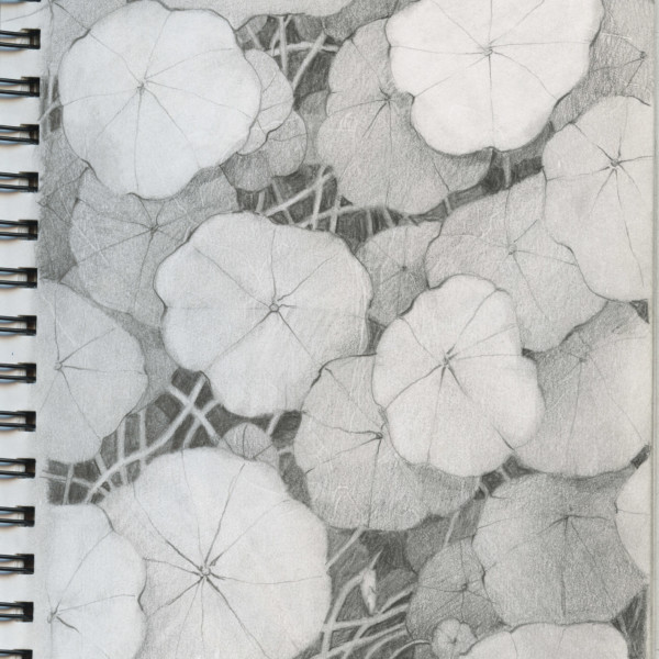
Here’s the drawing
-
Katy Lyness commented on sheila y.'s Photo 2 years, 11 months ago
-

sheila y. commented on sheila y.'s Photo 2 years, 11 months ago
Thanks, Katy. I like nasturtiums a lot and they hold up very well for drawing 😎 -
-
The tulip on the left is particularly good Cathie. One of the reasons it is successful is the highlights. They are not as strong on the tulip on the right and I think it would help to look at that again. Both tulips and the stems and leaves could use some dark toning. It would especially help the tulip on the right. It is hard to differentiate the…[Read more]
-
-
Renata added a Photo 2 years, 11 months ago
-
Renata added a Photo 2 years, 11 months ago
-
Hi Renata- The leaves have a beautiful range of greens and a great sense of movement! Looking forward to see how your drawing progresses!
-
-
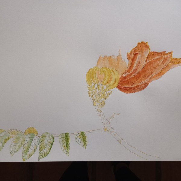
Katy Lyness commented on Hélène Chiasson's Photo 2 years, 11 months ago
Hi Helene, Those thin petals are a challenge! Especially those yellow tips!
I think what this drawing needs is some darks. Just a touch where the darkest areas would be. Keep them saturated. Try using reds. Then add browns to tone them down. -
Renata added a Photo 2 years, 11 months ago
-
Karen Minden commented on Karen Minden's Photo 2 years, 11 months ago
thanks. Will give it a try. -
Katy Lyness commented on Karen Minden's Photo 2 years, 11 months ago
Nice rich colors! And I like the your value range. The highlights really pop. Just be carefull to think of the flower as a whole, with the prominent highlight in the upper left. And a distinct shadow side. Also, sharpen your pencil! I want to see some of those edges crisped up.
-
Katy Lyness commented on Karen Minden's Photo 2 years, 11 months ago
Nice work on those highlights in the purple flower. I love your richness of color. The purple with the yellow makes for a very pleasing composition.
Yellow is a challenge. I think you could have kept more of the paper color open for the highlights. And be very careful of your toning. The green is a good choice, but the transition in to the…[Read more]
-
Katy Lyness commented on Cathie Hunter's Photo 2 years, 11 months ago
This drawing is just getting better and better. I’d pay some attention to the stem now. Try to find a distinct highlight. think of it as a cylinder.
- Load More