Activity
-

Katy Lyness commented on Mary Frost's Photo 3 years ago
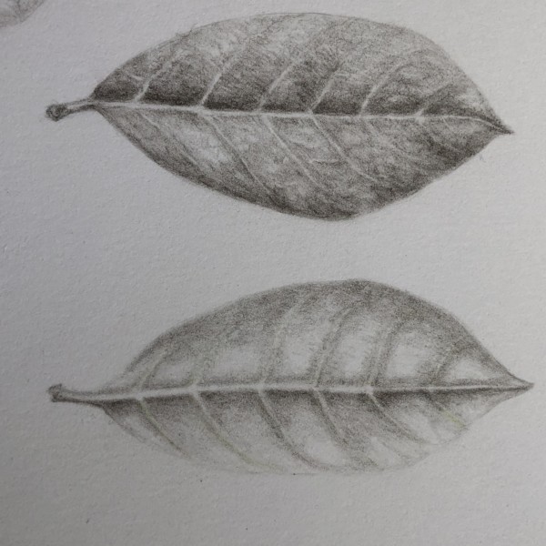
I like the way I feel the curve of the top leaf. And the indentation around the midrib in the bottom one. Also, nice pillowing between the veins!
-
Katy Lyness commented on Karen Minden's Photo 3 years ago
To get a shine you will need to have a relatively sharp, bright highlight. Look for it in your subject. Once you have established where the highlight is, be careful to let the paper white show through to create that highlight. To make it sweaty, you may need to create a water drop. I think Wendy may have done a video on that. I couldn’t find it…[Read more]
-
Katy Lyness commented on Mary Frost's Photo 3 years ago
Hi Mary, Lovely drawing! I agree with Doug comments. Your changes have enhanced the drawing. White is such a challenge. You’ve done beautifully. I really feel the texture of this lily. Good job.
-
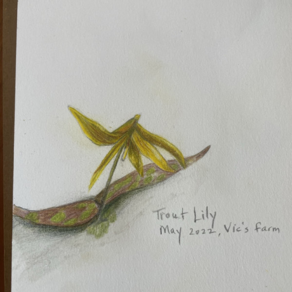
Katy Lyness commented on Ethel's Photo 3 years ago
Yellow! Such a challenging color! I love the ripply edges!
-
Karen Minden commented on Karen Minden's Photo 3 years ago
How to make the leaves look shiny? Sweaty?
-
Karen Minden added a Photo 3 years ago
-
How to make the leaves look shiny? Sweaty?
-
To get a shine you will need to have a relatively sharp, bright highlight. Look for it in your subject. Once you have established where the highlight is, be careful to let the paper white show through to create that highlight. To make it sweaty, you may need to create a water drop. I think Wendy may have done a video on that. I couldn’t find it in…[Read more]
-
-
Karen Minden commented on Karen Minden's Photo 3 years ago
Thanks Doug. Will have to make it up, as the flowers are now in full bloom, but I think I know what to do.
-
Doug Milne commented on Karen Minden's Photo 3 years ago
Hi Karen- I like how the leaves are in various stages of completion! Beautiful colors and saturation! However, the flower buds and upper leaves need more toning and highlights to enhance their form. It would also help differentiate the individual buds and leaves. You are almost there!
-
Doug Milne commented on Ethel's Photo 3 years ago
Great pages Ethel! Keep up the good work!
-
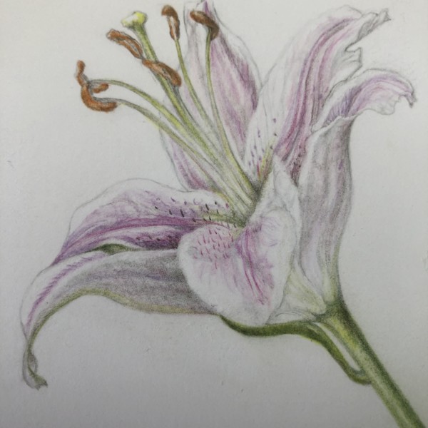
Doug Milne commented on Mary Frost's Photo 3 years ago
The changes are really good Mary! The visual strength of the petals now is on par with the stamens, etc.
-
Ethel commented on Ethel's Photo 3 years ago
I enjoyed the spring flower workshop. I learned so much and I was inspired to continue with something I find intimidating.
-
Mary Frost commented on Mary Frost's Photo 3 years ago
There is a tiny part of a leaf I missed on the left side that separates the two petals. I darkened the left petal more and added a shadow in the well of the flower. I deepened the colors on the petals to separate them a bit more.
-
Mary Frost added a Photo 3 years ago
-
There is a tiny part of a leaf I missed on the left side that separates the two petals. I darkened the left petal more and added a shadow in the well of the flower. I deepened the colors on the petals to separate them a bit more.
-
The changes are really good Mary! The visual strength of the petals now is on par with the stamens, etc.
-
Hi Mary, Lovely drawing! I agree with Doug comments. Your changes have enhanced the drawing. White is such a challenge. You’ve done beautifully. I really feel the texture of this lily. Good job.
-

I especially love the reproductive parts of this drawing, Mary. They are so well done.
-
-
Emily Zelinsky Low commented on Emily Zelinsky Low's Photo 3 years ago
Thank you Dolores. Drawing is very new to me so I’m really over the moon about this beet
-
Mary Frost commented on Mary Frost's Photo 3 years ago
I made the secondary veins on the front of the leaf thinner and removed some of the dark shading on the left side of the back of the leaf. Surprisingly the mid vein still pops. The back of the leaf is lighter. I also added some shading to the far left edge of the back of the leaf.
-
Mary Frost added a Photo 3 years ago
-
I made the secondary veins on the front of the leaf thinner and removed some of the dark shading on the left side of the back of the leaf. Surprisingly the mid vein still pops. The back of the leaf is lighter. I also added some shading to the far left edge of the back of the leaf.
-
I like the way I feel the curve of the top leaf. And the indentation around the midrib in the bottom one. Also, nice pillowing between the veins!
-
You are getting nice 3 D form on these leaves. Good job! I think you could narrow up those veins a little more, and maybe try to make them just a little bit let uniform while you are doing that.
-
-
Karen Minden commented on Karen Minden's Photo 3 years ago
It’s called Lunaria or Silver Dollar
-
-
Hi Karen- I like how the leaves are in various stages of completion! Beautiful colors and saturation! However, the flower buds and upper leaves need more toning and highlights to enhance their form. It would also help differentiate the individual buds and leaves. You are almost there!
-
Thanks Doug. Will have to make it up, as the flowers are now in full bloom, but I think I know what to do.
-
This is lovely, Karen. I like how you included all of those leaves – such a challenge, and you are doing a great job. If you could lift out some highlights and add a little more toning to the buds (think sphere smushed with a cylinder), you will get this looking more three dimensional. Keep going. You are doing great!
-
-
Dolores Duran-Cefalu commented on Harriet O’Donnell's Photo 3 years ago
wow awesome!
-
Dolores Duran-Cefalu commented on Emily Zelinsky Low's Photo 3 years ago
I love the little fine hairy roots.
- Load More