Activity
-
Renata added a Photo 3 years, 3 months ago
-

Katy Lyness commented on Hélène Chiasson's Photo 3 years, 3 months ago
Hi Helene, Those thin petals are a challenge! Especially those yellow tips!
I think what this drawing needs is some darks. Just a touch where the darkest areas would be. Keep them saturated. Try using reds. Then add browns to tone them down. -
Renata added a Photo 3 years, 3 months ago
-
Karen Minden commented on Karen Minden's Photo 3 years, 3 months ago
thanks. Will give it a try. -
Katy Lyness commented on Karen Minden's Photo 3 years, 3 months ago
Nice rich colors! And I like the your value range. The highlights really pop. Just be carefull to think of the flower as a whole, with the prominent highlight in the upper left. And a distinct shadow side. Also, sharpen your pencil! I want to see some of those edges crisped up.
-
Katy Lyness commented on Karen Minden's Photo 3 years, 3 months ago
Nice work on those highlights in the purple flower. I love your richness of color. The purple with the yellow makes for a very pleasing composition.
Yellow is a challenge. I think you could have kept more of the paper color open for the highlights. And be very careful of your toning. The green is a good choice, but the transition in to the…[Read more]
-
Katy Lyness commented on Cathie Hunter's Photo 3 years, 3 months ago
This drawing is just getting better and better. I’d pay some attention to the stem now. Try to find a distinct highlight. think of it as a cylinder.
-
Katy Lyness commented on sheila y.'s Photo 3 years, 3 months ago
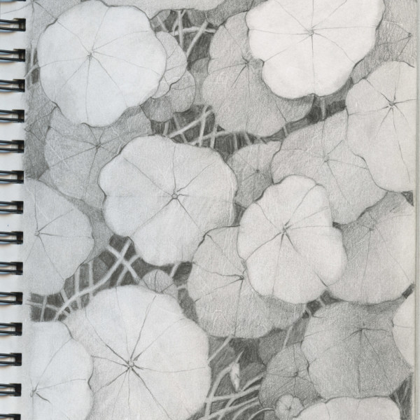
Hey Shelia, such a great tangle of summer. Nasturtiums are one of my favorites. I did a graphite drawing of them I am particularly fond of. I’ll see if I can find a scan of it.
-
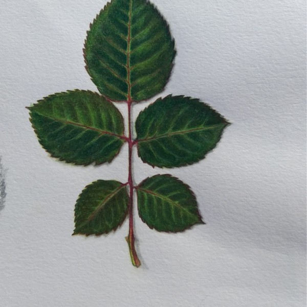
Katy Lyness commented on Iulia Popescu's Photo 3 years, 3 months ago
This is a beautiful sensitive drawing! I love your rich colors! And the pillowing between the veins. Also the magenta of the midrib. Great observation! And the subtle cast shadow makes this leaf jump off the page! Good work!
-
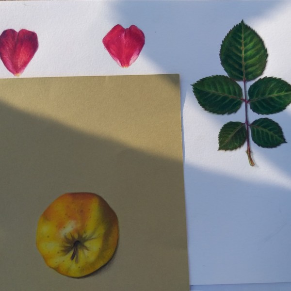
Katy Lyness commented on Iulia Popescu's Photo 3 years, 3 months ago
Hi Iulia, That apple looks great. The photo is a bit in shadow, so I’m not seeing all the rich colors you seem to have. But from what I can see it has the rich, saturated colors you other works show.
-
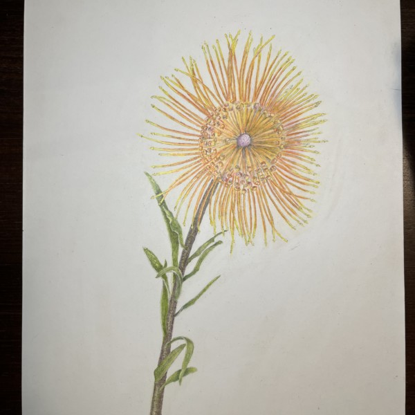
Hélène Chiasson commented on Hélène Chiasson's Photo 3 years, 3 months ago
I just had to draw this pin-cushion protea. What a challenge. I could have benefitted from a few pointers before attacking this specimen.
-
Hélène Chiasson added a Photo 3 years, 3 months ago
-
I just had to draw this pin-cushion protea. What a challenge. I could have benefitted from a few pointers before attacking this specimen.
-
Hi Helene, Those thin petals are a challenge! Especially those yellow tips! I think what this drawing needs is some darks. Just a touch where the darkest areas would be. Keep them saturated. Try using reds. Then add browns to tone them down.
-
-
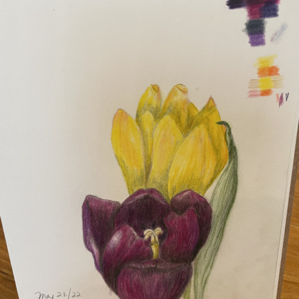
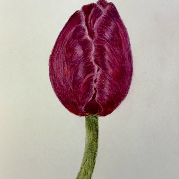
Karen Minden commented on Karen Minden's Photo 3 years, 3 months ago
These tulips are too flat looking, and the purple one should be closer to black. I’m stumped about what to do
-
Karen Minden added a Photo 3 years, 3 months ago
-
Nice rich colors! And I like the your value range. The highlights really pop. Just be carefull to think of the flower as a whole, with the prominent highlight in the upper left. And a distinct shadow side. Also, sharpen your pencil! I want to see some of those edges crisped up.
-
-
Karen Minden added a Photo 3 years, 3 months ago
-
These tulips are too flat looking, and the purple one should be closer to black. I’m stumped about what to do
-
Nice work on those highlights in the purple flower. I love your richness of color. The purple with the yellow makes for a very pleasing composition. Yellow is a challenge. I think you could have kept more of the paper color open for the highlights. And be very careful of your toning. The green is a good choice, but the transition in to the yellow…[Read more]
-
thanks. Will give it a try.
-
-
-
This drawing is just getting better and better. I’d pay some attention to the stem now. Try to find a distinct highlight. think of it as a cylinder.
-
-

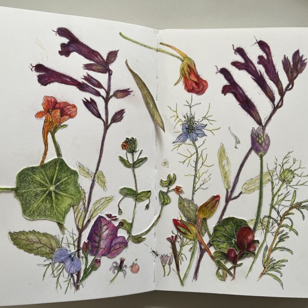
sheila y. added a Photo 3 years, 3 months ago
-
Hey Shelia, such a great tangle of summer. Nasturtiums are one of my favorites. I did a graphite drawing of them I am particularly fond of. I’ll see if I can find a scan of it.
-
Thanks, Katy. I like nasturtiums a lot and they hold up very well for drawing 😎
-
-
Here’s the drawing
-
I love the illusion of depth here
-

Love this Sheila…happy memories!
-
Thanks, Ishbel. Had a really good hike today and it brought me back to the terraced hillsides!
-
Thanks, Maureen. I enjoyed wandering around finding specimens for this page.
-
-
Iulia Popescu added a Photo 3 years, 3 months ago
-
This is a beautiful sensitive drawing! I love your rich colors! And the pillowing between the veins. Also the magenta of the midrib. Great observation! And the subtle cast shadow makes this leaf jump off the page! Good work!
-
-
Iulia Popescu added a Photo 3 years, 3 months ago
-
Hi Iulia, That apple looks great. The photo is a bit in shadow, so I’m not seeing all the rich colors you seem to have. But from what I can see it has the rich, saturated colors you other works show.
-
-

Pam commented on Maureen Clare Murphy's Photo 3 years, 3 months ago
Beautiful composition Maureen. Those delicate highlights are gorgeous, and give your leaves a lovely sheen. I really like the mix of the pale leaves with the fully saturated leaves – it makes for a very interesting composition. Bravo!
- Load More


Hi Renata- The leaves have a beautiful range of greens and a great sense of movement! Looking forward to see how your drawing progresses!