Activity
-

Kellie Patton added a Photo 1 year, 1 month ago
-
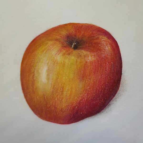
Kellie Patton added a Photo 1 year, 1 month ago
-
Hélène Chiasson commented on Hélène Chiasson's Photo 1 year, 1 month ago
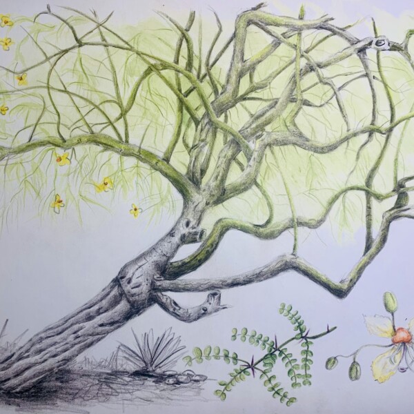
There is still more to do on this drawing. This was started at the Kauai workshop in October and I am now working from a photo. I would like to benefit from tomorrow’s webinar to obtain comments and suggestions that would help in going forward. Thank you!
-
Hélène Chiasson added a Photo 1 year, 1 month ago
-
There is still more to do on this drawing. This was started at the Kauai workshop in October and I am now working from a photo. I would like to benefit from tomorrow’s webinar to obtain comments and suggestions that would help in going forward. Thank you!
-
-
Gale Foster added a Photo 1 year, 1 month ago
-
This is beautifully rendered Gale and the colors are wonderful! Great job! The flower center is especially good! Your lettering also compliments the flower. My one comment would be the highlights on the leaves. They look too white and strategically placed. Look at Wendy’s leaves in her books and lesson videos (and others on the ArtFeed) or in b…[Read more]
-
-
Gale Foster added a Photo 1 year, 1 month ago
-
Denise Beach added 3 Photos 1 year, 1 month ago
-
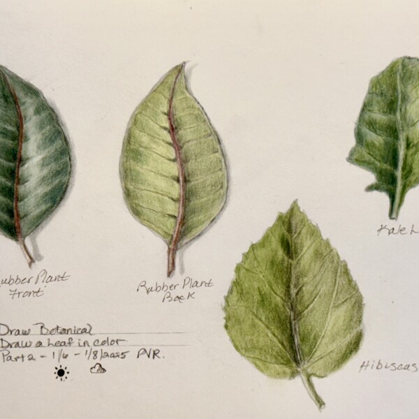
This is a good study page Denise! I was just telling another artist that leaves can often be more challenging than the flower or other aspects of the plant. As you probably noticed there are some basic rules, but every type of leaf will require something unique to identify it. I have it in my head that kale leaves have a lot of pillowing on them.…[Read more]
-
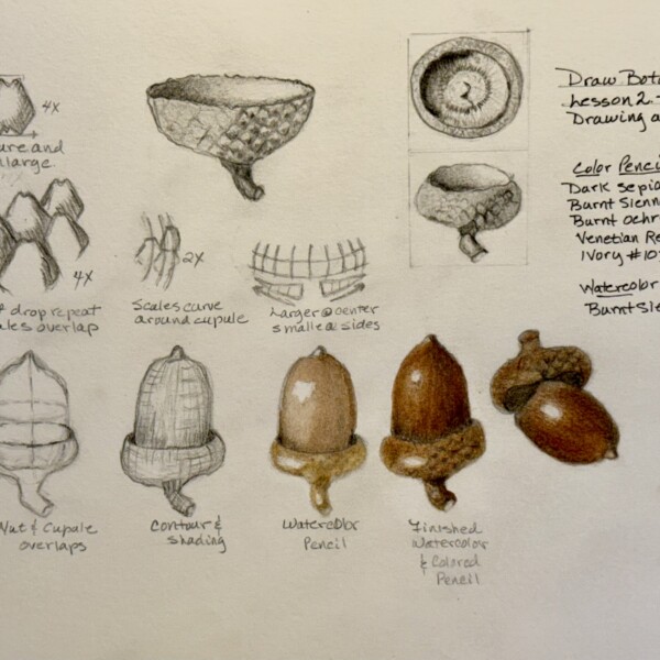
Great page Denise!
-
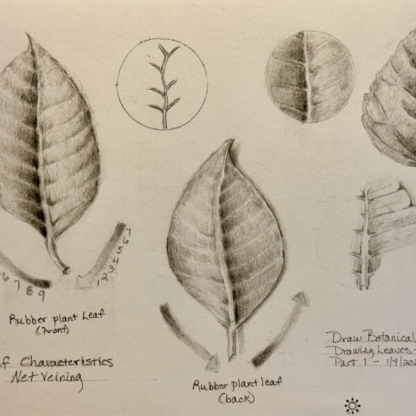
Wonderful progression images and details! Fantastic page Denise!
-
-
Denise Beach added a Photo 1 year, 1 month ago
-
Doug Milne commented on Gale Foster's Photo 1 year, 1 month ago
Great job Gale! The color selection and saturation are really good! Wonderful range of tones and highlight. I might think of toning the highlight down a bit. The whiter the highlight, the more it makes the subject look like it has a shiny surface. I don’t think of sweet potatoes as having a shiny surface and I would just lightly add some i…[Read more]
-
Doug Milne commented on Gale Foster's Photo 1 year, 1 month ago
This is a great page Gale! White flowers are very challenging! You want to be careful not to outline the petals. Remember that the edges of the petals closest to the light source should be fairly light. Of course a big concern is adding form toning and details like folds and creases without making the petal color muddy.
There are often subtle…[Read more] -
Doug Milne commented on Dolores Duran-Cefalu's Photo 1 year, 1 month ago
I love this Dolores! Love the mix of color and black and white! Very striking image!
-
Doug Milne commented on Dolores Duran-Cefalu's Photo 1 year, 1 month ago
Hi Dolores! Great image and composition. I am having a hard time figuring which direction the light is coming from. I would go in and add some shading to clarify that. Think of what might need more form toning in addition to cast shadows. Regardless of the direction of the light source I would add some shading in the well area of the flower on the…[Read more]
-
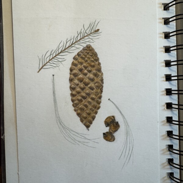
Gale Foster added a Photo 1 year, 1 month ago
-
Wow! The cone segments have so much texture and dimension! Great job! Remember though, the overall cone itself will require the full range of tones from highlight to dark to give it it’s form. The details really stand out, but the cone itself looks flat. By adding the form toning the whole cone will look realistic and take this image to the next level.
-
-
Gale Foster added a Photo 1 year, 1 month ago
-
Good job Gale! The berries have a strong highlight which emphasizes their shiny skin. Generally holly leaves are also very shiny. For drawing future holly leaves, I would leave the white of the paper rather than adding white on top later. It makes for a stronger highlight, which you need here. This image would make a nice holiday card next year.
-
-
Gale Foster added a Photo 1 year, 1 month ago
-
Hi Gale- the cast shadow is positioned perfectly. I would just lighten it a little. The shadow fades as it moves away from the subject. Your color selection is also great! If the pear had a shiny surface, the highlights are okay, but I would expect them to be toned down a little by adding some color to them. I think the leaves have too many…[Read more]
-
-
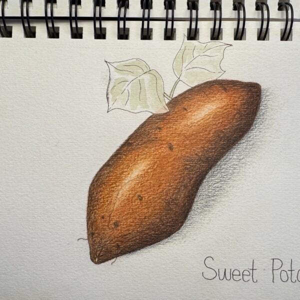
Gale Foster added a Photo 1 year, 1 month ago
-
Great job Gale! The color selection and saturation are really good! Wonderful range of tones and highlight. I might think of toning the highlight down a bit. The whiter the highlight, the more it makes the subject look like it has a shiny surface. I don’t think of sweet potatoes as having a shiny surface and I would just lightly add some i…[Read more]
-
-
Gale Foster commented on Gale Foster's Photo 1 year, 1 month ago
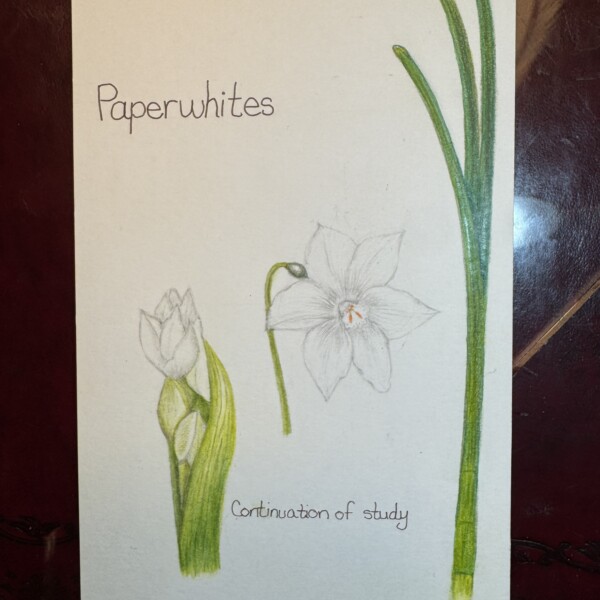
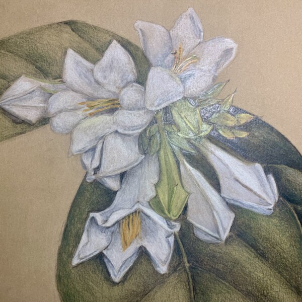
Struggling to capture the white flowers of a paperwhite. My first attempt.
-
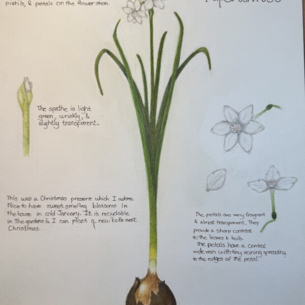
Gale Foster added a Photo 1 year, 1 month ago
-
Struggling to capture the white flowers of a paperwhite. My first attempt.
-
This is a great page Gale! White flowers are very challenging! You want to be careful not to outline the petals. Remember that the edges of the petals closest to the light source should be fairly light. Of course a big concern is adding form toning and details like folds and creases without making the petal color muddy. There are often subtle…[Read more]
-
-
Dolores Duran-Cefalu added 2 Photos 1 year, 1 month ago
-
Hi Dolores! Great image and composition. I am having a hard time figuring which direction the light is coming from. I would go in and add some shading to clarify that. Think of what might need more form toning in addition to cast shadows. Regardless of the direction of the light source I would add some shading in the well area of the flower on the…[Read more]
-
I love this Dolores! Love the mix of color and black and white! Very striking image!
-
-
Sarah Lees commented on Sarah Lees's Photo 1 year, 2 months ago
Many thanks for your feedback!
- Load More
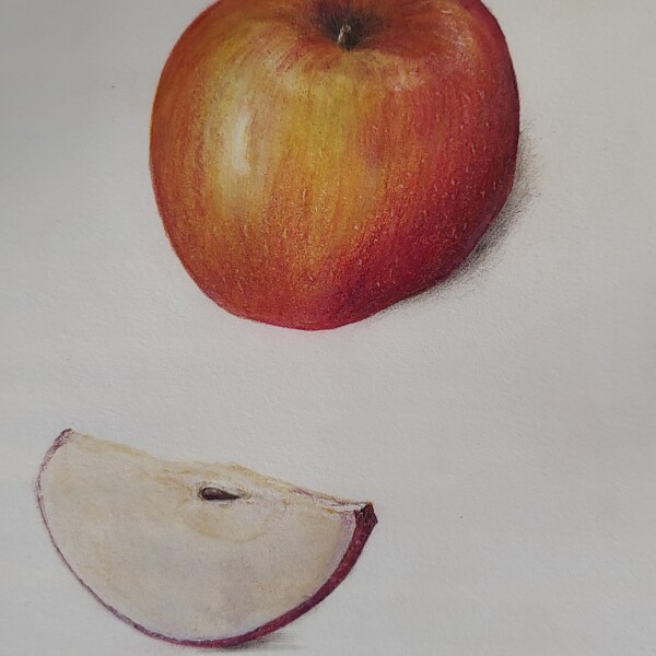


Great job Kellie! The color selection and saturation are wonderful! As is your toning and patterning! The apple has great form and everything came together to make the image very realistic!