Activity
-

Sam McWilliams commented on Peta McDonald's Photo 3 years ago
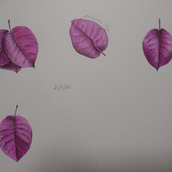
Looking great, Peta! I love the one top right. Yes, give em a rest – they deserve it – they’ve been working so hard. 🙂
-

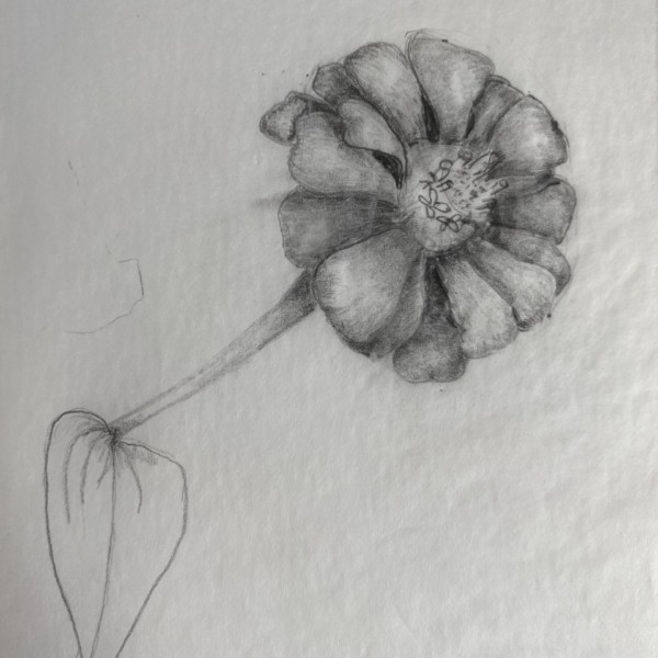
Pam commented on Cathie Hunter's Photo 3 years ago
Cathie, this has a lovely soft ethereal quality to it. You have a nice range of values in the lighter range, and I would like to see you add some more values in the darker range in some areas. I’m having a little bit of trouble figuring out the overlaps in the petals of that main blossom. You might want to go in with a really sharp colored pencil,…[Read more]
-

Maureen Clare Murphy commented on Peta McDonald's Photo 3 years ago
I got an email notification of your reply but it seems to have disappeared from the page. I’m a newcomer to lichens so I don’t know much … yet! The book I mentioned is titled Urban Lichens: A Field Guide for Northeastern North America. I’m not sure if we’d have the same lichens as you. But in any case, I was excited to hear you mention… -
Peta McDonald commented on Peta McDonald's Photo 3 years ago
@pgthompson It was so nice to meet you today in the zoom. Thanks for helping me so much today. I’ve done a couple and am now going to give it a rest because it’s frustrating me. 🙂
-
Peta McDonald added a Photo 3 years ago
-
@pgthompson It was so nice to meet you today in the zoom. Thanks for helping me so much today. I’ve done a couple and am now going to give it a rest because it’s frustrating me. 🙂
-
Looking great, Peta! I love the one top right. Yes, give em a rest – they deserve it – they’ve been working so hard. 🙂
-
Peta, It was great to meet you too! You are doing a really nice job with those bracts. They are tough little buggers. There’s a nursery near me that has a bougainvillea in their greenhouse. I’ll see if they’ll let me take some bracts home with to play with.
-
@pgthompson ooooh, if you ever draw one yourself I’d love to see it pretty please! 🙂
-
you bet!
-
-
Maureen Clare Murphy commented on Peta McDonald's Photo 3 years, 1 month ago
I really like the energy in your drawing — and it was great meeting you in the open studio today!
-
Kyra Saulnier added 2 Photos 3 years, 1 month ago
-
Good practice, Kyra. Good to practice making some embossed marks lighter and different sizes. And “random” like you have lower left. Resist the urge to make neat rows or pairs.
-
Great feather collection. Keep up the good work. Sharpen those pencils when you want to get a really fine, thin feather line out at the edges. Also, like Pam did in the Open Studio demo, you can try holding your pencil far back and toning very softly and patiently to build up soft, smooth layers.
-
Those colors are spot on! Lovely.
-
Kyra, this is a great practice page. It could be fun for you to also try the waxed paper lifting technique on these studies. If you haven’t seen that technique yet, you just take a piece of kitchen waxed paper, and put it on top of an area of your colored pencil drawing where you want to lift out some color and use your embossing tool on top of…[Read more]
-
-
Peta McDonald commented on Peta McDonald's Photo 3 years, 1 month ago
@pgthompson Thank you for your beautiful manner and encouragement on here. I’ve learnt so much in the past month and the feedback has been invaluable. Wendy’s book just arrived in the mail yesterday so I will now move onto the more complex videos (I’ve actually watched a few of them already).
Looking forward to meeting you in the monthly zoom…[Read more]
-
Kyra Saulnier added 2 Photos 3 years, 1 month ago
-
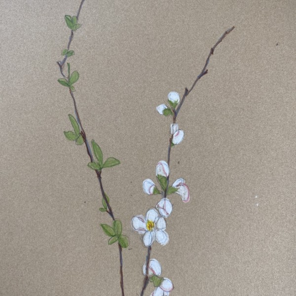
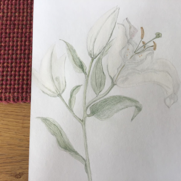
Pretty! The composition is fun to look at. The whites pop so well and the green leaves look great on their own branch aside the white flowers. Nice movement in the branches.
-
Nice. Now you can try using the cad lemon yellow pencil over your green to smooth it out and brighten the green a bit. Clean up the petal edges by smoothly toning with white from the edges in just a bit. Show me the green that’s behind the reproductive parts and in between the white petals. Putting the green behind those repro parts will pop the…[Read more]
-
Nice vibrant whites, Kyra. I like how you are showing how those branches change their angles as they grow at each node. Very nice.
-
-
Kyra Saulnier added 2 Photos 3 years, 1 month ago
-
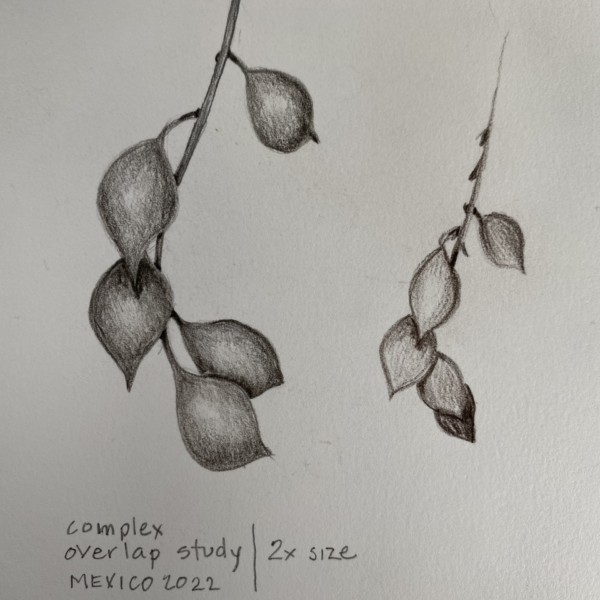
Yep – you are getting the overlap idea. Cool to see you drawing while traveling. 🙂
-
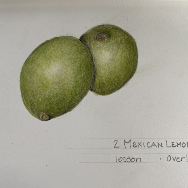
Nice color matching for limes here. Cool writing! Your front highlight can move left a bit. I like the shadow behind the top nub on the rear lime. You can still darken these lime “spheres” a bit more increase the 3D illusion shading. Looking good!
-
-
Kyra Saulnier added a Photo 3 years, 1 month ago
-
Nice! Make sure your stem connects to the centre of the flower. Love the perspective on this one. Shading is looking good as is the believability of those petals curling out from the centre of the flower. Nice super darks in those little “V”s where it counts.
-
Nice Kyra. What a great example of how little bits of darks can make a huge impact.
-
-
-
Cathie, this has a lovely soft ethereal quality to it. You have a nice range of values in the lighter range, and I would like to see you add some more values in the darker range in some areas. I’m having a little bit of trouble figuring out the overlaps in the petals of that main blossom. You might want to go in with a really sharp colored pencil,…[Read more]
-
I like your attention/observation to the pistil and anthers. I also like the movement and the bluey-green you’ve captured.
-
-

Wendy Hollender commented on Helene Duplessis's Photo 3 years, 1 month ago
I think there is a way to address Katy’s comments with some subtle changes. I think when if you were to tone the background slightly in a pale green gray behind the main flowers and leaves the halo will disappear and we will be able to focus more . I would give it a try. Love all these drawings here
-
Pam commented on Peta McDonald's Photo 3 years, 1 month ago
Peta, It’s been so much fun watching you go through these lessons. You are doing such a great job. This is such a fun subject. I love the composition. Those two little seeds are just adorable. There are a few spots where those fold lines are curved instead of straight (that bottom one that rests on top of one half of the pod is an example). You…[Read more]
-
Pam commented on Hélène's Photo 3 years, 1 month ago
Helene, your leaves look great!!!! Great job. (clap clap clap)
-
Peta McDonald commented on Peta McDonald's Photo 3 years, 1 month ago
@pgthompson Fabulous Pam, that is a very useful thing to note. 🙂
I don’t have the leaf any more but tomorrow I’ll go and fold a few leaves and pay attention to that fold. Thanks a lot. -
Pam commented on Helene Duplessis's Photo 3 years, 1 month ago
Really nice Helene. I like those really dark darks where those seeds are. Just lovely.
-
Pam commented on Helene Duplessis's Photo 3 years, 1 month ago
Wow Helene. This is so striking. And I love the style of the composition. So much to look at, and my eye eventually rests at that beautiful large flower at the bottom. I love the little details of the stamen poking out of those top flowers. That faded jungle in the back is great. I would add just a little more of that faded jungle behind that…[Read more]
-
Pam commented on Helene Duplessis's Photo 3 years, 1 month ago
Oh my goodness Helene. This is so cool. What a fantastic subject and beautiful composition. Love it.
-
Pam commented on Peta McDonald's Photo 3 years, 1 month ago
Peta. This is great! And, you nailed what I was just trying to explain about the line at folds/curls being straight and not curved on leaves. See how those fold/curved lines are all straight? You drew them beautifully here. Same thing happens with leaves. Ribbons are such great subjects to study. You did a fantastic job! Yay!
- Load More