Activity
-

Machi added a Photo 3 years, 1 month ago
-
Peta McDonald added a Photo 3 years, 1 month ago
-

Peta, wow. These are great. Your toning is really wonderful, and you have nailed getting 3D form on these spheres. Your handling of that highlight is just gorgeous. I really love how you are keeping those cast shadows quiet, and the way you are getting really dark where the sphere meets the paper, and then fading out to nothing. I might consider…[Read more]
-
Aha… that’s really helpful about both the cast shadow (which I wasn’t completely happy with) and the transition between the reflected highlight and core shadow. I’ll practice that on the next one because I’m too scared to touch these again. 🙂 Thanks so much for your help.
-

Yes. Peta. yes. 🙂
-
-
Iulia Popescu commented on Iulia Popescu's Photo 3 years, 1 month ago
Thanks Amelie, happy you like it! Your drawings looks great!!
-
Iulia Popescu commented on Iulia Popescu's Photo 3 years, 1 month ago
Hi Peta! The little white spots on the apple I got them in the early stages using an embossing tool( mine was for nail decoration 🙂). See for inspiration Botanical Basics Lesson 23, Apple pattern… By the way, I love how realistic& detailed you made your branches look!
-
Peta McDonald commented on Peta McDonald's Photo 3 years, 1 month ago
Thank you Doug. I have just ordered some hot press paper in the hope it will be easier.
I started the course before I actually had the right equipment, so am making do with what was lying around. 🙂
-
Linda Proctor commented on Linda Proctor's Photo 3 years, 1 month ago
Thank you Doug. I knew the reflective highlight was wrong. It made the sphere look like a Whoopie Pie. Thank you for all of the encouragement. This is such a nice positive group.
-
Doug Milne commented on Linda Proctor's Photo 3 years, 1 month ago
You are starting to get good form on your sphere Linda! There is also good transition of tones! The lighter area looks very similar in tone and part of the problem is I don’t see a true highlight. Establishing a highlight and making sure you have a nice, light transition away from it will help a lot! Reflected highlights are really tricky!!! Y…[Read more]
-
Peta McDonald commented on Peta McDonald's Photo 3 years, 1 month ago
Thank you for your feedback Doug. I made a mistake, it’s an F pencil. And I might have cheated and brought in a B for the right hand side of the branch at the end there. 🙂
Thanks for letting me know the pencils you use. I’ll look out for a set of Faber-castelle ones.
-
Linda Proctor commented on Linda Proctor's Photo 3 years, 1 month ago
Doug, thank you so much! I see what you are saying. About the branch and the cylinder. Lol. I was thrilled it looks like a branch!
-
Linda Proctor commented on Linda Proctor's Photo 3 years, 1 month ago
Doug. Thank you so much for the comments.
-
Linda Proctor commented on Linda Proctor's Photo 3 years, 1 month ago
Doug, thank you for the feedback. The glare did not help but definitely 8 and 9 are too close. Lol 7 too. I have never drawn before so the concepts are new to me. I will practice practice practice.
-
Doug Milne commented on Linda Proctor's Photo 3 years, 1 month ago
Hi Linda- your tone bar looks good! 7, 8 and 9 look a little close in tone, but there is a glare on a couple of them and that might be the reason I think that.
-
Doug Milne commented on Linda Proctor's Photo 3 years, 1 month ago
This looks great Linda!!! A couple of areas I would revisit. As I mentioned on your cylinder post, the highlight is too much of a stripe and the areas flanking it should be lightened. There is not enough range of tones in the area too the right of the highlight as it moves toward the shadowed side of the branch. Actually the top of the branch…[Read more]
-
Doug Milne commented on Linda Proctor's Photo 3 years, 1 month ago
These look good Linda! I would work a little more on the range of tones. There is too much of a jump from the darkest area on the right edge to the tone to the left of it. There should not be any stripes of tone – one tone should smoothly transition to the next tone. Same with the highlight. It is too much of a stripe which means the tones…[Read more]
-
Doug Milne commented on Sam McWilliams's Photo 3 years, 1 month ago
Wow! Wow! Wow! Sam!!! Those veins!!! Amazing!!!!
-
Doug Milne commented on Liz Paganelli's Photo 3 years, 1 month ago
Really nice Liz! Colors are beautiful! And those roots!!! What I find missing is a sense of form on many of the plant’s parts. I can’t tell where your light source is because you are missing the toning and highlights that would establish that. Adding that would also achieve the missing form I mentioned above. I see the dark recesses in the clu…[Read more]
-
Doug Milne commented on Peta McDonald's Photo 3 years, 1 month ago
Great toning exercises Peta! Beautiful transitions!!! You have mastered toning!!! I am surprised you can achieve the darks with an H pencil! I don’t know how hard it was for you, but a HB or B graphite pencil would get you the darks easier and quicker. After using several different brands I prefer the Faber-Castelle graphite pencils. The same b…[Read more]
-
Doug Milne commented on Peta McDonald's Photo 3 years, 1 month ago
Fantastic Peta! Beautiful toning even on what looks like textured paper! Great range of tones and highlights which is achieving wonderful form! Great attention to the details!!!
-
Hélène commented on Hélène's Photo 3 years, 1 month ago
Thank you Peta. Yes , I learned from this website and lately from the ´Winter leaves ´ workshop. It was very helpful. Hélène
-
Liz Paganelli added a Photo 3 years, 1 month ago
-
Really nice Liz! Colors are beautiful! And those roots!!! What I find missing is a sense of form on many of the plant’s parts. I can’t tell where your light source is because you are missing the toning and highlights that would establish that. Adding that would also achieve the missing form I mentioned above. I see the dark recesses in the clu…[Read more]
-
Wow, Liz. All those petals! Such a challenging subject, and you did a really nice job with it. You have a really great drawing skills, and it’s impressive how you are able to get such beautifully rendered and believable details. You are showing some really nice 3 dimensional form on those leaves and stems. I want to see more 3 dimensional overall.…[Read more]
-
Thanks so much for the feedback, I really appreciate it. Yes I do understand what you’re both talking about, I will be adding more darks and try to get more of a 3d quality.
-
Beautiful Liz! Wow, so much work. 🙂 Those roots! And colours.
-
- Load More
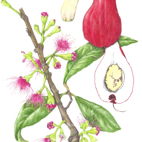

Flowers from Kauai, and fruits from the Big Island
Lovely!
I LOVE this Machi! All of those thin little stamen are just wonderful. Your leaves have a lovely lyrical quality, and they have a lot of form and dimension to them. You nailed the way that branch bends and curves as it grows each year, and I really like the variety of color that you are getting along that branch. It’s absolutely wonderful just as…[Read more]
Ooh so great that you got the fruit when you went home! Machi, you are really pumping out the awesome drawings! Ah- the red fruit may have a kind of double highlight like on a pear – a highlight that’s on the lower shape of the fruit that’s like a sphere, and a longer highlight on the top, as on the cylinder or cone that sits on top of the sphere.…[Read more]