Activity
-

Rachel Powell added a Photo 3 months, 1 week ago
-
Margaret Hahn commented on Margaret Hahn's Photo 3 months, 1 week ago
Laurie – sorry I lost track of this question – I used first Pablo golden ochre then Faber Castelle 183 and lastly Luminescence 034 for the shading. FC 105 and 107 were the base colors.
-
Colleen Kersgard added a Photo 3 months, 1 week ago
-
Colleen Kersgard added a Photo 3 months, 1 week ago
-
Rachel Powell commented on Rachel Powell's Photo 3 months, 1 week ago
Just started Botanical Basics. I had to use whatever materials I had in the house while I wait for my hot pressed watercolour paper, Polychromos and Albrecht Dürer pencils to arrive.
-
Rachel Powell added a Photo 3 months, 1 week ago
-
Just started Botanical Basics. I had to use whatever materials I had in the house while I wait for my hot pressed watercolour paper, Polychromos and Albrecht Dürer pencils to arrive.
-
Hi Rachel! Welcome to the ArtFeed! Both spheres are looking pretty good especially with the materials you had to work with. The yellow tomato has nice form and the form on the red one would improve a lot with the addition of a highlight.
-
-
Beatrice Skokan added a Photo 3 months, 1 week ago
-
Anna Horst commented on Anna Horst's Photo 3 months, 3 weeks ago
Thank you for the feedback and suggestions.
-
Doug Milne commented on Hélène Chiasson's Photo 3 months, 3 weeks ago
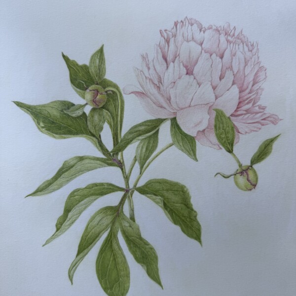
Hi Helene- I got your message. The only thing you might do is add some more darks to the “v” area of the overlapping petals. Thinking the entire flower as a sphere you could add some toning to the right side and a little on the left side edge. But not much at all for anything I have said above. You don’t want to lose the delicate color you have…[Read more]
-
Doug Milne commented on Anna Horst's Photo 3 months, 3 weeks ago
Welcome to the ArtFeed Anna! The colors are wonderful and I especially like the texture you have captured on the second eggplant from the left. I am confused by the white line on the right edge of that eggplant. If it is to be a reflected light then it is too white and too controlled. You could use an ivory pencil to blend the white line into the…[Read more]
-
Rachel Trachten commented on Rachel Trachten's Photo 3 months, 3 weeks ago
Thanks so much Doug. It’s great to get feedback!
-
Anna Horst added a Photo 3 months, 3 weeks ago
-
Welcome to the ArtFeed Anna! The colors are wonderful and I especially like the texture you have captured on the second eggplant from the left. I am confused by the white line on the right edge of that eggplant. If it is to be a reflected light then it is too white and too controlled. You could use an ivory pencil to blend the white line into the…[Read more]
-
Thank you for the feedback and suggestions.
-
-
Doug Milne commented on Machi's Photo 3 months, 3 weeks ago
I am glad you got to go to Soain again Machi! I see what you are saying about the bottom left flower, but I don’t if it would have bothered me if you had not said anything!
-
Doug Milne commented on Rachel Trachten's Photo 3 months, 3 weeks ago
Wonderful color selection Rachel! You could apply more saturation especially to the cut view of the apple and also the leaves. So that the stems have form to them (elongated cylinders) be sure to have a range of tones from highlights to shadows so they appear to be rounded rather than flat. The top leaf looks pretty good. Leaves vary so much, but…[Read more]
-
Doug Milne commented on Rita Haft's Photo 3 months, 3 weeks ago
Great color selection and wonderful textures Rita!
-
Doug Milne commented on Hélène Chiasson's Photo 3 months, 3 weeks ago
So beautiful Helene! The leaves and buds are so well done and they really compliment the subtler, softer flower. Superb!
-
Doug Milne commented on Hélène Chiasson's Photo 3 months, 3 weeks ago
I can see why you found it daunting Helene! Could you punch up the darks on the leaves a little? Great composition!
-
Doug Milne commented on Hélène Chiasson's Photo 3 months, 3 weeks ago
Gorgeous Helene! The flower in particular is so crisp and realistic! Terrific!
-
Hélène Chiasson added a Photo 3 months, 3 weeks ago
-
So beautiful Helene! The leaves and buds are so well done and they really compliment the subtler, softer flower. Superb!
-
Hi Helene- I got your message. The only thing you might do is add some more darks to the “v” area of the overlapping petals. Thinking the entire flower as a sphere you could add some toning to the right side and a little on the left side edge. But not much at all for anything I have said above. You don’t want to lose the delicate color you have…[Read more]
-
-
Rita Haft added a Photo 4 months ago
-
Great color selection and wonderful textures Rita!
-
- Load More


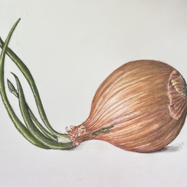
Nice job Rachel! Good range of tones!