Activity
-

Denise Harris added a Photo 1 year, 3 months ago
-
Doug Milne commented on Rita Haft's Photo 1 year, 4 months ago
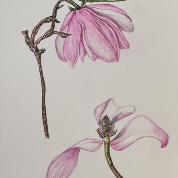
Great Rita! You achieve such wonderful deep, rich colors on so many of your drawings and it is nice to also see how well you have handled these softer colors. Love the movement of the bottom view!
-
Doug Milne commented on Hélène Chiasson's Photo 1 year, 4 months ago
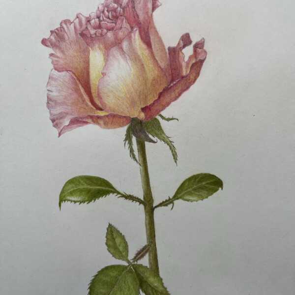
Wow Helene! Absolutely gorgeous! It has so much going for it – the colors, the highlights, the delicacy, the toning! Everything is working! Even the stem and leaves are beautifully done and visually support the flower and let it be the star.
-
Rita Haft added a Photo 1 year, 4 months ago
-
Great Rita! You achieve such wonderful deep, rich colors on so many of your drawings and it is nice to also see how well you have handled these softer colors. Love the movement of the bottom view!
-
-
Hélène Chiasson added a Photo 1 year, 4 months ago
-
Wow Helene! Absolutely gorgeous! It has so much going for it – the colors, the highlights, the delicacy, the toning! Everything is working! Even the stem and leaves are beautifully done and visually support the flower and let it be the star.
-
Thank you so much Doug!
-
-
Dipa Suri added 2 Photos 1 year, 4 months ago
-
Faye Forman commented on Faye Forman's Photo 1 year, 4 months ago
@dougmilne thank you Doug! Let me try again and apply your suggestions with the B pencil
-
Dolores Duran-Cefalu added 3 Photos 1 year, 4 months ago
-
Rita Haft added a Photo 1 year, 4 months ago
-
Denise Harris added a Photo 1 year, 4 months ago
-
Doug Milne commented on Maureen Griffin's Photo 1 year, 4 months ago
Nice study page Maureen! Your color selection and saturation is really good! I would revisit the interior areas of the caps. The dark top ring on the side view should not be dark all the way around. Where the light hits it it should be light and be darker furthest from the light source. The left side of the interior of the cup, where it is…[Read more]
-
Doug Milne commented on Rita Haft's Photo 1 year, 4 months ago
Wow Rita! The exterior view of this eggplant is gorgeous! You have captured the colors and skin texture beautifully! I am thrown by the cut view. Personally I don’t think there is enough going on visually to include it. I would matte it to not include the cut view. The exterior view is definitely frame worthy!!!
-
Doug Milne commented on Faye Forman's Photo 1 year, 4 months ago
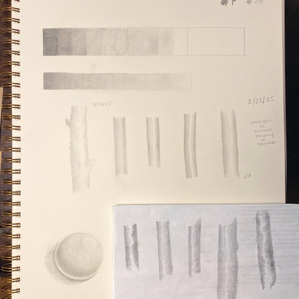
You are off to a good start Faye. Some areas need a revisit. With the tone blocks the mid-range blocks are too similar. Some of the blocks that should be light are darker than the darker blocks. You should be able to see that each block is different as they progress from light to dark (or dark to light). Using a B pencil which allows you to get…[Read more]
-
Maureen Griffin added a Photo 1 year, 5 months ago
-
Nice study page Maureen! Your color selection and saturation is really good! I would revisit the interior areas of the caps. The dark top ring on the side view should not be dark all the way around. Where the light hits it it should be light and be darker furthest from the light source. The left side of the interior of the cup, where it is…[Read more]
-
-
Rita Haft added a Photo 1 year, 5 months ago
-
Wow Rita! The exterior view of this eggplant is gorgeous! You have captured the colors and skin texture beautifully! I am thrown by the cut view. Personally I don’t think there is enough going on visually to include it. I would matte it to not include the cut view. The exterior view is definitely frame worthy!!!
-
-
Faye Forman added a Photo 1 year, 5 months ago
-
You are off to a good start Faye. Some areas need a revisit. With the tone blocks the mid-range blocks are too similar. Some of the blocks that should be light are darker than the darker blocks. You should be able to see that each block is different as they progress from light to dark (or dark to light). Using a B pencil which allows you to get…[Read more]
-
@dougmilne thank you Doug! Let me try again and apply your suggestions with the B pencil
-
-
Faye Forman commented on Katie Helmrick's Photo 1 year, 5 months ago
Absolutely beautiful
-
Doug Milne commented on Maureen Griffin's Photo 1 year, 5 months ago
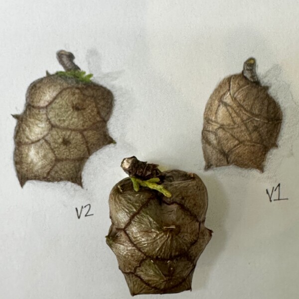
Yes Maureen! You did a great job capturing the colors and this is a much more interesting view than the original. See how the highlights on the actual subject really help emphasize the curves and form of the individual sections.
-
Doug Milne commented on Denise Harris's Photo 1 year, 5 months ago
You did a great job capturing the frost Denise and this was a great subject for the Kraft paper! The one thing I am struggling with is the form toning. The flower is missing it’s full form impact because there is no light side or dark side. It will be tricky because you don’t want to eliminate where the frost is on the right side. I would add som…[Read more]
-
Maureen Griffin added a Photo 1 year, 5 months ago
-
Yes Maureen! You did a great job capturing the colors and this is a much more interesting view than the original. See how the highlights on the actual subject really help emphasize the curves and form of the individual sections.
-
- Load More
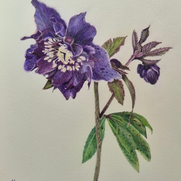



Bravo Denise! This drawing has so much going for it! The composition and view, the colors and details to name a few. So many hellebores like to hang their heads and this is a great view showing off the intricacy of the center details! Love the mix of purples you achieved! The stem and leaves are equally as good! Gorgeous!