Activity
-

-

Pam commented on Karen Minden's Photo 3 years, 3 months ago
Definitely!
-
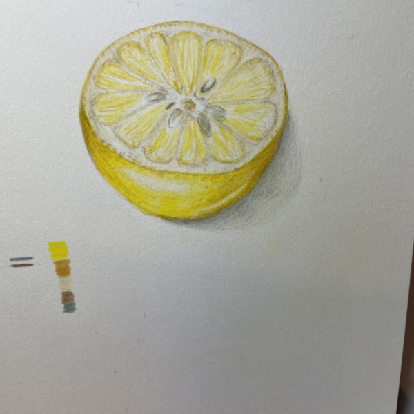
Karen Minden commented on Karen Minden's Photo 3 years, 3 months ago
Thanks for encouraging me to take the leap and cut the lemon!
-
Karen Minden commented on Karen Minden's Photo 3 years, 3 months ago
Yes that streak is my attempt at the elusive and mysterious thing called a reflective highlight. Will follow up with your suggestions. The seeds are actually Polychromos earth green and some Derwent wheat. will try to warm them up
-
Karen Minden commented on Karen Minden's Photo 3 years, 3 months ago
I will try a new drawing. I think I am finally getting better at this.
-
Karen Minden commented on Karen Minden's Photo 3 years, 3 months ago
Thank you both so much for the help with this very confusing bulb. It has sprouted three times, and this time, there are only leaves and no stalk. You can see the stump of the last stock. I had to cut the very tall droopy stock with blooms and put it in a vase. The inside of the stalk is bright red!!!! Who knew?? It is now in the fridge and I… -
Janegold commented on Janegold's Photo 3 years, 3 months ago
Thanks, Katy. I am adding a couple of leaves and a bit of color to the toning. The paper is in one of DB’s spiral books, Legion. Must be the photo. I’ll post the new one when I get it done.
-
Pam commented on Karen Minden's Photo 3 years, 3 months ago
Hi Karen, Vern gave you awesome advice. I did some quick and dirty drawing on top of your drawing using photoshop to give you an example of how putting in just a few more darks can sharpen some things up and push things in back behind. I only did a little bit around the leaves. I’m going to try to post the image here and hope that it shows up… -
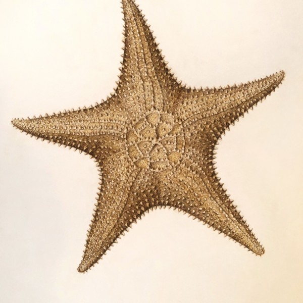
Pam commented on Jill Amadei's Photo 3 years, 3 months ago
Wow Jill. Gorgeous. I really like the subtle diffences in shadows where the triangles meet, showing how the light is coming from the upper left – skillfully done. I wonder whether you might consider just adding a bit of some darker and maybe cooler toning just a little on the right side of the starfish just to give it some more form as a whole?…[Read more]
-
Pam commented on Karen Minden's Photo 3 years, 3 months ago
It’s really looking great Karen! I agree with Vern about that little streak of light. I would fill that in just a little bit. The seeds look just a touch on the gray side to me. You may want to consider warming them up just a bit – may with some bistre and some ivory?
-
Pam commented on Karen Minden's Photo 3 years, 3 months ago
Karen, good job. You are definitely on the right track, and have the right idea. Darkening the right side has given this lemon some good 3D form. It looks like the surface of your paper has maybe started to deteriorate. I’ve been there, and it can be frustrating, but I think that what you might want to do now is take what you’ve learned and draw…[Read more]
-
-
Hi Karen, Vern gave you awesome advice. I did some quick and dirty drawing on top of your drawing using photoshop to give you an example of how putting in just a few more darks can sharpen some things up and push things in back behind. I only did a little bit around the leaves. I’m going to try to post the image here and hope that it shows up…
-
Thank you both so much for the help with this very confusing bulb. It has sprouted three times, and this time, there are only leaves and no stalk. You can see the stump of the last stock. I had to cut the very tall droopy stock with blooms and put it in a vase. The inside of the stalk is bright red!!!! Who knew?? It is now in the fridge and I…
-
-
-
Karen, good job. You are definitely on the right track, and have the right idea. Darkening the right side has given this lemon some good 3D form. It looks like the surface of your paper has maybe started to deteriorate. I’ve been there, and it can be frustrating, but I think that what you might want to do now is take what you’ve learned and draw…[Read more]
-
I will try a new drawing. I think I am finally getting better at this.
-
Definitely!
-

Sometimes I use a little purple in my shadow side on lemons too. Try it if you dare!
-
-
-
It’s really looking great Karen! I agree with Vern about that little streak of light. I would fill that in just a little bit. The seeds look just a touch on the gray side to me. You may want to consider warming them up just a bit – may with some bistre and some ivory?
-
Yes that streak is my attempt at the elusive and mysterious thing called a reflective highlight. Will follow up with your suggestions. The seeds are actually Polychromos earth green and some Derwent wheat. will try to warm them up
-
Good job Karen – these are tricky! I have complete confidence you will keep growing with the great feedback above.
-
-
sweiz commented on Vern Fannin's Photo 3 years, 3 months ago
Vern, I love the utter simplicity of this piece. You invite my vision to see beauty where I might just overlook. Thank you
-

Jill Amadei commented on Jill Amadei's Photo 3 years, 3 months ago
The starfish is approximately 11” wide
-
Jill Amadei added a Photo 3 years, 3 months ago
-
The starfish is approximately 11” wide
-
Wow Jill. Gorgeous. I really like the subtle diffences in shadows where the triangles meet, showing how the light is coming from the upper left – skillfully done. I wonder whether you might consider just adding a bit of some darker and maybe cooler toning just a little on the right side of the starfish just to give it some more form as a whole?…[Read more]
-
11 inches?!?! Wow. This is such a good time looking at this gem. Yes, time to play a tad with those warm, cool color tensions. Bring in a touch of cools on the shadow side. You should really make a run of high quality prints of these, Jill, to sell after the original sells.
-
-
Pam commented on Pam's Photo 3 years, 3 months ago
Margaret, this was just in watercolor so far.
-
Doug Milne commented on Stephanie Harold's Photo 3 years, 3 months ago
Hi Stephanie- I like a mix of mediums on a page! However, it doesn’t always work. I use it when there are details that will not read as strongly as I want if those particular details were done in color. Also when parts would compete too much with the areas that are the focal point. Personally I would add color to the areas you left m…[Read more]
-
Doug Milne commented on Janegold's Photo 3 years, 3 months ago
Wow Jane!!! This is spectacular! I especially love the center of the cut open view! Amazing!!!!
- Load More


Great composition Rita! I think you need some toning on the white flowers to give the flowers some depth and delineation. For example, the flower on the top right. After looking at it for a while I know that the flower face is suppose to be facing left (with the petals curving in towards the center), but it reads to me that it is facing right (and…[Read more]