Activity
-

Maureen Doram commented on Maureen Doram's Photo 3 years, 11 months ago
Hi folks,
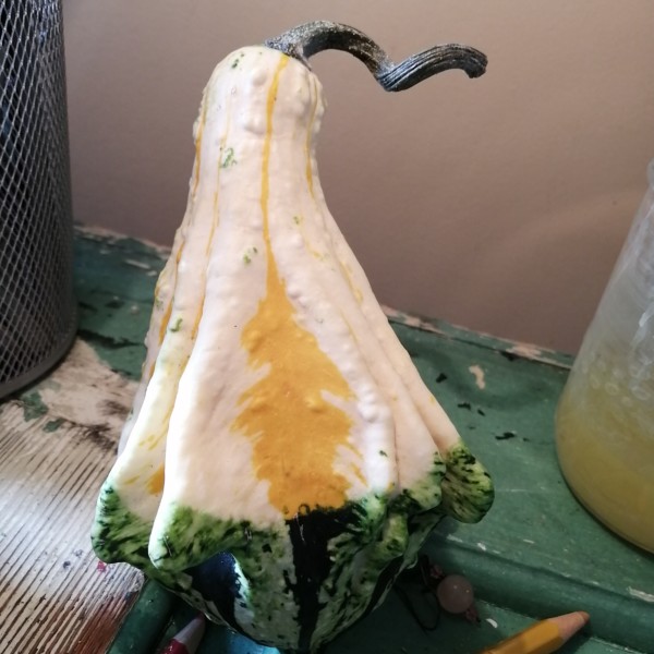
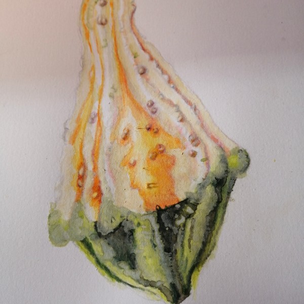
Hoping to get some tips on this gourd, it’s really fun and I am using some dry brush technique in the green area. Because it’s so light in color wondering how to render shape as shown in photo. -
-
Hi folks, Hoping to get some tips on this gourd, it’s really fun and I am using some dry brush technique in the green area. Because it’s so light in color wondering how to render shape as shown in photo.
-
Hi Maureen- this is looking great! I think I would first try earth green to add some toning to the shaded side on the white top part of the gourd. Check out Jill’s recent citrus drawings (she has the sweet gum drawing next to your photo post). Her citrus are both very textured and she captured the form toning so well in addition to retaining b…[Read more]
-
@doug-milne Thanks Doug, good ideas! I will repost in about a week when I’m back from the west coast.
-

Wonderful gourd!
-
-
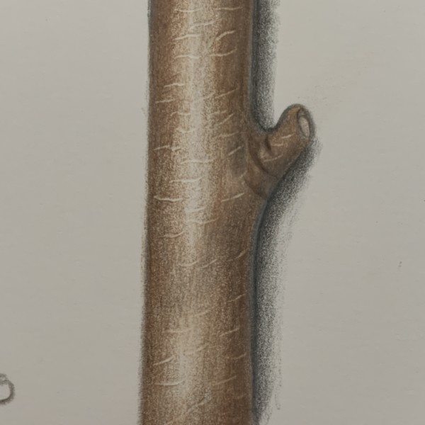
CcLane added a Photo 3 years, 11 months ago
-
Hi Cc, There is some nice smooth toning on this! Good job! I’m feeling the cylinder. I also like that you are adding some texture and experimenting with embossing. But be careful when you are adding texture to an object, that the lines follow the curve of that object. This helps define the shape.
-
Thanks Katy.I must admit I was very excited to see someone had actually commented on a piece of my work! First time I have put any up online as I am a beginner. Thanks for your suggestions.
-
-
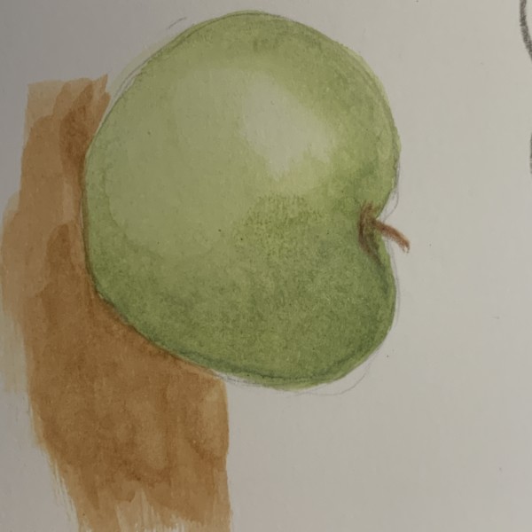
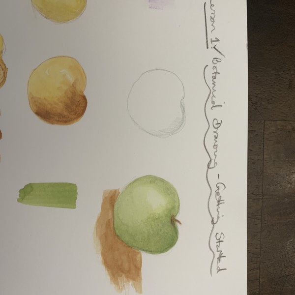
CcLane added 2 Photos 3 years, 11 months ago
-
Good start on these! Especially the green apple. You have chosen a good base color. And are showing an understanding of light on form. You’ve got the highlight and the start of the shadows. I feel it as a sphere. Now comes the fun of bringing in the colored pencils! Think about the core shadow and the reflective light as you do. Be careful of a t…[Read more]
-
Hi Vern. thank you for the encouragement and suggestions:) Much appreciated.
-
Hi Katy:) Thanks once again! Really see what you mean about cast shadow. Will try to do this. Think I need to develop more patience with coloured pencils.
-
-
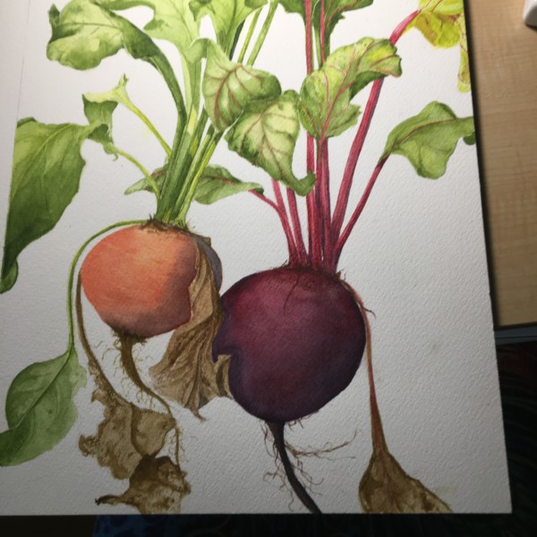
Beverley Brand added a Photo 3 years, 11 months ago
-
Great drawing Beverley!!!!! Love the composition and how the leaves run off the page!
-
Thank you all. Yes, the beets are an unusual color. They are from my garden. The yellow ones are really yummy. All of the vegetables in my Portfolio are from my garden.
-
-
Doug Milne commented on Cassandra Cyr's Photo 3 years, 11 months ago
Great page Cassandra!!! A wonderful record of the month to look back on and compare to! So much more interesting to have the fun visual record to accompany the text! I can just visualize the slime trail of that slug!
-
Cassandra Cyr commented on Cassandra Cyr's Photo 3 years, 11 months ago
SO helpful!!! Thanks a lot, I will make those changes 😀 -
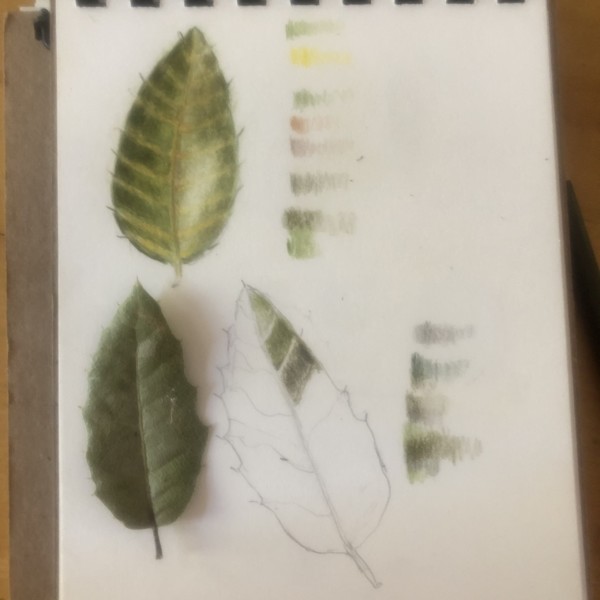
Doug Milne commented on Elizabeth Dyer's Photo 3 years, 11 months ago
You are off to a good start Elizabeth! The secondary veins are too pronounced in color and width. I can hardly see those veins (especially on the left side) in the photo. You can also see in the photo that there is some highlight along the left edge and the darkest area on the left side of the leaf is along the main vein. I would also slightly…[Read more]
-
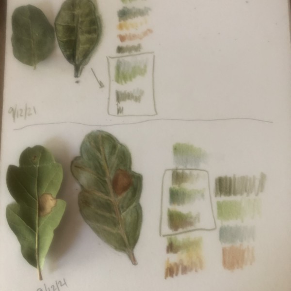
Doug Milne commented on Elizabeth Dyer's Photo 3 years, 11 months ago
The top leaf is beautiful Elizabeth! The bottom leaf could use more dark toning along the left side of the main vein as you did on the leaf above. I think it would also benefit from adding the highlights to the right side that I see in the photo. Maybe the leaf did not start out cupping up as it appears in the photo. If that is the nature of the…[Read more]
-
Doug Milne commented on Elizabeth Dyer's Photo 3 years, 11 months ago
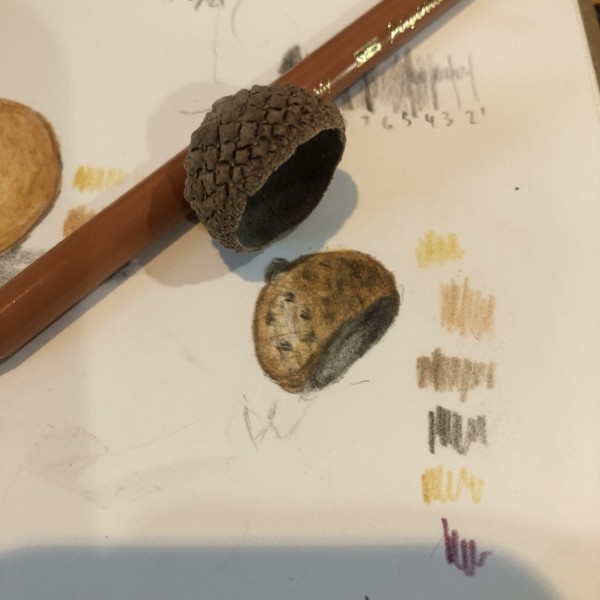
Really nice toning Elizabeth! I see the faint pattern cross marks on your drawing, but what stands out to me are the polka dots. The grid of the acorn cap is very evident on the actual subject, but I don’t see it on your drawing.
-
Doug Milne commented on Maureen Doram's Photo 3 years, 11 months ago
Great Maureen! Those crinkly leaves are so good!
-
Doug Milne commented on Cassandra Cyr's Photo 3 years, 11 months ago
Beautiful apple Cassandra! The colors, the skin details and the well area are so well done!!!! There are a couple of areas I would revisit. First is the highlight – it needs to come down a little and also be a little bigger. Apples usually have a nice shiny skin and the highlight helps convey that. Also be careful not to outline your subject. I…[Read more]
-
Doug Milne commented on Liz Paganelli's Photo 3 years, 11 months ago
Adding the dark toning to the leaves helped promote the flower Liz. Even though I see different colors on the flower petals it has a monotone appearance to me. I would play up some of the darks, but what I think it needs most of all is to enhance some of the highlights (make them more noticeable).
-
-
Hi Cassandra, Another fun page! Keep them coming! They make me smile! Such beautiful observations. And so skillfully rendered and composed It makes me want to go out and sketch. Have you read any of John Muir Laws books? He goes in great detail about keeping a nature journal. This is a page he would really love!
-
Thanks so much!! Yes, I LOVE his books! I found them last year and this year decided I wanted my illustrations to be a little more polished and realistic so found this website. They are a great pair and the nature journal is a fun low-stakes way for me to practice.
-
I agree! Draw Botanical and Laws’s nature journal are a good combo. I learn a lot from both.
-
-
Fanny Bischoff added a Photo 3 years, 11 months ago
-
Hi Fanny, Ahh, the challenge of the white and/or light tinted flower! Using toned paper is a good choice. I think the gray as a grisaille works for the white flowers but I would add some more colors as you work out the shading. On the yellow tinted flowers, I would have chosen a slightly warmer grisaille. I also would like to see some darker darks…[Read more]
-
Thank you Katy for your comment! After taking some time off this drawing I agree it lacks depth. I thought I was about done, but now I see there is a lot of little improvements needed to finish it!
-
-
-
Great page Cassandra!!! A wonderful record of the month to look back on and compare to! So much more interesting to have the fun visual record to accompany the text! I can just visualize the slime trail of that slug!
-

I’m joining the fan club, here – what a great page.
-
-
Elizabeth Dyer commented on Elizabeth Dyer's Photo 3 years, 11 months ago
TY!
-
Elizabeth Dyer added 2 Photos 3 years, 11 months ago
-
The top leaf is beautiful Elizabeth! The bottom leaf could use more dark toning along the left side of the main vein as you did on the leaf above. I think it would also benefit from adding the highlights to the right side that I see in the photo. Maybe the leaf did not start out cupping up as it appears in the photo. If that is the nature of the…[Read more]
-
You are off to a good start Elizabeth! The secondary veins are too pronounced in color and width. I can hardly see those veins (especially on the left side) in the photo. You can also see in the photo that there is some highlight along the left edge and the darkest area on the left side of the leaf is along the main vein. I would also slightly…[Read more]
-
-
Elizabeth Dyer added a Photo 3 years, 11 months ago
-
Really nice toning Elizabeth! I see the faint pattern cross marks on your drawing, but what stands out to me are the polka dots. The grid of the acorn cap is very evident on the actual subject, but I don’t see it on your drawing.
-
-
Maureen Doram added a Photo 3 years, 11 months ago
-
Great Maureen! Those crinkly leaves are so good!
-
Love West Coast Seeds :)I love the glow and hues and absolutely autumnal glow of this drawing. So warm. Cucurbitaceae
-
- Load More