Activity
-

Doug Milne commented on Liz Paganelli's Photo 3 years, 11 months ago
Adding the dark toning to the leaves helped promote the flower Liz. Even though I see different colors on the flower petals it has a monotone appearance to me. I would play up some of the darks, but what I think it needs most of all is to enhance some of the highlights (make them more noticeable).
-
-
Hi Cassandra, Another fun page! Keep them coming! They make me smile! Such beautiful observations. And so skillfully rendered and composed It makes me want to go out and sketch. Have you read any of John Muir Laws books? He goes in great detail about keeping a nature journal. This is a page he would really love!
-
Thanks so much!! Yes, I LOVE his books! I found them last year and this year decided I wanted my illustrations to be a little more polished and realistic so found this website. They are a great pair and the nature journal is a fun low-stakes way for me to practice.
-
I agree! Draw Botanical and Laws’s nature journal are a good combo. I learn a lot from both.
-
-
Fanny Bischoff added a Photo 3 years, 11 months ago
-
Hi Fanny, Ahh, the challenge of the white and/or light tinted flower! Using toned paper is a good choice. I think the gray as a grisaille works for the white flowers but I would add some more colors as you work out the shading. On the yellow tinted flowers, I would have chosen a slightly warmer grisaille. I also would like to see some darker darks…[Read more]
-
Thank you Katy for your comment! After taking some time off this drawing I agree it lacks depth. I thought I was about done, but now I see there is a lot of little improvements needed to finish it!
-
-
-
Great page Cassandra!!! A wonderful record of the month to look back on and compare to! So much more interesting to have the fun visual record to accompany the text! I can just visualize the slime trail of that slug!
-

I’m joining the fan club, here – what a great page.
-
-
Elizabeth Dyer commented on Elizabeth Dyer's Photo 3 years, 11 months ago
TY!
-
Elizabeth Dyer added 2 Photos 3 years, 11 months ago
-
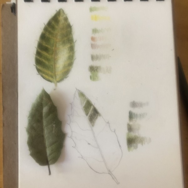
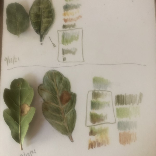
The top leaf is beautiful Elizabeth! The bottom leaf could use more dark toning along the left side of the main vein as you did on the leaf above. I think it would also benefit from adding the highlights to the right side that I see in the photo. Maybe the leaf did not start out cupping up as it appears in the photo. If that is the nature of the…[Read more]
-
You are off to a good start Elizabeth! The secondary veins are too pronounced in color and width. I can hardly see those veins (especially on the left side) in the photo. You can also see in the photo that there is some highlight along the left edge and the darkest area on the left side of the leaf is along the main vein. I would also slightly…[Read more]
-
-
Elizabeth Dyer added a Photo 3 years, 11 months ago
-
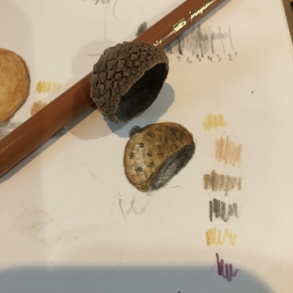
Really nice toning Elizabeth! I see the faint pattern cross marks on your drawing, but what stands out to me are the polka dots. The grid of the acorn cap is very evident on the actual subject, but I don’t see it on your drawing.
-
-
Maureen Doram added a Photo 3 years, 11 months ago
-
Great Maureen! Those crinkly leaves are so good!
-
Love West Coast Seeds :)I love the glow and hues and absolutely autumnal glow of this drawing. So warm. Cucurbitaceae
-
-
-
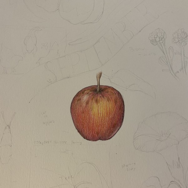
Beautiful apple Cassandra! The colors, the skin details and the well area are so well done!!!! There are a couple of areas I would revisit. First is the highlight – it needs to come down a little and also be a little bigger. Apples usually have a nice shiny skin and the highlight helps convey that. Also be careful not to outline your subject. I…[Read more]
-
SO helpful!!! Thanks a lot, I will make those changes 😀
-
-
Karen Wright commented on Karen Wright's Photo 3 years, 11 months ago
Thanks…I’ve pulled the eraser out :-).
-
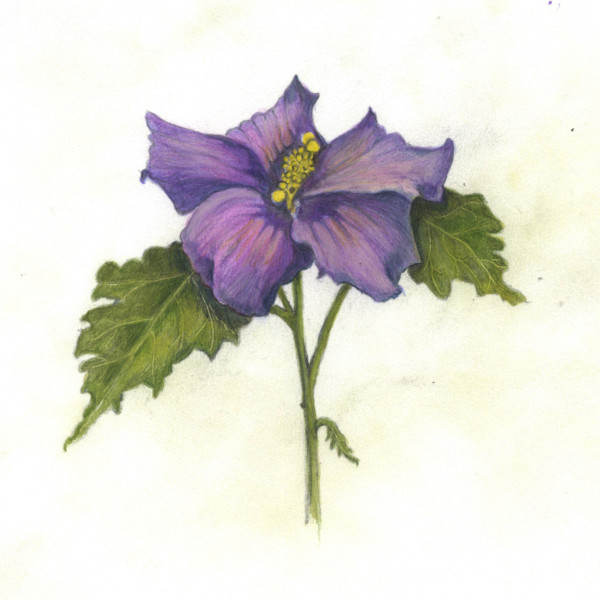
Liz Paganelli commented on Liz Paganelli's Photo 3 years, 11 months ago
Added watercolor and more colored pencil.
-
Liz Paganelli added a Photo 3 years, 11 months ago
-
Added watercolor and more colored pencil.
-
Adding the dark toning to the leaves helped promote the flower Liz. Even though I see different colors on the flower petals it has a monotone appearance to me. I would play up some of the darks, but what I think it needs most of all is to enhance some of the highlights (make them more noticeable).
-
-
Liz Paganelli commented on Machi's Photo 3 years, 11 months ago
Wow this is beautiful, never seen quava like this. the composition is stunning.
-
Katy Lyness commented on Kyra Saulnier's Photo 3 years, 11 months ago
I love this drawing! And seeing it develop through your photos is a joy!
-
Katy Lyness commented on Liz Paganelli's Photo 3 years, 11 months ago
First of all, lovely drawing!
Your veins will be less pronounced, as they will take the value of the watercolor. But that is not necessarily a bad thing. As I see them now, they should be toned down a bit. Use a very lightly tinted hue and carefully brush over areas that you want the veins to be less pronounced. For example the side veins,…[Read more] -
Katy Lyness commented on Camille Maravegias's Photo 3 years, 11 months ago
I love these two views of a gnarly squash! I can see them framed side by side on a wall. Enchanting everyone who passes by.
-
Katy Lyness commented on Machi's Photo 3 years, 11 months ago
Beautiful! I especial like the white innards of the fruit. I know that white is not an easy hue to render. You have done a great job.
-
Katy Lyness commented on Dorothee Frandsen's Photo 3 years, 11 months ago
Hi Dorothee, You certainly have a way with greens! This is beautiful! So well observed and skillfully drawn. I love the “pillowing” between the veins.
-
Katy Lyness commented on Laurie McConnachie's Photo 3 years, 11 months ago
Wow! Who knew a radish could look so lovely! I love that saturated color. And such a beautiful, simple composition. I can’t take my eyes off it!
-
Katy Lyness commented on Elizabeth Ann Roberts's Photo 3 years, 11 months ago
Wow! So beautiful. I agree “great to look at”. I love the way you have added that touch of color. So skillfully done!
- Load More