Activity
-

Doug Milne commented on Katie Helmrick's Photo 1 year, 7 months ago
Gorgeous Katie! It has so much going for for it! The colors, the highlights, shadows and pillowing are all so well done! Bravo!
-
Doug Milne commented on Hélène Chiasson's Photo 1 year, 7 months ago
Hi Helene! Happy Holidays to you too! I so enjoy seeing your beautiful work and I look forward to seeing more in the future! Vern’s suggestion was great and I can see the additional improvement in the leaves! I doubt that they could get any better than they are now!
-
Doug Milne commented on Sarah Lees's Photo 1 year, 7 months ago
Great colors and nice form Sarah! The main highlight could be a little whiter, which signifies a shiny surface. The reflected light is too much of a controlled white line. It should not be as bright as the main highlight. Add some color to tone it down. Try using an ivory pencil to blend the colors and then add some of the green on top. This…[Read more]
-
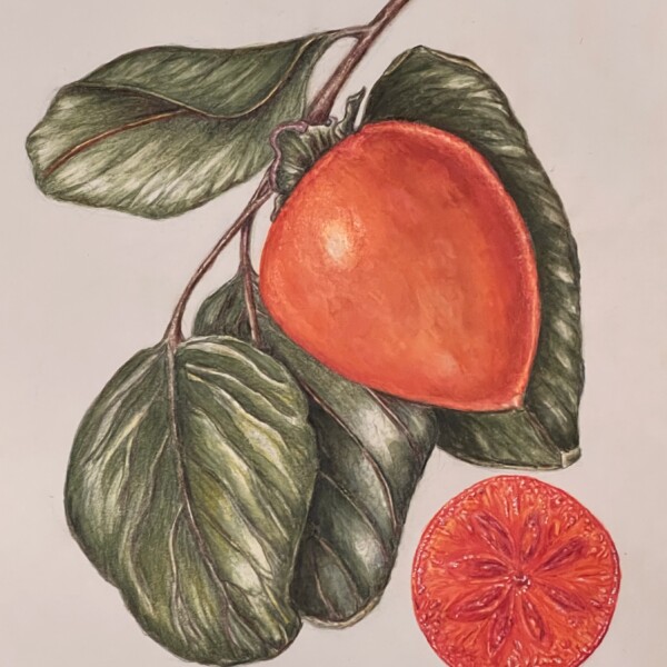
Doug Milne commented on Sarah Lees's Photo 1 year, 7 months ago
Really nice Sarah! Great colors and saturation! I think you could tone down the main highlight a little. It is a good place to also put more subtle texture. Be aware of the white lines where the edge of the orange meets the leaves. Good job!
-
Katie Helmrick added a Photo 1 year, 7 months ago
-
Gorgeous Katie! It has so much going for for it! The colors, the highlights, shadows and pillowing are all so well done! Bravo!
-
-
Hélène Chiasson commented on Hélène Chiasson's Photo 1 year, 8 months ago
Hi Doug, As you suggested, the drawing looks better with the crisper edges. i also followed Vern’s suggestion to add different shades of green to the leaves in order to make them look more distinct. The various shades (from lemon yellow to pine green) do not show up very well but I think that they make a difference. Thank you for your support…[Read more]
-
Hélène Chiasson added a Photo 1 year, 8 months ago
-
Hi Doug, As you suggested, the drawing looks better with the crisper edges. i also followed Vern’s suggestion to add different shades of green to the leaves in order to make them look more distinct. The various shades (from lemon yellow to pine green) do not show up very well but I think that they make a difference. Thank you for your support…[Read more]
-
Hi Helene! Happy Holidays to you too! I so enjoy seeing your beautiful work and I look forward to seeing more in the future! Vern’s suggestion was great and I can see the additional improvement in the leaves! I doubt that they could get any better than they are now!
-
-

Patricia Nesbitt commented on Patricia Nesbitt's Photo 1 year, 8 months ago
Thanks Doug! 😊
-
Sarah Lees added 2 Photos 1 year, 8 months ago
-
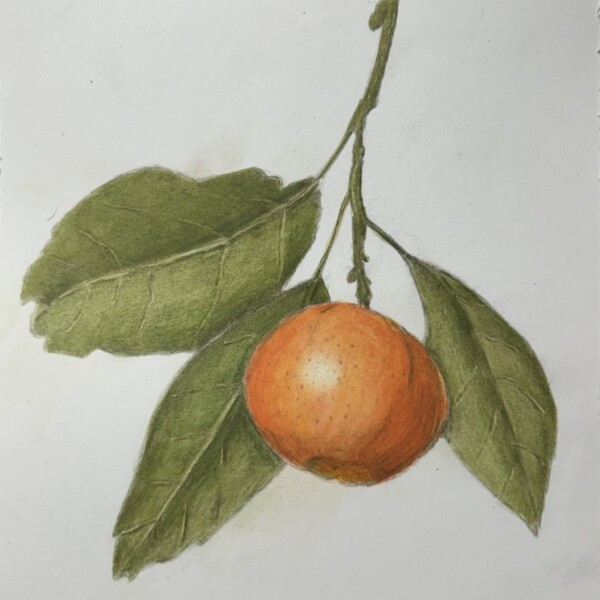
Really nice Sarah! Great colors and saturation! I think you could tone down the main highlight a little. It is a good place to also put more subtle texture. Be aware of the white lines where the edge of the orange meets the leaves. Good job!
-
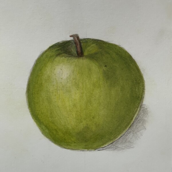
Great colors and nice form Sarah! The main highlight could be a little whiter, which signifies a shiny surface. The reflected light is too much of a controlled white line. It should not be as bright as the main highlight. Add some color to tone it down. Try using an ivory pencil to blend the colors and then add some of the green on top. This will…[Read more]
-
Yes, thanks!
-
-
Doug Milne commented on Patricia Nesbitt's Photo 1 year, 8 months ago
You nailed the colors again Patricia! Wonderful! The original stem is looking much better! Great job on both views!
-
Doug Milne commented on Rita Haft's Photo 1 year, 8 months ago
Love the composition Rita! And that cut view! Wow!
-
-
You nailed the colors again Patricia! Wonderful! The original stem is looking much better! Great job on both views!
-
Thanks Doug! 😊
-
-
Rita Haft added a Photo 1 year, 8 months ago
-
What a great view Rita! I think it would help to add some dark through mid-range tones to give it some form.
-
Love the composition Rita! And that cut view! Wow!
-
-
Patricia Nesbitt commented on Patricia Nesbitt's Photo 1 year, 8 months ago
Thanks Doug! I do have Verithins. Will put them where they are handy. Will also thin the stem out.
-
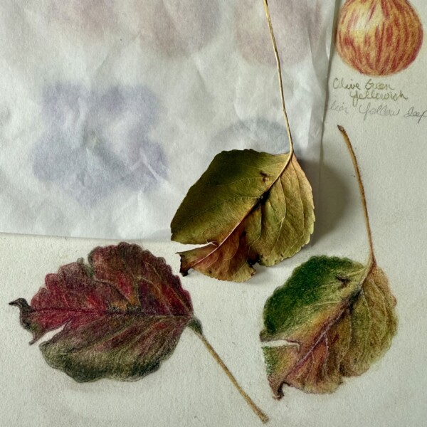
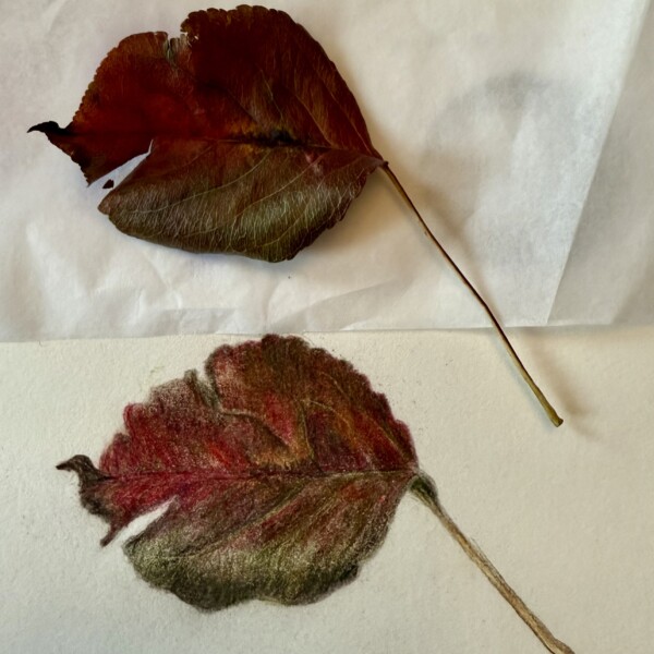
Doug Milne commented on Patricia Nesbitt's Photo 1 year, 8 months ago
Great job Patricia! The color match is very good! If you have Verithin pencils, using them to outline the edges in matching colors seals the edge so the image doesn’t smear, but it also crisps up the edge. Being picky, see how much thinner the actual stem is.
-
Patricia Nesbitt added a Photo 1 year, 8 months ago
-
Great job Patricia! The color match is very good! If you have Verithin pencils, using them to outline the edges in matching colors seals the edge so the image doesn’t smear, but it also crisps up the edge. Being picky, see how much thinner the actual stem is.
-
Thanks Doug! I do have Verithins. Will put them where they are handy. Will also thin the stem out.
-
-
Sarah Lees commented on Sarah Lees's Photo 1 year, 8 months ago
Yes, agreed. TY!
-
Sarah Lees commented on Sarah Lees's Photo 1 year, 8 months ago
Many thanks!
-
Sarah Lees commented on Sarah Lees's Photo 1 year, 8 months ago
I appreciate your feedback and agree that many of the points you made will pertain to multiple pieces. I just got started with this process, so I uploaded everything I did in the past 2 months all at once. I have learned so much from the book, the course videos, and the ZOOM winter card class.
Best wishes to you with your move! -
Sarah Lees commented on Sarah Lees's Photo 1 year, 8 months ago
Oh, good to know! I can see how that would enhance the drawing.
- Load More