Activity
-

Margaret Hahn commented on Margaret Hahn's Photo 1 month ago
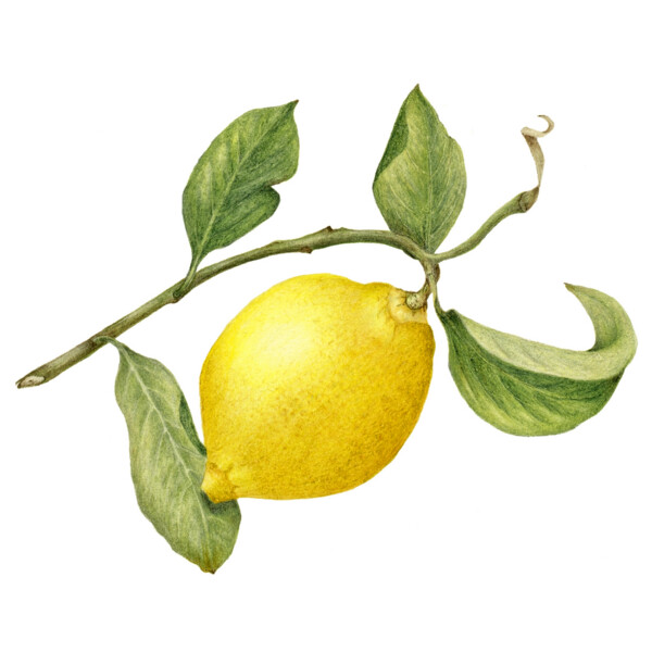
Created as part of a workshop with Ann Swan at her studio in England, fall 2024 and finished in my studio fall 2025. We were working on shading with yellows.
-
Margaret Hahn commented on Margaret Hahn's Photo 1 month ago
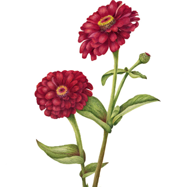
Created fall of 2025 at my annual retreat at my sister’s garden in Northern Wisconsin from her amazing beds of zinnia. The red ones were especially vibrant – hope I captured some of their beauty.
-
Margaret Hahn commented on Margaret Hahn's Photo 1 month ago
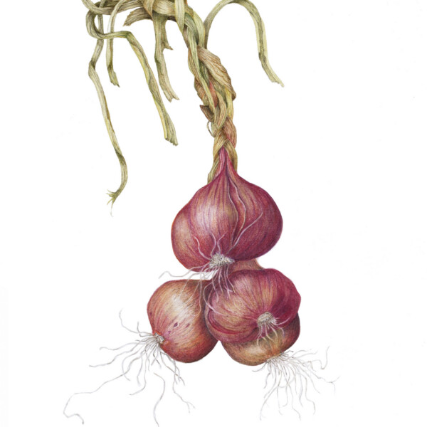
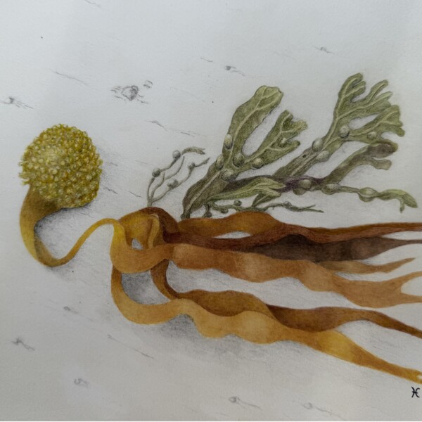
Created fall of 2025 at my annual retreat at my sister’s garden in Northern Wisconsin from her shallots that she braided for me to draw.
-
Margaret Hahn commented on Margaret Hahn's Photo 1 month ago
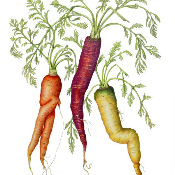
Created as part of a Draw Botanical Zoom Class from farmer’s market carrots
-
Margaret Hahn added a Photo 1 month ago
-
Created as part of a Draw Botanical Zoom Class from farmer’s market carrots
-
Superb job Margaret! The uniquely shaped subjects, the colors and textures! Everything works!
-
I must say, I do like how this drawing turned out – in large part due to Pam’s workshop and recommendations.
-
-
Margaret Hahn added 2 Photos 1 month ago
-
Created fall of 2025 at my annual retreat at my sister’s garden in Northern Wisconsin from her shallots that she braided for me to draw.
-
Created fall of 2025 at my annual retreat at my sister’s garden in Northern Wisconsin from her amazing beds of zinnia. The red ones were especially vibrant – hope I captured some of their beauty.
-
Wonderful Margaret! You really captured the textures of the shallots and their stems! Great composition too!
-
Zinnias are a complicated flower to draw and you have done a wonderful job here! Beautifully rendered and the color selection and saturation are fantastic!
-
That’s so meaningful coming from you, Doug. Thanks for the encouragement.
-
🙏
-
-
Margaret Hahn added a Photo 1 month ago
-
Created as part of a workshop with Ann Swan at her studio in England, fall 2024 and finished in my studio fall 2025. We were working on shading with yellows.
-
You are ready for a return trip to the Garden of Lemons!
-
Oh how I wish! But this May is impossible for me. Hoping there is a 2028!
-
-
-
I like the addition to this drawing Helene. Such an unusual and interesting subject!
-
-

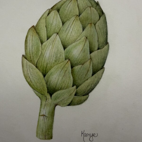
Karye Hood commented on Karye Hood's Photo 1 month, 1 week ago
It’s on white paper, Stonehenge Aqua. I think my phone for some reason darkened the paper in this photo.
-
Erin Russek commented on Erin Russek's Photo 1 month, 1 week ago
Thank you Doug! That was a ton of fun.
-
Doug Milne commented on Karye Hood's Photo 1 month, 1 week ago
Beautifully drawn Karye! It looks like it is drawn on grey paper or the photograph is dark.
-
Doug Milne commented on Vern Fannin's Photo 1 month, 1 week ago
Wow Vern! There are no words! Just sublime!
-
Doug Milne commented on Erin Russek's Photo 1 month, 1 week ago
It is hellebore season. We are still getting snow and my hellebores are blooming away! Wonderful study Erin! The colors and details are spot on! Beautifully drawn!
-
Doug Milne commented on Rita Haft's Photo 1 month, 1 week ago
Striking colors! Suggestion: since it is a vine, maybe think of bringing the main stem down further to run behind the vine of the pod.
-
Doug Milne commented on Rita Haft's Photo 1 month, 1 week ago
Beautiful Rita! Wonderful colors and details! Seems like the underside of the leaf would have some shadow toning.
-
Karye Hood added a Photo 1 month, 1 week ago
-
Beautifully drawn Karye! It looks like it is drawn on grey paper or the photograph is dark.
-
It’s on white paper, Stonehenge Aqua. I think my phone for some reason darkened the paper in this photo.
-
-

Carmen Santos commented on Vern Fannin's Photo 1 month, 1 week ago
GORGEOUS!!!
-

Vern Fannin added a Photo 1 month, 1 week ago
-
Wow Vern! There are no words! Just sublime!
-
-
Erin Russek commented on Erin Russek's Photo 1 month, 2 weeks ago
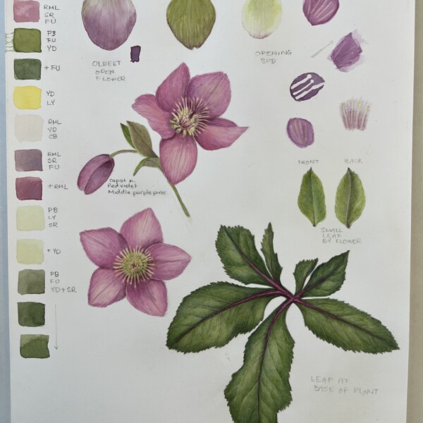
I took a break from my holly and orange drawing when I found Hellebores at the nursery.
-
Erin Russek added a Photo 1 month, 2 weeks ago
-
I took a break from my holly and orange drawing when I found Hellebores at the nursery.
-
It is hellebore season. We are still getting snow and my hellebores are blooming away! Wonderful study Erin! The colors and details are spot on! Beautifully drawn!
-
Thank you Doug! That was a ton of fun.
-
- Load More