Activity
-
Doug Milne commented on Beverley Brand's Photo 4 years, 1 month ago
Beautiful painting Beverly! The split open sections are particularly wonderful! As you said you struggled with the cast shadows and they are too dark. Fortunately there is so many good things to look at. Love looking at all the details especially on the center section!
-
Beverley Brand commented on Beverley Brand's Photo 4 years, 1 month ago
This is water color on cold press paper. Cast shadows are kind of scary. I tried Davie’s Gray first but it doesn’t flow or fade well unfortunately. I switched to Payne’s Gray but it was too late.
-
Clare Lindberg commented on Beverley Brand's Photo 4 years, 1 month ago
I like that it looks like a willowy dancing figure to me.
-
Beverley Brand added a Photo 4 years, 1 month ago
-
This is water color on cold press paper. Cast shadows are kind of scary. I tried Davie’s Gray first but it doesn’t flow or fade well unfortunately. I switched to Payne’s Gray but it was too late.
-
Beautiful painting Beverly! The split open sections are particularly wonderful! As you said you struggled with the cast shadows and they are too dark. Fortunately there is so many good things to look at. Love looking at all the details especially on the center section!
-
A friend thought it was pretty funny that I pay someone to criticize my work but I really appreciate it and $10/month is pretty sweet. Thanks so much Doug.
-
-
Katy Lyness commented on Maureen Doram's Photo 4 years, 1 month ago
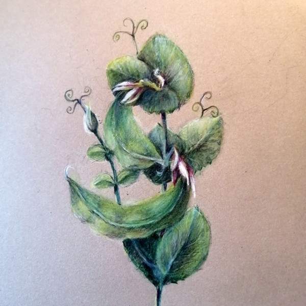
Yes, this is more like it! I’d like to see you do more of these pea plants. So many interesting elements: the clasping leaves, the sweet, strange flowers, and those dynamic tendrils!
-
Maureen Doram commented on Maureen Doram's Photo 4 years, 1 month ago
@katylyness this photo shows the colors a little better. Our scanner does the best job but it’s out of the house at the moment! I had so much fun using blues and moving through the pods to find the contour that was showing with the peas. I’m not sure about the bottom leaves but I’m going to try another version of peas on white paper. I’d…[Read more]
-
Maureen Doram added a Photo 4 years, 1 month ago
-
@katylyness this photo shows the colors a little better. Our scanner does the best job but it’s out of the house at the moment! I had so much fun using blues and moving through the pods to find the contour that was showing with the peas. I’m not sure about the bottom leaves but I’m going to try another version of peas on white paper. I’d really…[Read more]
-
Yes, this is more like it! I’d like to see you do more of these pea plants. So many interesting elements: the clasping leaves, the sweet, strange flowers, and those dynamic tendrils!
-
-
Katy Lyness commented on Maureen Doram's Photo 4 years, 1 month ago
Hi Maureen,
I’m glad you find my tips useful! As for the reds on the butterfly, I would add hints of red. I don’t think you should change the actual color of the total butterfly, just add a spot of what might be a reflective color. Since botanical illustration aims to be accurate, flights of fancy on color should be somewhat true to reality. -
Doug Milne commented on Theodora Korasidis's Photo 4 years, 1 month ago
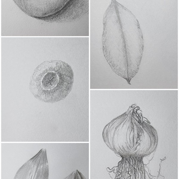
You have been busy Dora! A little more darker toning on the apple to enhance it’s form and I would tone down the reflected highlight. I would also add more dark toning to the right side of the bulb. Those roots are something! Great job on the front/back petals! The blueberry and leaf/nut look very light – maybe it is the quality of the image. T…[Read more]
-
Theodora Korasidis added a Photo 4 years, 1 month ago
-
You have been busy Dora! A little more darker toning on the apple to enhance it’s form and I would tone down the reflected highlight. I would also add more dark toning to the right side of the bulb. Those roots are something! Great job on the front/back petals! The blueberry and leaf/nut look very light – maybe it is the quality of the image. T…[Read more]
-
Thanks Doug. These are some quick sketches I did as daily practice. They do need some refining and extra toning. I find it difficult to get that reflected highlight to look right and I didn’t know how to add more dark toning to the garlic bulb without losing its shape.
-
Thanks Vern. Great advice on the highlight. I find the way you described it very helpful. I’ll keep the relative values in mind going forward. I miss you guys also. Feels like we are in prison here in Australia. In lockdown again and vaccine roll-out has been pathetic. I’m afraid an art retreat is not one of the exceptions for travel sadly. Hope…[Read more]
-
-
Maureen Doram commented on Maureen Doram's Photo 4 years, 1 month ago
@vern It was a really fun piece to work on, many many layers in the chives! I still need to work on my writing, I think smaller letters might have been better but overall I am pretty happy with it.
-
Maureen Doram commented on Maureen Doram's Photo 4 years, 1 month ago
@katylyness Thanks for your tips, I like how you notice the warm red. It gives me confidence to continue experimenting with unusual tones. Do you suppose it would be possible to do a glaze of some kind over the butterfly? Or maybe just suggestive hints of reds mixed in with the ochre on the wings?
-
clotilde lambert commented on clotilde lambert's Photo 4 years, 1 month ago
Hi Vern, thank you for the advice. I’ve been really nervous to try a drawing from a live plant but I think it’s time I take the leap. I will post it soon. Thank you for the encouragement.
-
clotilde lambert commented on clotilde lambert's Photo 4 years, 1 month ago
Doug, thank you. I smoothed the transitions out and it does look a lot better!
-
clotilde lambert commented on clotilde lambert's Photo 4 years, 1 month ago
You mean use blues and greens for the shadows at the top edge of the petal?
-
clotilde lambert commented on clotilde lambert's Photo 4 years, 1 month ago
Thank you so much Doug.
-
clotilde lambert commented on clotilde lambert's Photo 4 years, 1 month ago
Hi Doug, thank you for the feedback. I made the changes you recommended and you’re right, it looks much better with just a few tweaks!
-
Doug Milne commented on Theodora Korasidis's Photo 4 years, 1 month ago
Gorgeous Dora!!! That flower is so crisp and beautiful!!! I feel like I can pick it up off the page! Everything is really good!
-
Doug Milne commented on clotilde lambert's Photo 4 years, 1 month ago
Hi Clotilde- I would lighten the cast shadows a little. It looks like grey tones on the petal are done in watercolor and I would lighten them a little too. White flowers are tricky. Depending on the flower you can use blues or greens to do the toning and the petals keep their lightness.
-
Doug Milne commented on clotilde lambert's Photo 4 years, 1 month ago
Beautiful, rich colors and saturation! The branch and leaves are so good!!! That little bump out on the bottom of the middle fruit and the shape of the fruit on the right are throwing me off a little. Maybe you could erase the bump and round off the other fruit. It should be easy to do since a lot of it is hidden by the leaves. Wonderful job!!!!
- Load More


