Activity
-

Katy Lyness commented on Maureen Doram's Photo 4 years, 2 months ago
Hi Maureen, So beautiful! I’m a big fan of your soft, almost dreamlike style. And this drawing has such lovely colors. That warm red on the underside of the flowers is such an unexpected choice. It really makes the drawing. I’d like to see a bit of a warm reddish hue in the butterfly. I’d also like to see the stems of the flowers more defined. T…[Read more]
-
Katy Lyness commented on Marina Segalovitch's Photo 4 years, 2 months ago
Hi Marina, this is such a pretty drawing. The colors you have chosen work together so well. For some reason the drawing seems grainy. Were you using a rough surfaced paper? I like seeing you try embossing. It is a challenging technique! Keep working on finessing the lines. They are a bit too uniform. Also try adding some shadow next to the…[Read more]
-
Katy Lyness commented on Theodora Korasidis's Photo 4 years, 2 months ago
Hi Theodora, Lovely drawing! Your colors are so vivid. And I like the way you are using the natural linear patterns on the leaves and petals to define the forms.
-
Katy Lyness commented on mary jo gimber's Photo 4 years, 2 months ago
Hi Mary Jo, I love things in threes! Bounty of the harvest? Nice work on the spherical shapes. That blueberry is “precious!” I also like your bringing the red color into the green of your leaves. Maybe a bit much on this one. The red is becoming too dominant and is greying out the greens, I’d add some indigo in the darker areas and erase away…[Read more]
-
Clo added 4 Photos 4 years, 2 months ago
-
Nice job Clotilde! Along with the highlight placements and rich, dark center well and overlaps you can easily understand the flower as a whole and all it’s individual petals. I would go in with a color pencil and smooth out some of the transitions from the darkest areas – especially at the overlaps.
-
Great job Clotilde! The curls are really well done! Not easy to do with a dark colored subject and this is very successful!
-
Beautiful, rich colors and saturation! The branch and leaves are so good!!! That little bump out on the bottom of the middle fruit and the shape of the fruit on the right are throwing me off a little. Maybe you could erase the bump and round off the other fruit. It should be easy to do since a lot of it is hidden by the leaves. Wonderful job!!!!
-
Hi Clotilde- I would lighten the cast shadows a little. It looks like grey tones on the petal are done in watercolor and I would lighten them a little too. White flowers are tricky. Depending on the flower you can use blues or greens to do the toning and the petals keep their lightness.
-
Hi Doug, thank you for the feedback. I made the changes you recommended and you’re right, it looks much better with just a few tweaks!
-
Thank you so much Doug.
-
You mean use blues and greens for the shadows at the top edge of the petal?
-
Doug, thank you. I smoothed the transitions out and it does look a lot better!
-
Hi Vern, thank you for the advice. I’ve been really nervous to try a drawing from a live plant but I think it’s time I take the leap. I will post it soon. Thank you for the encouragement.
-
-
Nicole Johnson commented on Nicole Johnson's Photo 4 years, 2 months ago
I know watercolor would take this to the next level so I finally ordered my watercolor pencils!
-

Ishbel Galloway commented on Theodora Korasidis's Photo 4 years, 2 months ago
Lovely Dora!
-
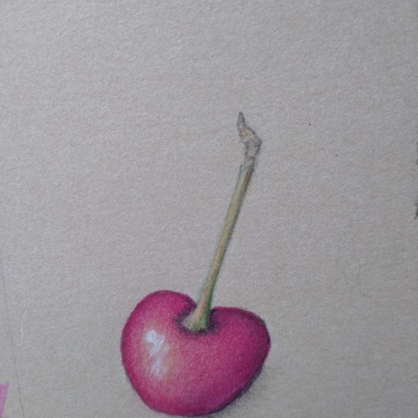
Julie Z.D. added a Photo 4 years, 2 months ago
-
Hi Julie- the bright highlight really conveys the cherry’s shiny surface! Be careful not to have an outline. The left side edge probably would not be that dark because it is close to the light source.
-
-
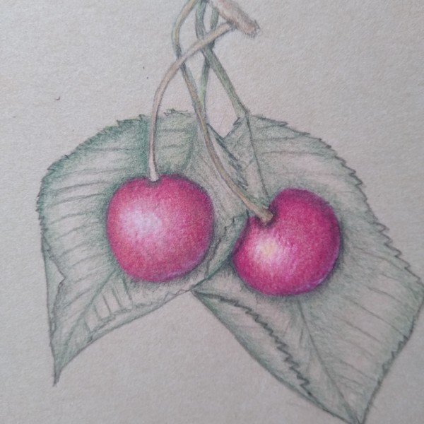
Julie Z.D. added a Photo 4 years, 2 months ago
-
Hi Julie- I love how the cherries are nestled into the leaves! The cherry on the left could use a little more darker tones like the one on the right. Even if you don’t add more color to the leaves there are areas that should have more dark toning. For example: the leaf on the left would cast a shadow on the leaf on the right. Also the left c…[Read more]
-
-
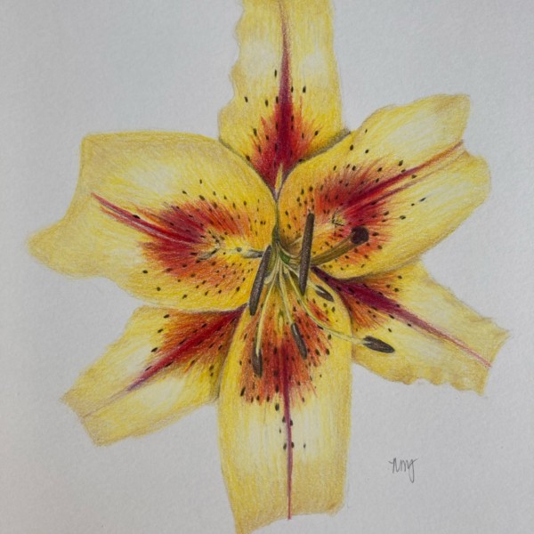
Nicole Johnson added a Photo 4 years, 2 months ago
-
I know watercolor would take this to the next level so I finally ordered my watercolor pencils!
-
Yeah! Watercolor works so well with colored pencils! Especially in the light colors like yellow! You will find the highlight areas so much easier to control. BTW, this is a lovely drawing, (with or without watercolor)!
-
Love how you captured the ripples on the sides of the petals – I struggle with that!
-
-

Qoo added a Photo 4 years, 2 months ago
-
Hi Qoo, Nice drawing. I like the feeling of the fold and that you are defining the veins by the dark value between them. Be careful to taper the veins as they move toward the margin of the leaf. Observe them from origin to end point. One other comment I have is that it seems you are drawing on a rough surfaced paper. With botanical art a fairly…[Read more]
-
-

sheila y. commented on sheila y.'s Photo 4 years, 2 months ago
Thanks, Maureen. I’m having fun putting the flowers together. See you online in a few weeks! -
Maureen Doram commented on sheila y.'s Photo 4 years, 2 months ago
So fun Sheila, I love your style
-
Maureen Doram commented on mary jo gimber's Photo 4 years, 2 months ago
Precious!
-
Maureen Doram commented on Theodora Korasidis's Photo 4 years, 2 months ago
Wonderful!
-
Maureen Doram commented on Marina Segalovitch's Photo 4 years, 2 months ago
So pretty
-
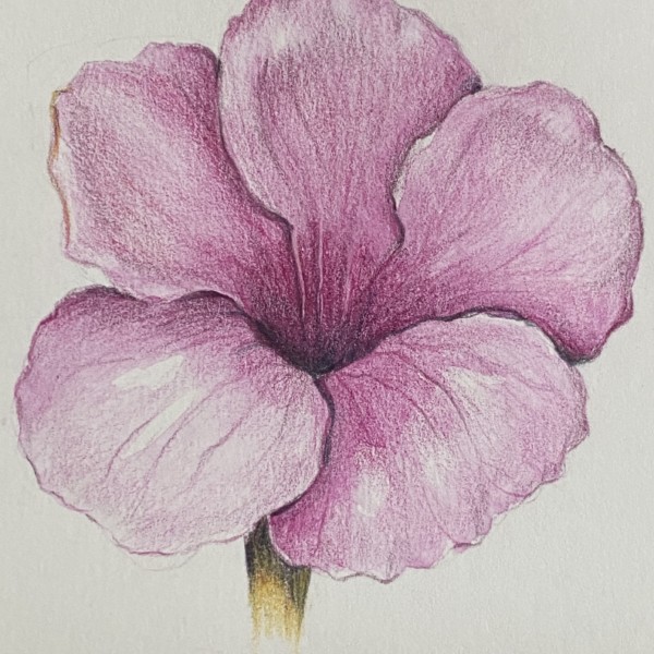
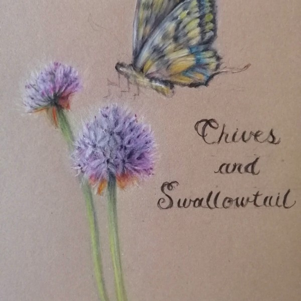
Maureen Doram added a Photo 4 years, 2 months ago
-
Hi Maureen, So beautiful! I’m a big fan of your soft, almost dreamlike style. And this drawing has such lovely colors. That warm red on the underside of the flowers is such an unexpected choice. It really makes the drawing. I’d like to see a bit of a warm reddish hue in the butterfly. I’d also like to see the stems of the flowers more defined. T…[Read more]
-
@katylyness Thanks for your tips, I like how you notice the warm red. It gives me confidence to continue experimenting with unusual tones. Do you suppose it would be possible to do a glaze of some kind over the butterfly? Or maybe just suggestive hints of reds mixed in with the ochre on the wings?
-
@vern It was a really fun piece to work on, many many layers in the chives! I still need to work on my writing, I think smaller letters might have been better but overall I am pretty happy with it.
-
Hi Maureen, I’m glad you find my tips useful! As for the reds on the butterfly, I would add hints of red. I don’t think you should change the actual color of the total butterfly, just add a spot of what might be a reflective color. Since botanical illustration aims to be accurate, flights of fancy on color should be somewhat true to reality.
-
-

paigemeredith commented on paigemeredith's Photo 4 years, 2 months ago
@sam-mcwilliams great points Sam. Treating my art less “precious-ly” is something I really need to work on… I blame it on the fact that having a young son, I don’t have much time make art, and want to “make the most of it.” Thanks for changing my perspective; the doing is important.
-
Marina Segalovitch added a Photo 4 years, 2 months ago
-
So pretty
-
Hi Marina, this is such a pretty drawing. The colors you have chosen work together so well. For some reason the drawing seems grainy. Were you using a rough surfaced paper? I like seeing you try embossing. It is a challenging technique! Keep working on finessing the lines. They are a bit too uniform. Also try adding some shadow next to the…[Read more]
-
Hi Kathy, thank you for the feedback. No, I was using the same paper but the new camera. Or, maybe it is my toning. The petals have veining, I tried to show them. I will keep working on my leaves too!
-
-
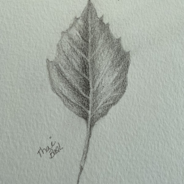
Theodora Korasidis commented on Fanny Bischoff's Photo 4 years, 2 months ago
I love these leaves. So beautiful!
- Load More