Activity
-

mary jo gimber added a Photo 4 years, 1 month ago
-
-
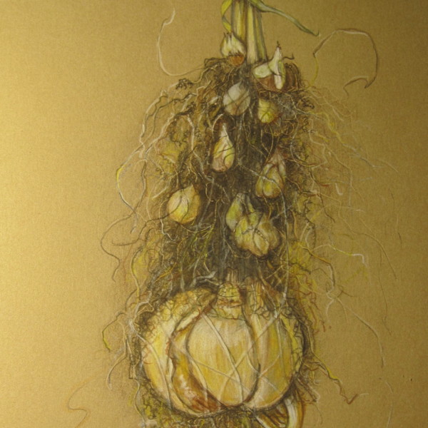
mary jo gimber added a Photo 4 years, 1 month ago
-
This is a result of having way too much fun with embossing, drawing mud and bulbs. Will try again with more discipline.
-
Love it Mary Jo!!! Fantastic subject!!!!
-

I love it! I think you had just the right amount of fun. 🙂
-
So fun!
-
-

Jill Amadei commented on Jill Amadei's Photo 4 years, 1 month ago
Thanks Vern! So interesting. I’m just amazed by the creatures Mother Nature has come up with! I got this urchin at my favorite little shell / crystal shop in Sag Harbor. It’s called Blooming Shells! 🙂
-
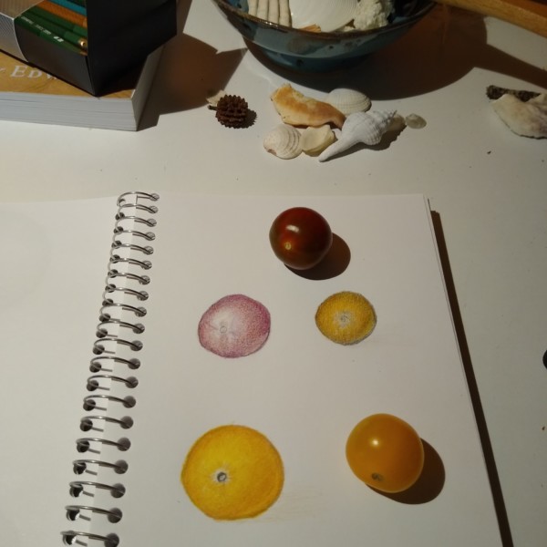
Julie Z.D. added a Photo 4 years, 1 month ago
-
Hi Julie- the tomato would benefit from more darker toning on it’s right side to enhance the form. Seeing the actual subject you can see there is a lot more room for color saturation to get to that red. Be sure to keep working on the various tones as you add more layers of color so they don’t get lost. Also seeing your pencils in the picture – the…[Read more]
-
-
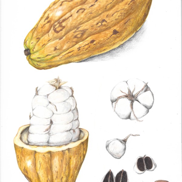
Machi added a Photo 4 years, 1 month ago
-
Beautiful Machi! So much fun to see how they all stack up together. And I love all the different views you give us.
-
Lovely!
-
-
Karen Minden commented on Karen Minden's Photo 4 years, 1 month ago
These comments are so encouraging. And helpful.
Thank you! -
Julie Z.D. commented on Jill Amadei's Photo 4 years, 1 month ago
Wow!
-
Julie Z.D. added a Photo 4 years, 1 month ago
-
Jill Amadei commented on mary jo gimber's Photo 4 years, 1 month ago
Beautiful!
-
-
Wow!
-
Thanks Vern! So interesting. I’m just amazed by the creatures Mother Nature has come up with! I got this urchin at my favorite little shell / crystal shop in Sag Harbor. It’s called Blooming Shells! 🙂
-
Oooh I love this guy! What a delight. I think you could bring some of the red violet or whatever colours you used in the reds/purple details into the deep centre shadow a bit on the left side fading out to the right, to unify the colour scheme.
-
Thank you @sam-mcwilliams as always! Love your helpful feedback. I see what you mean and I will definitely add some of the red violet on the other side so that it all ties together! 😊
-
-
Ellery Kimball commented on Ellery Kimball's Photo 4 years, 1 month ago
Thanks Sam:)
-
Fanny Bischoff added 3 Photos 4 years, 1 month ago
-
The changes really worked Fanny! Good job!!!!
-
-
Marilyn Tooke commented on Marilyn Tooke's Photo 4 years, 1 month ago
Wanted to try to capture the various colours in this conference pear.
-
-
Wanted to try to capture the various colours in this conference pear.
-
-
Cynthia Ziegler commented on Cynthia Ziegler's Photo 4 years, 1 month ago
I might have made a too many layers resulting in the crackly finish.
-
Cynthia Ziegler commented on Cynthia Ziegler's Photo 4 years, 1 month ago
Thanks 🙏🏻. I will get into more detail when/if my mad drawing skillz improve! Need to make use of that magnifying glass 🔍
-
Karen Minden commented on Karen Minden's Photo 4 years, 1 month ago
Toning with dark sepia “grisaille” or with coloured pencils?
-
Karen Minden commented on Karen Minden's Photo 4 years, 1 month ago
thx. I felt stuck on both drawings with the same problem.
-
Karen Minden commented on Karen Minden's Photo 4 years, 1 month ago
Thank you Doug. I started doodling this on really cheap paper, which now has a hole in it, but I will go back and add toning and highlights. -
Doug Milne commented on Fanny Bischoff's Photo 4 years, 1 month ago
Hi Fanny- the colors are great! I think you could use a little more dark toning to enhance their form.
- Load More


Worked on adding shadows and darks as suggested.
Hi Mary Jo- this almost seems like two separate drawings to me. The right side is strongly vertical and the left side is strongly horizontal. I think I would have given the leaf a curve or something to soften the geometry of this. I would add some darker toning to the flower to give it some depth and punch. The stamens and pistil have more…[Read more]
Thank you, Doug. Your comments are giving me some ideas about changes that I can make-turn it , add lettered info, and as a last resort cut it and collage. Thanks again for your critique! mary jo