Activity
-

Marina Segalovitch added a Photo 4 years, 10 months ago
-
Maureen Doram added a Photo 4 years, 10 months ago
-
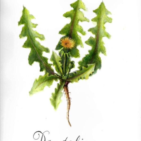
Beautiful drawing. I like it when the lowly dandelion gets celebrated. (And I am saying this after spending hours pulling them out of a lawn.) So many things to like about this drawing: I love the way you have used color- that warm brown moving from the tip of the tap root to almost the tips to the leaves is beautiful and evokes the line of…[Read more]
-
-
Yahya Elsouly added a Photo 4 years, 10 months ago
-
Hi Yahya, Such a cheery drawing. I’m not sure about the treatment of the background. It distracts from the daffodil. If the directional lines were not so obvious and uniformly one direction. or the tone went right up the the edge of the flower, it might work. When one draws a light colored subject on white paper, it is very tempting to tone the…[Read more]
-
-
mary jo gimber added a Photo 4 years, 10 months ago
-
-
Hi Mary Jo, lovely page. You have a real way with colors. I like the warm glow you have achieved with the under color of yellow. it gives the flowers such depth!
-
-
mary jo gimber added a Photo 4 years, 10 months ago
-
Hi Mary Jo, I’m not sure what it is about this drawing, but I so enjoy looking at it. It seems retro somehow. Like something from my childhood.
-
Katy, It feels retro to me, too, and it wasn’t my intention to do that. I still have some corrections to make from critique of latest webinar. Thanks, Katy, Mary Jo
-
-
Fanny Bischoff commented on Fanny Bischoff's Photo 4 years, 10 months ago
Yes it was more challenging. The inside of the onion skin and the petals I found were very shiny and I find it hard to represent. It seems with real subjects there is more thinking to do to choose an angle and appreciate the volumes, but less to imagining and therefore it’s easier to get closer to the truth.
-
-
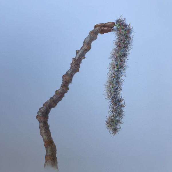
What an interesting subject. I like the contrast of textures, and the colors you included in the feathery catkin.
-

I just adore the fine details and colours in the catkin, Elizabeth.
-
-
Doug Milne commented on Diane Ryle's Photo 4 years, 10 months ago
Hi Diane- leaves are a challenge and these are off to a good start. Usually the main vein starts off wider than you have shown and it tapers as it moves toward the top of the leaf. You can often see the connection where the secondary veins meet the main vein. I would consider using a variety of greens when working on the details, etc to create…[Read more]
-
Doug Milne commented on Lisa's Photo 4 years, 10 months ago
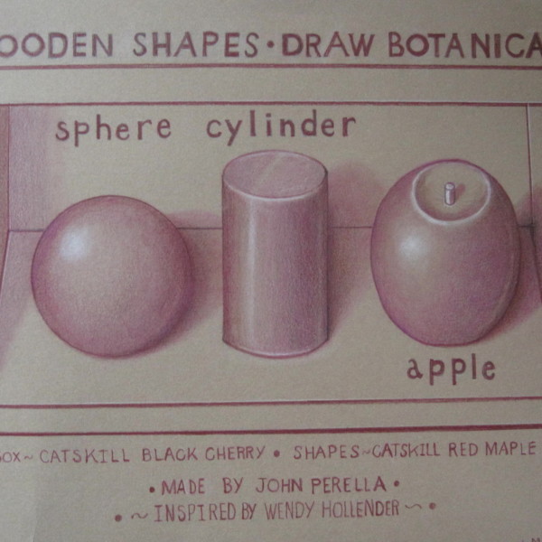
Lisa – I think the both spheres needs more dark toning. Especially the one on the bottom. Look at your tone bar exercises on your page for reference to make sure you are getting the full range of tones when you switch over to drawing objects. See my note on your other post about changing the reflected highlights.
-
Doug Milne commented on Lisa's Photo 4 years, 10 months ago
Hi Lisa- the branch is beautifully rendered!!!! I would add more dark toning to the right side as you have done so well on the green subject!!!!
-
Doug Milne commented on Lisa's Photo 4 years, 10 months ago
Hi Lisa- you are making great use of the whole page!!! Really nice range of tones on the tone bar! On the arc tone bars you could add more of the darker tones. When I look at the cylinders I see a lot of midrange tones and not enough of the dark. Your toning technique is really nice! The range of tones on the green fruit is very well done! I would…[Read more]
-
Doug Milne commented on Fanny Bischoff's Photo 4 years, 10 months ago
The color of the red onion skin is certainly different and more the color I think of. Was it more challenging to do these from real life?
-
Doug Milne commented on Fanny Bischoff's Photo 4 years, 10 months ago
Hi Fanny- the cast shadow really helps ground the apple. There looks like a light tone closest to the apple and that should actually be the darkest area. You could also fade it out a little more as it extends out. Something to consider now that you have added a cast shadow is to also have a reflected highlight. This apple is so well done! Great job!!!!
-
Doug Milne commented on Beverley Brand's Photo 4 years, 10 months ago
Hi Beverley- I like the angle and how the carrot is positioned on the page. I think you could add a little more dark toning on the right side of the carrot. Love the variety of greens on the foliage and how crisp it is! Beautiful!
-
Douglass Reitter commented on Jill Amadei's Photo 4 years, 10 months ago
Beautiful!
-
-
Diane Ryle added a Photo 4 years, 10 months ago
-
Hi Diane- leaves are a challenge and these are off to a good start. Usually the main vein starts off wider than you have shown and it tapers as it moves toward the top of the leaf. You can often see the connection where the secondary veins meet the main vein. I would consider using a variety of greens when working on the details, etc to create…[Read more]
-
-

sheila y. added a Photo 4 years, 10 months ago
-

Jill Amadei commented on Jill Amadei's Photo 4 years, 10 months ago
Thank you Vern and Doug for the helpful suggestions! I have tried to implement your tips as I understood them. I look forward to zoom on Monday!
- Load More
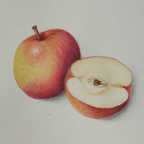


Hi Marina, Sweet drawing. Your use of color keeps getting better and better. I really like the subtle transition of color in the reds and yellows. And the cross section is sensitively done. Just the right tinge of browns! My two comments would be the reflective light should look less like a line and more like a glow. Think of that light bouncing…[Read more]
Thank you, Katy!