Activity
-

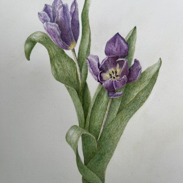
Hélène Chiasson added a Photo 1 year, 2 months ago
-
-
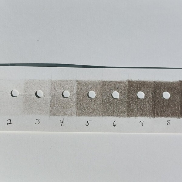
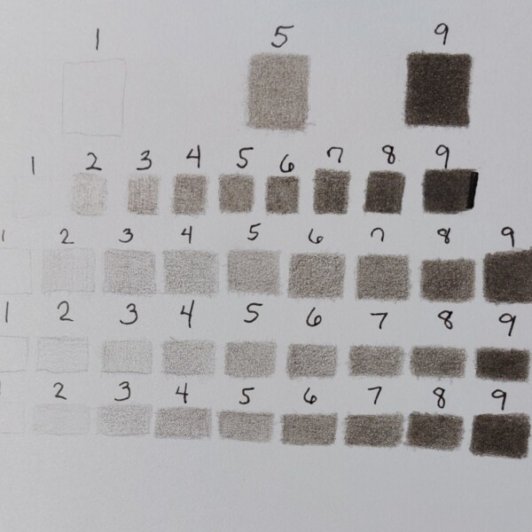
Hi Chris! All your experimentation and perseverance is paying off! That you can see the clear progression of tones is wonderful! I think #8 could be a little darker and #9 even more. Have you tried turning your paper when you add different layers? It can help achieve better coverage. Keep up the good work!
-
Thank you! It helps me seeing the tones right beside each other. I turn the paper with each layer I do. Will keep working on smooth layers. Thanks for your help.
-
-
Rita Haft added a Photo 1 year, 2 months ago
-
Welcome back Rita! I like the movement of this piece! A couple of things to consider. I would make the bottom end of the main stem continue down a little further so it does not line up with the bottom of the seed head to it’s right. I would clean up the top edge of the stem that connects to that seed head. It is not as crisp as the rest of the d…[Read more]
-
-
Chris Mathew commented on Chris Mathew's Photo 1 year, 2 months ago
Yes. Today I started making the 5 a bit darker. I do these each day, and think I’m seeing more. I’m quite enjoying this. I think the dark sepia pencil doesn’t get to quite a full black, so that may have shifted me off a bit. Thank you for the feedback, and I’ll post more soon!
-
Doug Milne commented on sheila y.'s Photo 1 year, 2 months ago
Hi Sheila- it is better Sheila! Maybe consider a small shot of red on the lower left? Or eliminate the largest pomegranate flower – it seems so dominate.
-
Doug Milne commented on Faye Forman's Photo 1 year, 2 months ago
This is a great study page Faye with great observations!
-
Doug Milne commented on Chris Mathew's Photo 1 year, 2 months ago
Hi Chris- this is fun to see you use the different colors! As I mentioned on your previous post, your #5 on some of the lines could be darker.
-
Doug Milne commented on Chris Mathew's Photo 1 year, 2 months ago
Hi Chris- welcome to the ArtFeed! Great job with the tone scales. Beautiful smooth toning! As the #5 is halfway, I think your 5 should be a little darker – more like your #6. Then of course, you will have to alter some of the other squares.
-

sheila y. commented on sheila y.'s Photo 1 year, 2 months ago
Hmm, maybe bottom right …??
-
sheila y. added a Photo 1 year, 2 months ago
-
Hmm, maybe bottom right …??
-
Hi Sheila- it is better Sheila! Maybe consider a small shot of red on the lower left? Or eliminate the largest pomegranate flower – it seems so dominate.
-
-
Faye Forman commented on Hayden McKay's Photo 1 year, 2 months ago
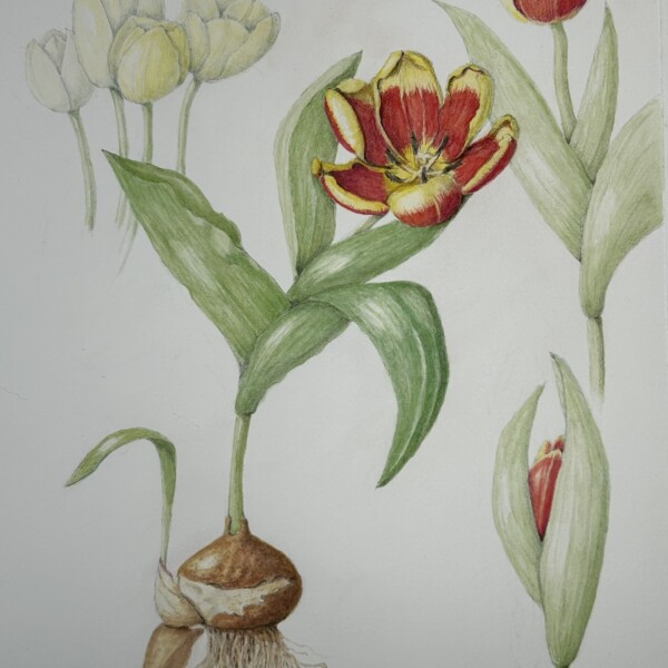
I love the gentle curve of your center tulip. This is my favorite stage of the tulip flower, as the weather becomes warmer and the petals open up the blooms remind me of poppies! I’m inspired by your logo on the bottom right and the red/yellow color pop.
-
Faye Forman added a Photo 1 year, 2 months ago
-
This is a great study page Faye with great observations!
-
-
Faye Forman commented on Faye Forman's Photo 1 year, 2 months ago
Thanks Doug!
-
Faye Forman commented on Faye Forman's Photo 1 year, 2 months ago
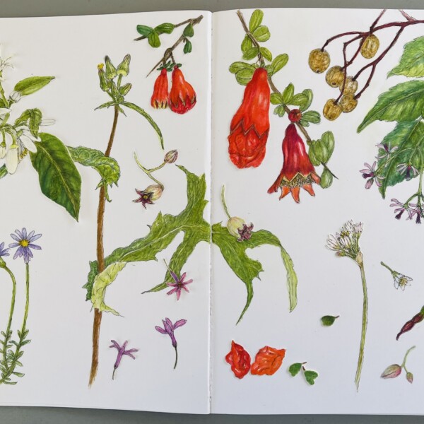
Thank you Doug! I love the watercolor pencils and have noticed my tendency to go in too quickly (I am excited and going too fast) with the color rather than slowly building up. How would you suggest I add highlight in after the fact? I tried removing the saturation from the berries using plain water on the no. 6 Interlon brush, and also by adding…[Read more]
-
Faye Forman commented on Faye Forman's Photo 1 year, 2 months ago
Thank you so much Doug! I’m going to try the berries again as they emerge in the landscape, the next time around with a sharper light source to achieve an accurate and defined highlight.
-
Chris Mathew commented on Chris Mathew's Photo 1 year, 2 months ago
I think I could do these for weeks. I’m still learning to see the different values, and learning to achieve smooth coverage.
-
Chris Mathew added 2 Photos 1 year, 2 months ago
-
I think I could do these for weeks. I’m still learning to see the different values, and learning to achieve smooth coverage.
-
Hi Chris- welcome to the ArtFeed! Great job with the tone scales. Beautiful smooth toning! As the #5 is halfway, I think your 5 should be a little darker – more like your #6. Then of course, you will have to alter some of the other squares.
-
Hi Chris- this is fun to see you use the different colors! As I mentioned on your previous post, your #5 on some of the lines could be darker.
-
Yes. Today I started making the 5 a bit darker. I do these each day, and think I’m seeing more. I’m quite enjoying this. I think the dark sepia pencil doesn’t get to quite a full black, so that may have shifted me off a bit. Thank you for the feedback, and I’ll post more soon!
-
-
Doug Milne commented on sheila y.'s Photo 1 year, 2 months ago
Hi Sheila- as always, everything is beautifully drawn! The composition is off for me though. Three quarters of it is light and airy and the top quarter on the right has more weight with larger subjects closer together. Each work individually, but not as a whole. I am sure you will work it out!
-
sheila y. added a Photo 1 year, 2 months ago
-
Hi Sheila- as always, everything is beautifully drawn! The composition is off for me though. Three quarters of it is light and airy and the top quarter on the right has more weight with larger subjects closer together. Each work individually, but not as a whole. I am sure you will work it out!
-
-
Hayden McKay added a Photo 1 year, 2 months ago
-
I love the gentle curve of your center tulip. This is my favorite stage of the tulip flower, as the weather becomes warmer and the petals open up the blooms remind me of poppies! I’m inspired by your logo on the bottom right and the red/yellow color pop.
-
- Load More


Love seeing these.
Hi Helene! This is wonderful. The view of the tulip on the right is hard to do, but wow, you nailed it! It is sharp and crisp and it does not want me to look anywhere else. The tulip on the left looks more muted so the balance of the composition is off for me. I would also take another look at the toning on the leaves. You have a nice dark shadow…[Read more]
Hi Doug, thank you for your comments and I will join you for the webinar. I sent this on the art feed because I couldn’t no longer ´see ´ the drawing and was stuck..