Activity
-

Becky Bruno added a Photo 1 year, 1 month ago
-

sheila y. commented on sheila y.'s Photo 1 year, 1 month ago
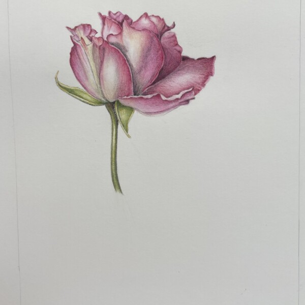
I think I still need something bottom left. I’ll keep looking at it and around.
-
sheila y. added a Photo 1 year, 1 month ago
-
I think I still need something bottom left. I’ll keep looking at it and around.
-
-
sheila y. commented on sheila y.'s Photo 1 year, 1 month ago
Thanks for the suggestion, Doug. I’m going to work on a lighter solution. I’m struggling to keep the seagulls away from my strawberry plant! -
Doug Milne commented on Becky Bruno's Photo 1 year, 1 month ago
Hi Becky! When I think of roses they are a combination of strength (of form) and delicacy and I think you really captured that! Congratulations on getting those beautiful dark shadows, which in combination with your highlights give this piece wonderful contrast and impact! The one area I am a little confused by is the larger petal on the right. I…[Read more]
-
Doug Milne commented on sheila y.'s Photo 1 year, 1 month ago
Hi Sheila! The two pages are more balanced now and look great. The problem for me is still the bottom left corner. The strawberry plant leaves in front of the succulent does seem heavy in comparison to the rest of the work. Could you do a smaller version of the leaves?
-
Becky Bruno commented on Becky Bruno's Photo 1 year, 1 month ago
I feel that there is more work to do on this but I would LOVE some feedback/suggestions before going further. Thank you.
-
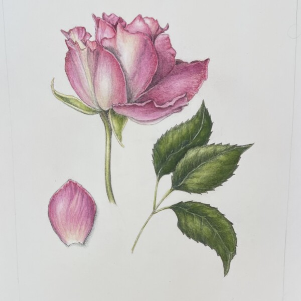
Becky Bruno added a Photo 1 year, 1 month ago
-
I feel that there is more work to do on this but I would LOVE some feedback/suggestions before going further. Thank you.
-
Hi Becky! When I think of roses they are a combination of strength (of form) and delicacy and I think you really captured that! Congratulations on getting those beautiful dark shadows, which in combination with your highlights give this piece wonderful contrast and impact! The one area I am a little confused by is the larger petal on the right. I…[Read more]
-
-
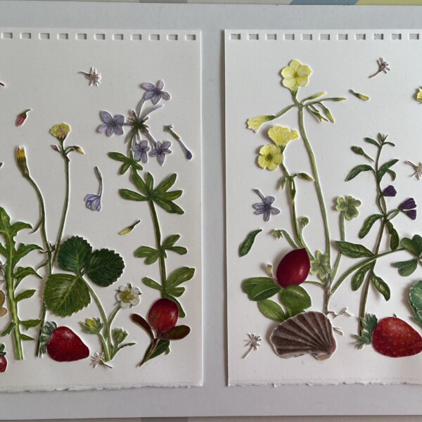
sheila y. commented on sheila y.'s Photo 1 year, 1 month ago
The additional strawberry leaves are not glued. I added some flying Jade plant flowers. Thoughts? Might be too heavy now🙃
-
sheila y. added a Photo 1 year, 1 month ago
-
The additional strawberry leaves are not glued. I added some flying Jade plant flowers. Thoughts? Might be too heavy now🙃
-
Hi Sheila! The two pages are more balanced now and look great. The problem for me is still the bottom left corner. The strawberry plant leaves in front of the succulent does seem heavy in comparison to the rest of the work. Could you do a smaller version of the leaves?
-
Thanks for the suggestion, Doug. I’m going to work on a lighter solution. I’m struggling to keep the seagulls away from my strawberry plant!
-
-
Margaret Hahn commented on Margaret Hahn's Photo 1 year, 1 month ago
Thanks! Worked on that and will repost.
-
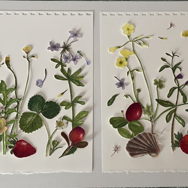
sheila y. commented on sheila y.'s Photo 1 year, 1 month ago
Thank you for the specific feedback, Doug. You hit it with the succulent and sprinkling a few more small bits around. I’ll work on it! -
Doug Milne commented on sheila y.'s Photo 1 year, 1 month ago
Hi Sheila! Great to see your work again! I love the colors and the open quality of the composition! The one piece that sticks out to me is the succulent on the very left side (of the left page). It seems too crowded there and is the one spot that differs from the light feel of the rest of the piece. Maybe moving it over to the left a little would…[Read more]
-
Doug Milne commented on Denise Harris's Photo 1 year, 1 month ago
Greetings Denise! You have done a really wonderful job illustrating the colors and textures! I am struggling to tell where your light source is coming from. Especially on the left side, at the very end where it curls up and the large curl to it’s right, which sticks up could both use some shadow toning which would help clarify it visually. You a…[Read more]
-
Doug Milne commented on Daniel Walsh's Photo 1 year, 1 month ago
Hi Daniel- you have been busy! This is a nice study page. Acorn nuts can be shiny. The shinier a subject is the whiter the highlight should be. With the inverted view of the cap on the top right I would suggest putting in some dark toning on the left side fading to a highlight on the right so you are conveying that it is an empty well. For fun,…[Read more]
-
Doug Milne commented on Daniel Walsh's Photo 1 year, 1 month ago
Hi Daniel- this is very nice! Strong bright colors and the placement of the highlight is great. You have a range of tones, but you could go even darker on the right side and bottom (transitioning lighter as you move toward the highlight) to emphasize the fruits form. With the cast shadow, it should be the darkest at the edge of the subject and…[Read more]
-
Doug Milne commented on Daniel Walsh's Photo 1 year, 1 month ago
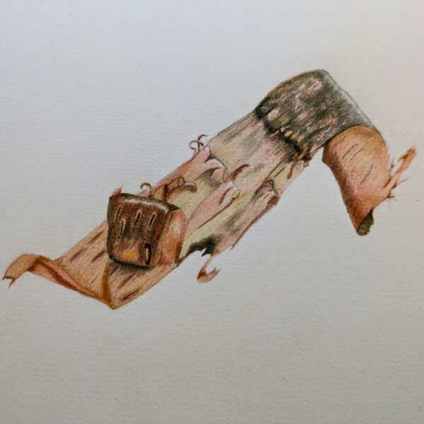
Hi Daniel- I love the colors and patterning on your branch segments. What medium are you using? A couple of things to consider. I see you have cast shadows, but the branches are missing the arc toning (highlight thru shadows) we discussed on your first post. Arc toning will give the branches form. All though beautiful, right now the branches are…[Read more]
-
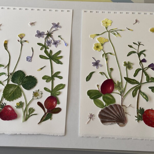
sheila y. commented on sheila y.'s Photo 1 year, 1 month ago
I’m working on this. Nothing glued yet. Thinking of a few more petals in the air and on the ground. Thoughts?
-
sheila y. added a Photo 1 year, 1 month ago
-
I’m working on this. Nothing glued yet. Thinking of a few more petals in the air and on the ground. Thoughts?
-
Hi Sheila! Great to see your work again! I love the colors and the open quality of the composition! The one piece that sticks out to me is the succulent on the very left side (of the left page). It seems too crowded there and is the one spot that differs from the light feel of the rest of the piece. Maybe moving it over to the left a little would…[Read more]
-
Thank you for the specific feedback, Doug. You hit it with the succulent and sprinkling a few more small bits around. I’ll work on it!
-
-
Denise Harris added a Photo 1 year, 1 month ago
-
Greetings Denise! You have done a really wonderful job illustrating the colors and textures! I am struggling to tell where your light source is coming from. Especially on the left side, at the very end where it curls up and the large curl to it’s right, which sticks up could both use some shadow toning which would help clarify it visually. You a…[Read more]
-
- Load More