Activity
-

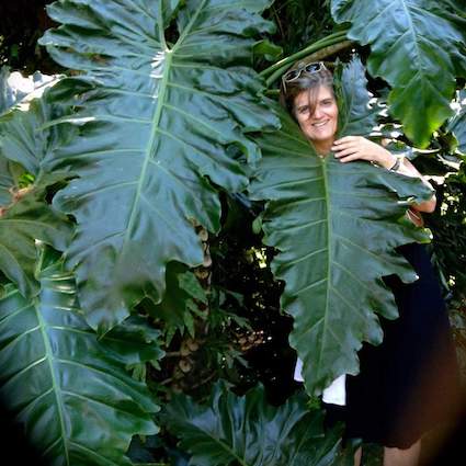
Dolores Duran-Cefalu added a Photo 4 years, 1 month ago
-
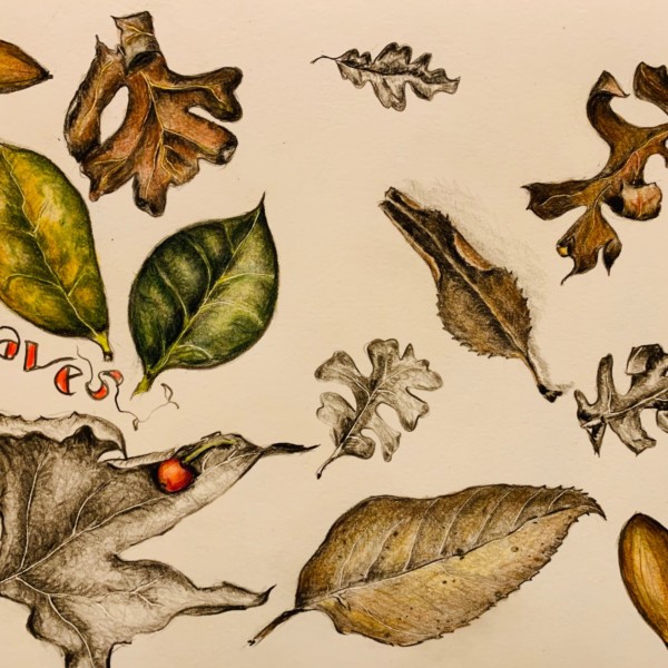
Dolores Duran-Cefalu added a Photo 4 years, 1 month ago
-

Wayto let your style shine through. 🙂
-
-
Dolores Duran-Cefalu added a Photo 4 years, 1 month ago
-
Dancing with the leaves. Great page, Dolores. My eye really dances around and the muted colour palette with pops of hot colour is great. The light/glow on the leaves is great too.
-
-
Doug Milne commented on Karen Minden's Photo 4 years, 1 month ago
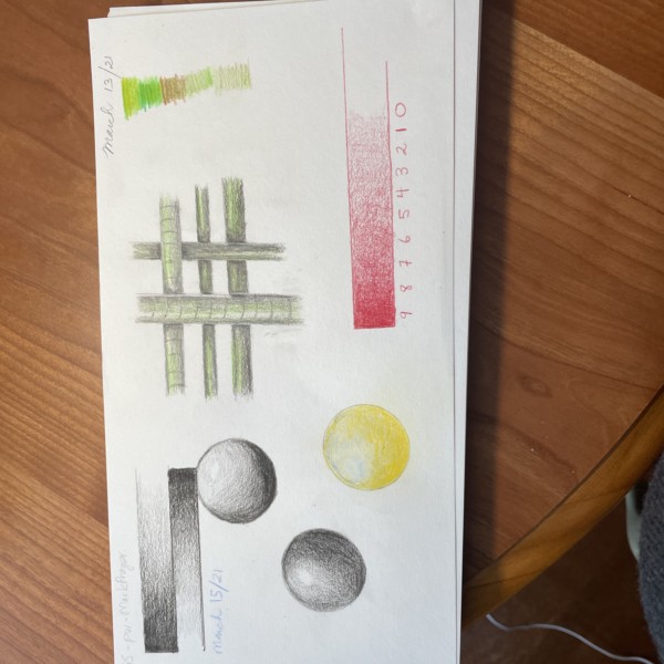
Hi Karen- you have been busy! On the tone bar – #1 should be lighter. There is too much of a jump from 0 to 1. Then you can also adjust the other lighter tones. Right now there is not much difference 1, 2 and 3.
On the spheres you want to have the same range of tones that you did on the tone bar. Lighten the area surrounding the highlight and…[Read more] -
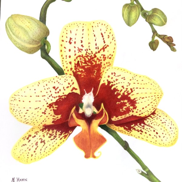
Doug Milne commented on Margaret Hahn's Photo 4 years, 1 month ago
Hi Margaret- the colors are so nice and saturated. The whole fruit has great form and weight to it. I don’t see much texture on the rind. Was it mostly smooth? The right side of the top portion of your cut segment could use toning to convey it would be in shadow. The flowers and stem don’t have a cast shadow. I would either add a cast shadow for…[Read more]
-
Mary added a Photo 4 years, 1 month ago
-
Lovely, Mary.
-
-
Doug Milne commented on Ishbel Galloway's Photo 4 years, 1 month ago
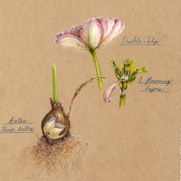
Hi Ishbel- the roots, papery bulb and leaves are great!!!! I feel like you could add more toning to the flowers themselves to enhance the dimension and details. Wonderful!
-
Doug Milne commented on Ishbel Galloway's Photo 4 years, 1 month ago
Beautiful Ishbel- it is a very pleasing view and the pear has great form! The skin texture is amazing!
-
Doug Milne commented on Colleen Brannen's Photo 4 years, 1 month ago
Hi Colleen- it does not look muddied to me. This pear has a lot of personality! The colors are very pleasingly bright and crisp and the texture looks great! The aspect that bothers me are the highlights. Instead of a series of white dots I would expect to see some lighter toning surrounding the current dots of white. I would also add a little…[Read more]
-
Doug Milne commented on Lesley Roos's Photo 4 years, 1 month ago
Hi Lesley- the texture of the rind on the unpeeled orange is great!!!!! I feel like I would like to see some texture on the half peeled rind. The fruit segments look juicy! The flower could use some toning on the petal overlaps some appropriate shading in the well. Nice job!!!!
-
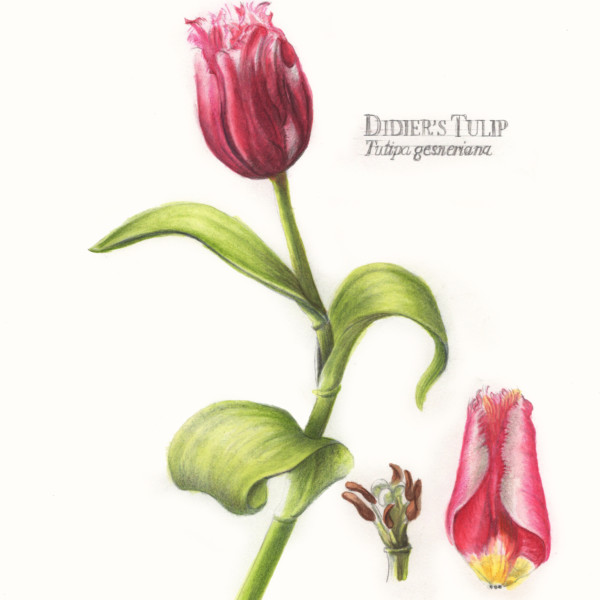
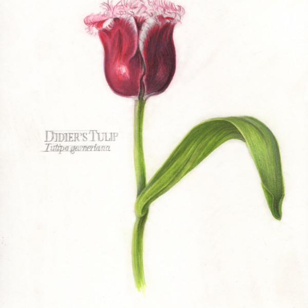
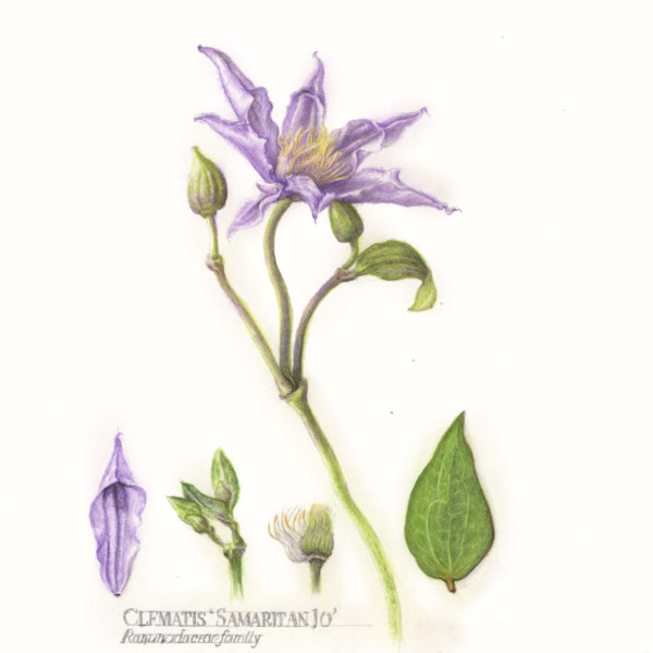
Camille Maravegias added 3 Photos 4 years, 1 month ago
-
WOW lovely
-
Hi Camille, You have such a way with flowers! Beautiful! I love the petals curling on themselves! The only thing that bothers me at all is the position of the smaller bud. I sort of wish it were positioned further away from the flower.
-
Another beauty. Love the lettering!
-
I think my favorite thing about this is the wonky stem with leaves shooting out in all directions. Oh, and also the beautiful curling petal.
-
Hi Katy
Thanks for your comments.They are always appreciated. And yes, that buds could have been further away. I was going for practicing overlapping and shaded. However, after it was done it seems awkward. Camille -
I mean, that folded petal knocks me off my feet! Breathtaking. Your writing is also fantastic. Sharp. Well done. Reads like an old hand coloured engraving.
-
Stunner. You on a role!
-
-
Margaret Hahn added a Photo 4 years, 1 month ago
-
Beautiful portrait, Margaret. It glows! You probably already addressed it with other feedback, but I want to see some toning on the petals.
-
-
Maureen Doram added a Photo 4 years, 1 month ago
-
The petals glow so well on the Kraft, Maureen! The roots look great. The shine on the bulb is awesome and you are getting such great colour saturation. Harmonious colour palette too – very pleasing.
-
-

Wendy Hollender commented on Wendy Hollender's Photo 4 years, 1 month ago
@MargaretHahn orchid structure
-
Wendy Hollender commented on sara stauffer's Photo 4 years, 1 month ago
Looking good Sara. I am starting a perpetual journal too. Have started a few entries and when I get it put together I will post some too. Yours is looking great.
-
Margaret Hahn commented on Ingrid Schenk's Photo 4 years, 1 month ago
Love how you did the background!
-
Karen Minden added a Photo 4 years, 1 month ago
-
Hi Karen- you have been busy! On the tone bar – #1 should be lighter. There is too much of a jump from 0 to 1. Then you can also adjust the other lighter tones. Right now there is not much difference 1, 2 and 3. On the spheres you want to have the same range of tones that you did on the tone bar. Lighten the area surrounding the highlight and work…[Read more]
-
-
Karen Minden added a Photo 4 years, 1 month ago
-
Hi Karen! How do you feel about a bit of light pink watercolour? Keep using those sharpened pencils to follow those contour lines that this petal clearly shows.
-
thank you Sam. I will try it. How do you get white contour lines? Leave blank? Embossing tool? Feathering? I can’t quite figure it out.
-
-
Margaret Hahn added a Photo 4 years, 1 month ago
-
Hi Margaret- the colors are so nice and saturated. The whole fruit has great form and weight to it. I don’t see much texture on the rind. Was it mostly smooth? The right side of the top portion of your cut segment could use toning to convey it would be in shadow. The flowers and stem don’t have a cast shadow. I would either add a cast shadow for…[Read more]
-
-

Ishbel Galloway added a Photo 4 years, 1 month ago
-
Hi Ishbel- the roots, papery bulb and leaves are great!!!! I feel like you could add more toning to the flowers themselves to enhance the dimension and details. Wonderful!
-
This is so lovely!
-
- Load More
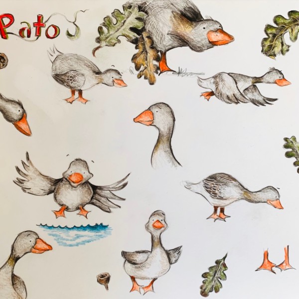


Andale Pato! Looking good Dolores! I dig that water too – nice negative space/movement in it 🙂 Ese pato parece tan feliz.
Si Sam! Gracias!