Activity
-
Renata commented on Renata's Photo 4 years, 3 months ago
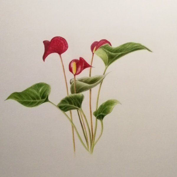
Having a hard time with the leaves again!!
-
Renata added a Photo 4 years, 3 months ago
-
Having a hard time with the leaves again!!
-

Hi Renata- the colors are so rich and saturated – beautiful!!!! You are real close with the leaves. I would look at the veining again on a couple of them. For example – the leaf on the left has a “V” created by veins that are highlighted and it doesn’t read well. The inside of the leaf on the top right doesn’t have the same nice finish and details…[Read more]
-
Thanks so much, @doug-milne! You have very sharp eyes. I will re-work the leaf on the left and get rid of that V, which was supposed be a light reflection but doesn’t really work. The one on the top right is more difficult though, because I used the embossing tool there and it really didn’t work. I will try to cover it though – will report. Thanks…[Read more]
-
-
Michaeline Gleasman commented on Michaeline Gleasman's Photo 4 years, 3 months ago
Fern and Sam, thank you for your your comments. I love the idea of continuing the shadow. Also… I’ll have to experiment with the grisaille colors as well. Wonderful feedback from you both:)
-
Renata commented on Renata's Photo 4 years, 3 months ago
Thank you @vern . I will try this again and follow your advice. I am actually looking forward to the lettering workshop so I am saving my drawings for them!
-
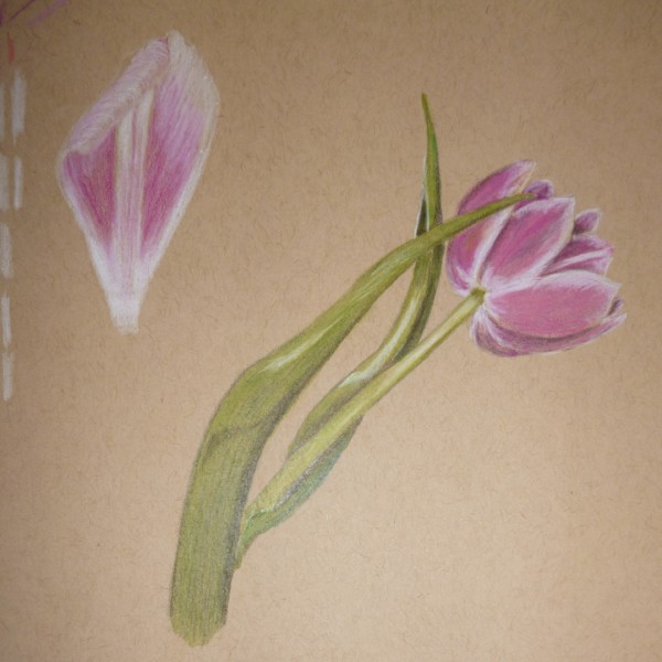
Renata commented on Renata's Photo 4 years, 3 months ago
Thanks, @sheilayoshpe and @vern ! I will try this flower again. I found it difficult to produce the full range, I do need to try again.
-
Renata commented on Renata's Photo 4 years, 3 months ago
Thanks @sheilayoshpe! I think I started by defining the lighter areas of the ruffles and edges of the petals. And then I used the darker yellows and oranges to produce the shadows and then merged them with the lighter yellows. So much fun. Perhaps we should make notes about what we do because now I can’t really remember very well anymore!
-
Renata commented on Renata's Photo 4 years, 3 months ago
Thanks, Sam. I will darken the back petal a little bit and see what happens.
-

Sam McWilliams commented on Bettina's Photo 4 years, 3 months ago
For a good photo, I find if I can put my drawing in indirect natural light that is the best. For example I’ll put mine on the floor and open the door when it’s light outside. My drawing isn’t in the direct sunlight but is receiving the overall natural light.
-
Sam McWilliams commented on sheila y.'s Photo 4 years, 3 months ago
The dried out one is def my fav. So fun to look at – swirl around with. I find myself wanting more saturation in the top left pink one. And the red and yellow. I think the standard answer right now is, Keep Going! As we know you will. 🙂
-
Sam McWilliams commented on Rita Haft's Photo 4 years, 3 months ago
I love it, Rita. 🙂
-
Sam McWilliams commented on Renata's Photo 4 years, 3 months ago
Hi Renata – my guess is what Katy suggested won’t go as dark as the corolla recess. Just enough to push it back a bit.
-
Sam McWilliams commented on Michaeline Gleasman's Photo 4 years, 3 months ago
Hey, great to meet this here colourful character. I agree with Vern’s comments and like the idea of seeing how the shadow continues under the tap root.
-
Sam McWilliams commented on Michaeline Gleasman's Photo 4 years, 3 months ago
It can also be fun, Michaeline, to pull one flower petal out and do a study/painting of it on the same page.
-
Sam McWilliams commented on Karen Minden's Photo 4 years, 3 months ago
Such a tough view to do, Karen. Watch out that the reflective highlight isn’t too severe or it makes the form look “squished”. The white is a bit stark on the top. Looks like very good practice to me in studying and trying out seeing and layering colors. Good job.
-
Sam McWilliams commented on Bettina's Photo 4 years, 3 months ago
Yellow is challenging and you are succeeding! Nice saturation of yellow here. You can try using ochres for toning – looks like maybe you have. And use yellow’s complimentary color of purple very lightly for some shading and darker areas. Also the earth green can be good for shading/grisaille sometimes. Do some practice tone bars. 🙂
-
Sam McWilliams commented on Lesley Roos's Photo 4 years, 3 months ago
Yes, Lesley, I like how I can feel the thick, rubberiness of this leaf.
-
Sam McWilliams commented on Pam's Photo 4 years, 3 months ago
Today I am really appreciating the lighter orange glow/midtones that form a beautiful circle around the highlight. Expertly shaded.
-
Bettina commented on Bettina's Photo 4 years, 3 months ago
Hi Vern, thank you for your comments. I add darks with dark sepie in the flower the stem inside the leave and slo in the leaves. To make a good photo is a problem…
-
Bettina added a Photo 4 years, 3 months ago
-
Hi Vern, thank you for your comments. I add darks with dark sepie in the flower the stem inside the leave and slo in the leaves. To make a good photo is a problem…
-
For a good photo, I find if I can put my drawing in indirect natural light that is the best. For example I’ll put mine on the floor and open the door when it’s light outside. My drawing isn’t in the direct sunlight but is receiving the overall natural light.
-
That’s true. But the last days its always rainy an stormy. I will try it next time.
-
-

sheila y. commented on Renata's Photo 4 years, 3 months ago
This is beautiful! Yellows are so hard. What did you do to get them? I love the color bar below, too. Like fabric.
- Load More