Activity
-

Sam McWilliams commented on Camille Maravegias's Photo 4 years, 6 months ago
Beautiful, as usual, Camille. I especially appreciate the back of the leaf – the softness, the muted green and the reddish tones. Just lovely. I could look at it for a long time.
-
Sam McWilliams commented on Camille Maravegias's Photo 4 years, 6 months ago
Hi Camille, I really love this drawing. It has a lovely orange glow and I like how it turns and opens up towards something. It’s an inviting and dynamic composition.
-

Doug Milne commented on Yahya Elsouly's Photo 4 years, 6 months ago
Hi Yahya- I don’t see the range of tones on your branches that would illustrate they are long cylinders. Having tones from dark to light with an appropriately placed highlight will convey the branches form. I would lighten the cast shadows. Also review the shadow cast by the thinner branch. I think adding the toning will make a big difference!
-
Doug Milne commented on Mary's Photo 4 years, 6 months ago
Hi Mary- you have a really good range of tones in the squares. Take your time and work on getting nice even, smooth toning with the color pencils. You should not be able to see pencil marks. I think your #9 color square could go even blacker. Even though some of your watercolor squares are not uniform the range of tones is really good!
-
Doug Milne commented on Mary's Photo 4 years, 6 months ago
Your leaves are nicely rendered Mary! You could go even thinner with the secondary veins and also on the center vein as it tapers to the top. Something about the positions of the veins on the backside view don’t jive with their position on the front view unless you used different leaves. You have a really nice smooth toning technique!
-
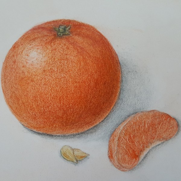
Doug Milne commented on Marina Segalovitch's Photo 4 years, 6 months ago
Your leaves are really nice Marina! Overall you have nice smooth toning! On the tangerine I see a lot of one tone and it would benefit from adding a range of tones. The reflected highlight seems too long and too much of a thin line. Look at the cast shadows again. The shadow on the right looks out of place. Shadows don’t have to be literal, but s…[Read more]
-
Doug Milne commented on Ingrid Schenk's Photo 4 years, 6 months ago
Beautiful colors Ingrid! I think some of the flowers (especially the large one and the one in the middle) could benefit from adding more toning. Adding some darker toning at the overlaps and in appropriate areas around the stamens would add clarity and emphasis. I think adding some toning to the leaves would also give them some needed variation…[Read more]
-
Doug Milne commented on Colleen Brannen's Photo 4 years, 6 months ago
The colors are beautiful Colleen! It looks like it is mostly watercolor, which gives a nice interpretation of the skin. The left hand edge looks like an outline and I would soften that a little and I would a little dark toning along the right hand side. The cast shadow should angle back rather than straight across. Nice job!!!
-
Elizabeth Gardner commented on Colleen Brannen's Photo 4 years, 6 months ago
I love the colors and shadowing on this! Beautiful Pear!
-
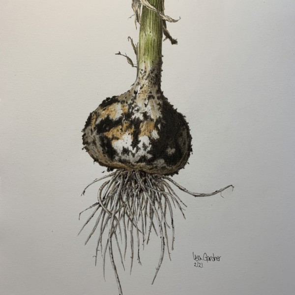
Elizabeth Gardner added a Photo 4 years, 6 months ago
-
Love it!
-
incredible!!!!!
-
-
-
Beautiful Elizabeth! Ready to walk or dance itself right off the page. Congrats on a great drawing.
-
-
Mary commented on Mary's Photo 4 years, 6 months ago
Maureen, Thanks for recognizing the beginner work and encouraging me. So sweet of you to take the time to comment.
-
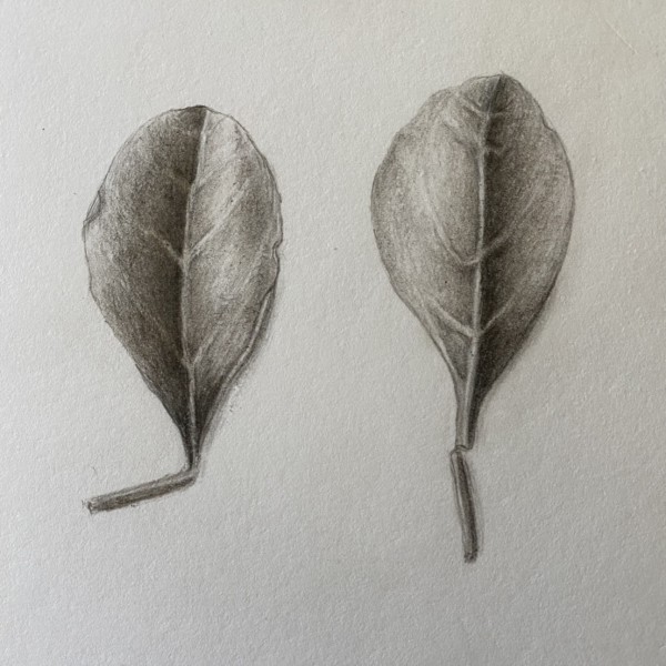
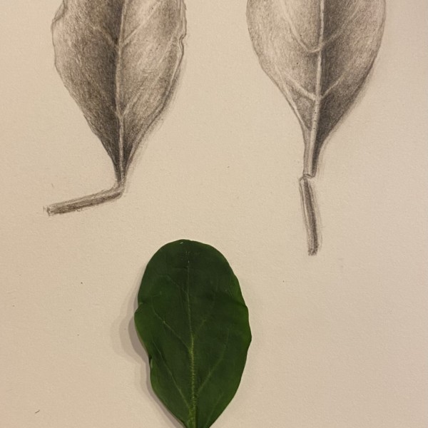
Mary added a Photo 4 years, 6 months ago
-
Yahya Elsouly added a Photo 4 years, 6 months ago
-
Hi Yahya- I don’t see the range of tones on your branches that would illustrate they are long cylinders. Having tones from dark to light with an appropriately placed highlight will convey the branches form. I would lighten the cast shadows. Also review the shadow cast by the thinner branch. I think adding the toning will make a big difference!
-
Thanks a lot I added toned as I could and lighten shadows what do you think?
-
-
Mary added a Photo 4 years, 6 months ago
-
Hi Mary- you have a really good range of tones in the squares. Take your time and work on getting nice even, smooth toning with the color pencils. You should not be able to see pencil marks. I think your #9 color square could go even blacker. Even though some of your watercolor squares are not uniform the range of tones is really good!
-
-
Mary commented on Wendy Kleinman's Photo 4 years, 6 months ago
Congratulations on such a constant feel in form and texture in the three stages. I can really tell that its the same apple. Wow! something to aspire to.
-
Mary added a Photo 4 years, 6 months ago
-
Your leaves are nicely rendered Mary! You could go even thinner with the secondary veins and also on the center vein as it tapers to the top. Something about the positions of the veins on the backside view don’t jive with their position on the front view unless you used different leaves. You have a really nice smooth toning technique!
-
@doug-milne So funny that I can go even thinner on the secondary leaves. I evne had that in my mind as I was drawing:) I did have to get another leaf for the front view. Thank you for your help.
-
-
Colleen Brannen added a Photo 4 years, 7 months ago
-
I love the colors and shadowing on this! Beautiful Pear!
-
The colors are beautiful Colleen! It looks like it is mostly watercolor, which gives a nice interpretation of the skin. The left hand edge looks like an outline and I would soften that a little and I would a little dark toning along the right hand side. The cast shadow should angle back rather than straight across. Nice job!!!
-
-
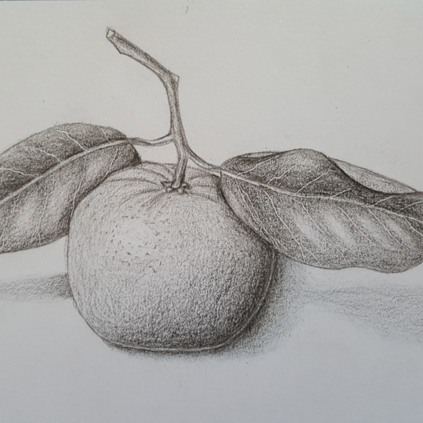
Marina Segalovitch added a Photo 4 years, 7 months ago
-
Your leaves are really nice Marina! Overall you have nice smooth toning! On the tangerine I see a lot of one tone and it would benefit from adding a range of tones. The reflected highlight seems too long and too much of a thin line. Look at the cast shadows again. The shadow on the right looks out of place. Shadows don’t have to be literal, but s…[Read more]
-
-
Marina Segalovitch added a Photo 4 years, 7 months ago
- Load More