Activity
-

Yahya Elsouly added a Photo 4 years, 5 months ago
-
Lesley Roos added a Photo 4 years, 5 months ago
-
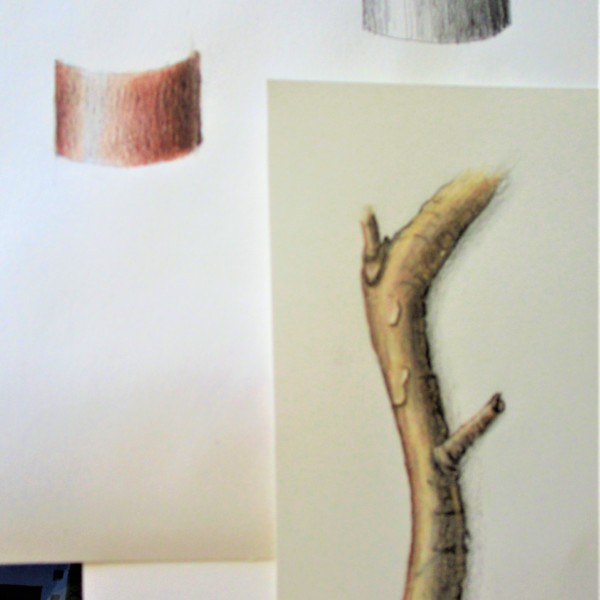
Hi Lesley- the arc tone bar in color is very well done and has a nice range of tones! You are off to a good start with the branch. The left side looks too much like an outline and I would lighten it a little. It is also redder in color than the rest of the branch and throws it off. The toning to the right of the highlight looks very uniform. It…[Read more]
-
-

Sam McWilliams commented on Janegold's Photo 4 years, 5 months ago
Oh I love this, Jane. What a standout. The curves on the white petals, the overall gracefulness, and the star shapes below. Beautiful.
-
Sam McWilliams commented on Mary Vinci's Photo 4 years, 5 months ago
Great practice, Mary. Work on your 0,1,23 transitions. 0 to 1 should be so subtle. The practice will pay off. Happy toning.
-
Sam McWilliams commented on Jill Amadei's Photo 4 years, 5 months ago
Haha, YES! Some darker red violet in places – and even a very sharpened dark sepia in key areas? I feel perhaps the Interlon long 3/0 417 paint brush is going to enter your life soon – so good for details with watercolour (more paint, less water…) I love this, Jill. @vern is going to love this.
-
Sam McWilliams commented on Amity VanDoren's Photo 4 years, 5 months ago
Water-colour will remove the unsaturated texture of the paper showing through.
-
Sam McWilliams commented on Amity VanDoren's Photo 4 years, 5 months ago
These look great. Allow yourself to try a darker green grisaille in your stems sometimes even if you don’t “see” it, just to up the value range and see if you like the effect. It could give more form and volume to the stems, and the darks help the lighter yellows read more bright. Don’t forget to keep some bright highlights – again, even if you…[Read more]
-
Sam McWilliams commented on Amity VanDoren's Photo 4 years, 5 months ago
Spiky forms are so enticing and so demanding of the artist!
-
Sam McWilliams commented on Amity VanDoren's Photo 4 years, 5 months ago
Did you try layering watercolour and colour pencil? Seems like the best way to get colour saturation in the red violet, burgundy, magenta and deep red tones.
-
Sam McWilliams commented on Marina Segalovitch's Photo 4 years, 5 months ago
Nice Marina. From where the highlight is located, I’d think the cast shadow would be up and away to the right from the orange?
-
Sam McWilliams commented on Pam's Photo 4 years, 5 months ago
Beautiful, Pam. Are you enjoying the Micron drawing?
-
Sam McWilliams commented on Jayne Atwood's Photo 4 years, 5 months ago
Stunner.
-
Sam McWilliams commented on Jayne Atwood's Photo 4 years, 5 months ago
Beautiful. Maybe even darker in some Vs and Overlap areas. Or lift some highlights in the purple petals.
-
Sam McWilliams commented on Jayne Atwood's Photo 4 years, 5 months ago
Again, great engagement thru movement and colour. If you like, you can think about your range of values – you could add more darks, and think about leaving some lighter highlights.
-
Sam McWilliams commented on Jayne Atwood's Photo 4 years, 5 months ago
Me too – great colour palette.
-
Sam McWilliams commented on Jayne Atwood's Photo 4 years, 5 months ago
Lovely, Jane. So much fun engaging with this page and its colour and movement.
-
Sam McWilliams commented on Pam's Photo 4 years, 5 months ago
I can hire you as a tattoo artist whenever you’re ready. 🙂 dot, dot , dot
-
Sam McWilliams commented on Pam's Photo 4 years, 5 months ago
So bright and luminous! Just glows! I love it. Better than my morning “Happy Lamp”. 🙂
-
Sam McWilliams commented on Dolores Duran-Cefalu's Photo 4 years, 5 months ago
Yes! Looking forward to reading the book. 🙂 Wonderful.
-
Sam McWilliams commented on Dolores Duran-Cefalu's Photo 4 years, 5 months ago
Wow Dolores!!! What great description! I think you achieved some oneness with these cones. 🙂 On the brown cone (which is my fav) @doug-milne might mean dark toning on the right side to tone the overall form of the whole cone. So that it turns back in space and volume away from our eye. Think about the highlight on the whole large shape, and shade side.
- Load More
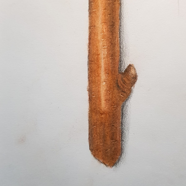
I know it’s not perfect but this my third try.
Very nice Yahya! Your color selection and saturation are really good!! I see a lot of mid-range toning and I think it would help to add more range of tones. Also think about elongating the highlight. Be aware that when you put in the horizontal lines that indicate details on the bark they have to curve when they near the outside edges. This will…[Read more]