Activity
-

Mary Vinci added a Photo 4 years, 4 months ago
-
Mary Vinci added a Photo 4 years, 4 months ago
-
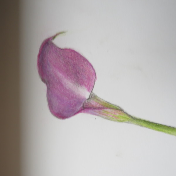
You are getting a nice dark. And your toning is coming along.
-
-
Mary Vinci added a Photo 4 years, 4 months ago
-

Great practice, Mary. Work on your 0,1,23 transitions. 0 to 1 should be so subtle. The practice will pay off. Happy toning.
-
Thank you! The toning is definitely good hand and eye practice. Appreciate your comments.
-
-

Jill Amadei commented on Jill Amadei's Photo 4 years, 4 months ago
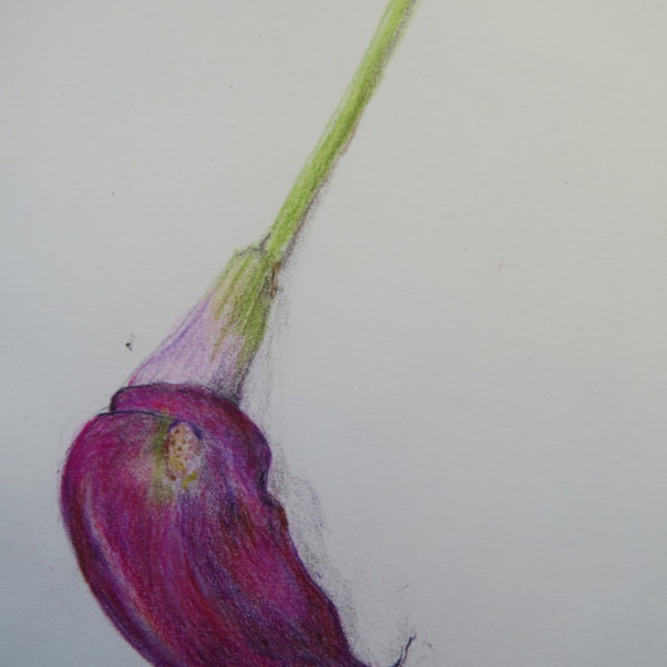
I don’t think I’m totally finished with this. Would appreciate any feedback. Thank you! 🙂
-
Jill Amadei added a Photo 4 years, 4 months ago
-
I don’t think I’m totally finished with this. Would appreciate any feedback. Thank you! 🙂
-
Haha, YES! Some darker red violet in places – and even a very sharpened dark sepia in key areas? I feel perhaps the Interlon long 3/0 417 paint brush is going to enter your life soon – so good for details with watercolour (more paint, less water…) I love this, Jill. @vern is going to love this.
-
Thanks so much @sam-mcwilliams for your helpful tips as always! I appreciate the suggestion to add some darkness. It really helped to make it stand out more. I have also been trying out the paintbrush you suggested and I like it a lot! (:
-
-
Amity VanDoren commented on Amity VanDoren's Photo 4 years, 4 months ago
Another attempt with more saturation – not so successful….
-
Amity VanDoren added a Photo 4 years, 4 months ago
-
Another attempt with more saturation – not so successful….
-
Water-colour will remove the unsaturated texture of the paper showing through.
-
Brilliant! Of course.
-
-
Amity VanDoren commented on Amity VanDoren's Photo 4 years, 4 months ago
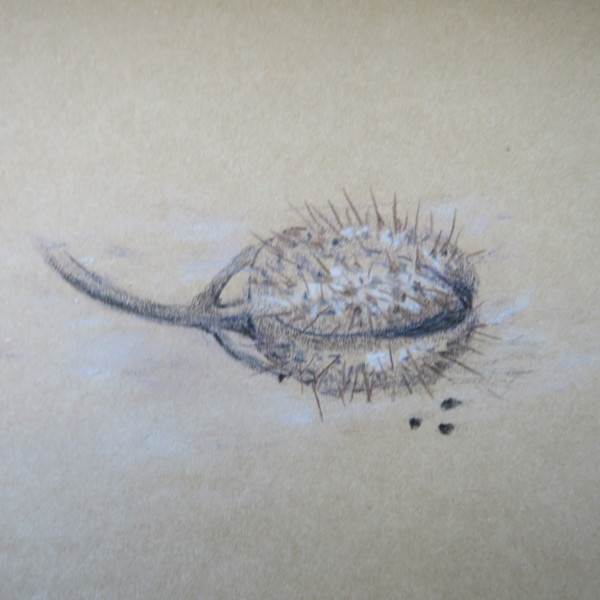
This was a blast! Why am I so attracted to spiky forms?
-
Amity VanDoren commented on Amity VanDoren's Photo 4 years, 4 months ago
One of the challenges here was to get color saturation without having it look like wax….lots of other challenges, too , of course.
-
Amity VanDoren commented on Amity VanDoren's Photo 4 years, 4 months ago
OK, this was fun, but pretty impossible.. The color of this trumpet is not that different from the petals, but it shows up a lot. I think it is the transparency part that is really hard to do.
-
Amity VanDoren commented on Amity VanDoren's Photo 4 years, 4 months ago
Thanks for your comment, Katy – tried to redden the shade side and tone down the “dots” with water color
-
Amity VanDoren added 5 Photos 4 years, 4 months ago
-
Thanks for your comment, Katy – tried to redden the shade side and tone down the “dots” with water color
-
OK, this was fun, but pretty impossible.. The color of this trumpet is not that different from the petals, but it shows up a lot. I think it is the transparency part that is really hard to do.
-
One of the challenges here was to get color saturation without having it look like wax….lots of other challenges, too , of course.
-
This was a blast! Why am I so attracted to spiky forms?
-
Did you try layering watercolour and colour pencil? Seems like the best way to get colour saturation in the red violet, burgundy, magenta and deep red tones.
-
Spiky forms are so enticing and so demanding of the artist!
-
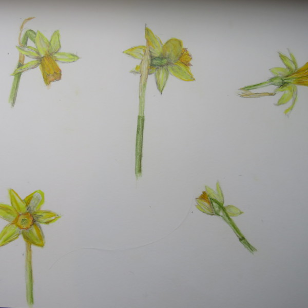
These look great. Allow yourself to try a darker green grisaille in your stems sometimes even if you don’t “see” it, just to up the value range and see if you like the effect. It could give more form and volume to the stems, and the darks help the lighter yellows read more bright. Don’t forget to keep some bright highlights – again, even if you…[Read more]
-
I will go back at this. I tend to mostly do the water color as a “base coat” Wendy had some helpful suggestions to take away the flatness in yesterday’s webinar. Again, it seems like I need to change my light source….
-
-
Dolores Duran-Cefalu commented on Jill Amadei's Photo 4 years, 4 months ago
WOWWWWW love it!!!
-
Dolores Duran-Cefalu commented on Dolores Duran-Cefalu's Photo 4 years, 4 months ago
Thanks! where do I put the dark toning, do you think? Kind of in general?
-
Dolores Duran-Cefalu commented on Pam's Photo 4 years, 4 months ago
WHOA its the most perfect happy little guy!
-
Dolores Duran-Cefalu commented on Jayne Atwood's Photo 4 years, 4 months ago
I love the color palette.
-
Dolores Duran-Cefalu commented on Jayne Atwood's Photo 4 years, 4 months ago
Wow I love this and especially the edges.
-

Pam commented on Pam's Photo 4 years, 4 months ago
Thanks!
-
Doug Milne commented on Jayne Atwood's Photo 4 years, 4 months ago
I love this view Jayne! I think you could use more dark toning at the overlaps and a range of tones on the blueberries to enhance their form. The leaves seem small in relationship to the size of the berries.
-
Doug Milne commented on Jayne Atwood's Photo 4 years, 4 months ago
Wow Jayne!!!! The colors, the textures, the composition!!!! Just amazing!!!!!!
- Load More


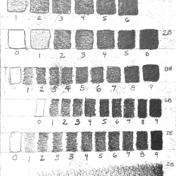


Nice rendering of a leaf and twig! What type of paper are you using? It seems a bit rough. Your tonal transitions would be easier on a smoother paper.
Thanks, I was using Strathmore 140lb cold press watercolor paper and a Windsor Newton 2B pencil since it was what I had. The paper definitely has a rough texture and the pencil applies heavy. But the draw botanicals Stonehenge aqua hot pressed sketchbook and Tombow H graphite pencil just arrived in the mail, so I will try it with those materials.…[Read more]