Activity
-

Doug Milne commented on Linda TALLEY's Photo 4 years, 5 months ago
Hi Linda- I love this modern composition! Doing a row of flower heads (in odd numbers) would be an amazing drawing!!!! You could go back in and strengthen the overlaps and “V” areas. Beautiful!!!!
-
Doug Milne commented on Linda TALLEY's Photo 4 years, 5 months ago
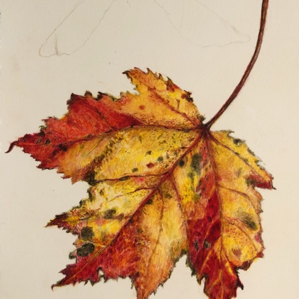
Hi Linda- these lotus pads look like bee hive sections! You did a super job with the toning and highlights!!!!
-
Doug Milne commented on Lucille Alice's Photo 4 years, 5 months ago
Nice Lucille! This is beautifully rendered! As you continue on with it I would be sure to add more dark toning where there are overlaps and those “V” areas.
-
Doug Milne commented on Bonnie Simandle's Photo 4 years, 5 months ago
Hi Bonnie- with your two spheres I see a lot of mid-range toning, but not the darker tones. The area surrounding your highlight could be lightened also. The reflected highlight appears to be on the table surface rather on the sphere/fruit. The cast shadow should be dark next to the subject and fade away as it moves away from the subject. The…[Read more]
-
Doug Milne commented on Bonnie Simandle's Photo 4 years, 5 months ago
Nice page Bonnie! Be careful when doing the toning on the cylinders. The areas flanking the highlight would be much lighter before transitioning in to the mid-range tones. The right side edge should be darker. The mushroom on the right reads a little flat because it is in need of a highlight and a range of tones to convey it’s form. You are off t…[Read more]
-
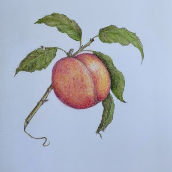
Doug Milne commented on Pam's Photo 4 years, 5 months ago
Beautiful Pam- you really captured that luminous smooth texture of a tomato!!!! Gorgeous!!!!!
-
Kayla Saager commented on Dolores Duran-Cefalu's Photo 4 years, 5 months ago
The little acorn caps ❤️
-
Marina Segalovitch added a Photo 4 years, 5 months ago
-

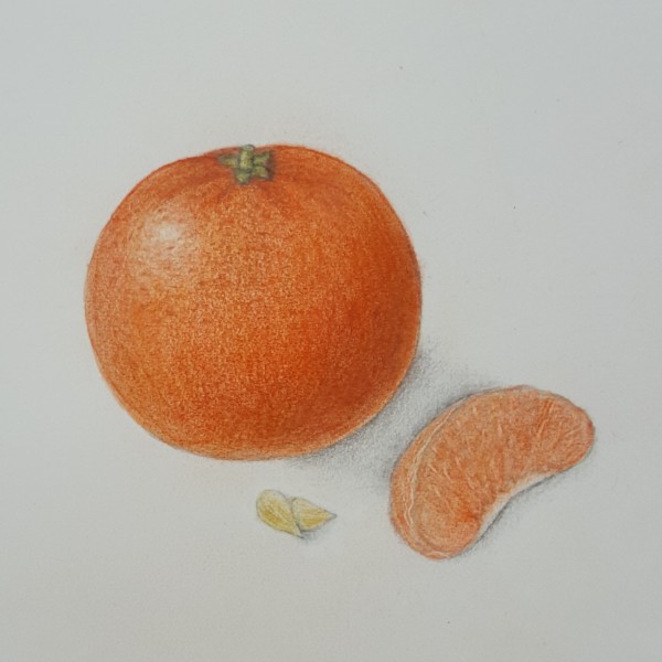
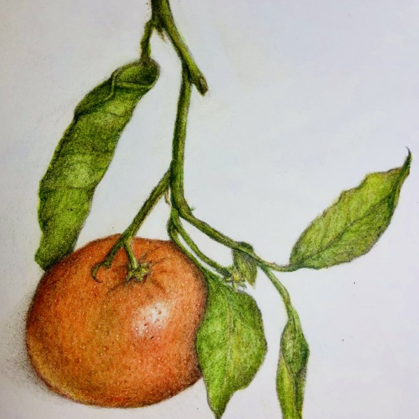
Nice Marina. From where the highlight is located, I’d think the cast shadow would be up and away to the right from the orange?
-
-

sheila y. commented on sheila y.'s Photo 4 years, 5 months ago
Thanks, Pam. We’ve got the same palette here. Right now, lots of white! -
sheila y. commented on sheila y.'s Photo 4 years, 5 months ago
That makes sense and it seems odd to leave brown when the petals or whatever are a different color, but like the effect I see people getting with more paper showing. -
-

Pam commented on Jayne Atwood's Photo 4 years, 5 months ago
Oooooh! I just love this.
-
Pam added a Photo 4 years, 5 months ago
-
Beautiful, Pam. Are you enjoying the Micron drawing?
-
-
Jayne Atwood added 10 Photos 4 years, 5 months ago
-
Oooooh! I just love this.
-
Wow Jayne!!!! The colors, the textures, the composition!!!! Just amazing!!!!!!
-
I love this view Jayne! I think you could use more dark toning at the overlaps and a range of tones on the blueberries to enhance their form. The leaves seem small in relationship to the size of the berries.
-
Wow I love this and especially the edges.
-
I love the color palette.
-
Lovely, Jane. So much fun engaging with this page and its colour and movement.
-
Me too – great colour palette.
-
Again, great engagement thru movement and colour. If you like, you can think about your range of values – you could add more darks, and think about leaving some lighter highlights.
-
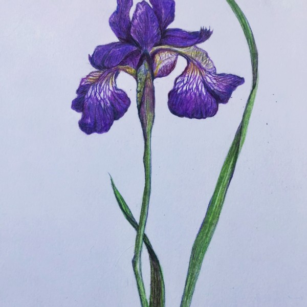
Beautiful. Maybe even darker in some Vs and Overlap areas. Or lift some highlights in the purple petals.
-
Stunner.
-
Thank you Sam! I appreciate your comments and will give it a try.
-
-
Pam commented on Pam's Photo 4 years, 5 months ago
I’ve been spending way too much time on homework, so it’s been a while since I’ve used my colored pencils. Felt great to use them again, but feeling rusty for sure.
-
Pam added a Photo 4 years, 5 months ago
-
I can hire you as a tattoo artist whenever you’re ready. 🙂 dot, dot , dot
-
-
Pam added a Photo 4 years, 5 months ago
-
I’ve been spending way too much time on homework, so it’s been a while since I’ve used my colored pencils. Felt great to use them again, but feeling rusty for sure.
-
Beautiful Pam- you really captured that luminous smooth texture of a tomato!!!! Gorgeous!!!!!
-
Thanks!
-
WHOA its the most perfect happy little guy!
-
Awww. Thanks. Fun to draw something colorful for a change 🙂
-
So bright and luminous! Just glows! I love it. Better than my morning “Happy Lamp”. 🙂
-
-
Pam commented on sheila y.'s Photo 4 years, 5 months ago
I love the bright colors. They really pop against the Kraft paper. We are surrounded by grays, browns, and a ton of white here 🙁
-
Pam commented on Dolores Duran-Cefalu's Photo 4 years, 5 months ago
Fantastic!
-

Jill Amadei commented on Elizabeth Simonson's Photo 4 years, 5 months ago
This is so pretty! Love the composition and colors.
- Load More