Activity
-

-
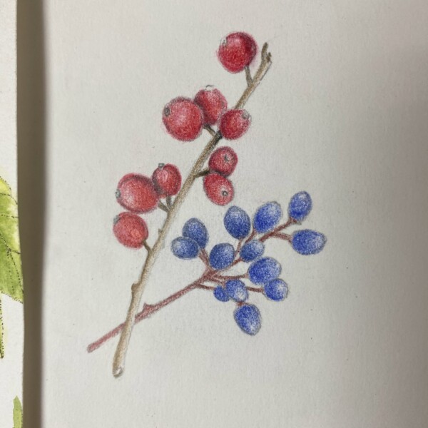
Faye Forman added a Photo 1 month ago
-
Wonderful colors Faye! There are a couple of areas to revisit. You could add more shadow toning where leaves overlap. The berries also need highlights and a range of dark toning. I see that the berries that are behind are slightly more saturated, but it is subtle. Because there are no highlights or range of tones the berries are too similar and in…[Read more]
-
Thank you Doug! I love the watercolor pencils and have noticed my tendency to go in too quickly (I am excited and going too fast) with the color rather than slowly building up. How would you suggest I add highlight in after the fact? I tried removing the saturation from the berries using plain water on the no. 6 Interlon brush, and also by adding…[Read more]
-
-
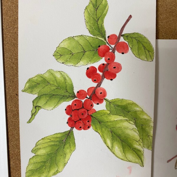
Faye Forman added a Photo 1 month ago
-
Welcome to the ArtFeed Faye! Good job on these berries! The rendering is nice as are the colors! My one comment would be consistency. A couple of the red berries could use more tonal range to enhance their form and a number are missing a highlight. Same goes for the blue berries. Pay attention to the placement of the highlights as some are not…[Read more]
-
Thank you so much Doug! I’m going to try the berries again as they emerge in the landscape, the next time around with a sharper light source to achieve an accurate and defined highlight.
-
-

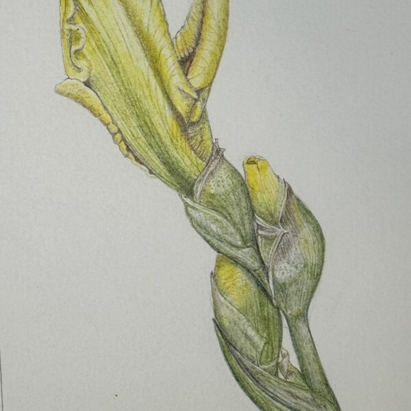
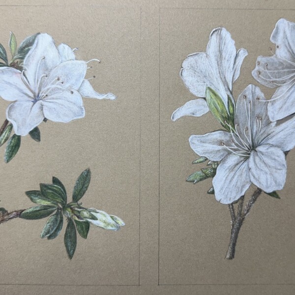
Ishbel Galloway added a Photo 1 month ago
-
Wow Ishbel! Gorgeous! You really captured the folds and details! The colors are so soft, but the image has such impact. I could look at this for hours! Bravo!
-
Thank you Doug!
-
-
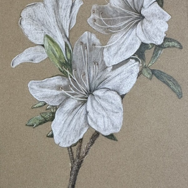
Ishbel Galloway added a Photo 1 month ago
-
Gorgeous.. I love the three angles of the blooms
-
You are mastering white flowers on Kraft paper Ishbel! The one spot I wonder about is the bottom right petal on the bottom flower. Unlike all the other petals it has a strong outline. That is causing a strong contrast which is demanding my attention and makes the petal look as if it is applied. Softening the two side edges of that petal will…[Read more]
-
Great comment Doug, thanks. This petal bothered me too. I think softening the edges has helped although it is still a bit odd.
-
-
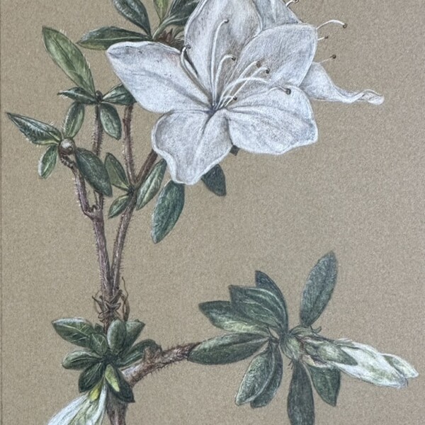
Ishbel Galloway added a Photo 1 month ago
-
Another white beauty Ishbel! The one area I would take another look at is the petal at the top that is seen between the two petals of the large flower in front of it. I think you need more dark in the “v” as you did in other spots. Visually, I wish the top edge of that petal in the back did not almost line up with the tip of the large petal to it’…[Read more]
-
-
-
Jill Gillard commented on Jill Gillard's Photo 1 month ago
Thank you Doug! I just purchased hot press watercolor paper and plan to do more work on that. I did use cold pressed and the texture is a little rough, for sure, to work with. Really appreciate the feedback on working in more of the dark and mid-range tones, now looking at it again I can see it is a bit ‘flat’. I will share more soon….Thank you! 🙂 -
Doug Milne commented on Jill Gillard's Photo 1 month ago
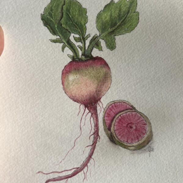
Welcome to the ArtFeed Jill! Really good job on this watermelon radish! It is nicely rendered and the colors are beautiful. Is this a hot press watercolor paper? It has a lot of texture, which we ideally do not want. You could use more dark and mid-range tones along the right side to emphasize the radish’s form. Looking forward to seeing more of your work!
-

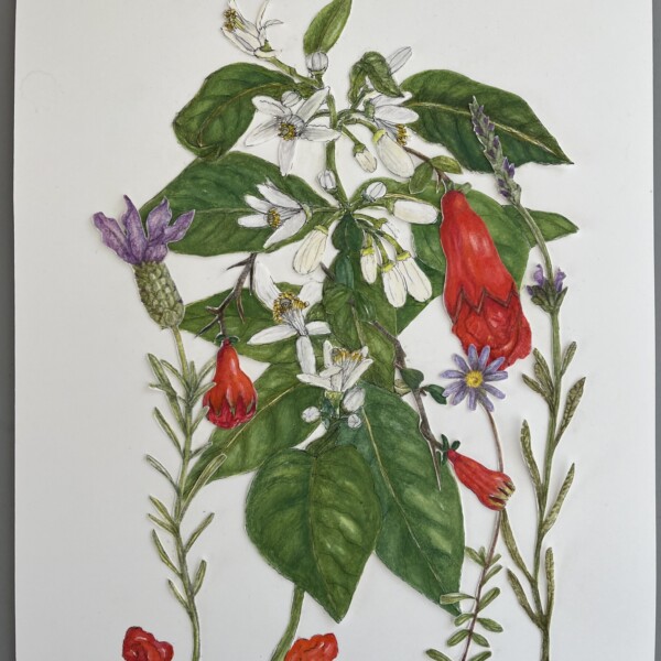
sheila y. commented on sheila y.'s Photo 1 month, 1 week ago
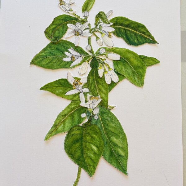
I found the largest pomegranate buds I’d ever seen and then I added them to the orange blossoms, along with some lavender. I’m wondering about the tops of the page.
-
sheila y. added a Photo 1 month, 1 week ago
-
I found the largest pomegranate buds I’d ever seen and then I added them to the orange blossoms, along with some lavender. I’m wondering about the tops of the page.
-
Hi Sheila! I thought I had responded to this piece, but I guess only in my mind. I am struggling with the composition. The top section seems busy, while the bottom area is dominated by the two leaves creating a strong inequity. Personally, rather than covering the two leaves with something I would rather see more exposure of the leaves in the…[Read more]
-
-
Jill Gillard commented on Jill Gillard's Photo 1 month, 1 week ago
I am a beginner. I am getting the feel of different paper, using the pencils and watercolor pencils etc. LOVE your book and artwork Wendy. Truly inspirational! Can’t wait to learn more from you. Plan to take your webinars.
-
Jill Gillard added a Photo 1 month, 1 week ago
-
I am a beginner. I am getting the feel of different paper, using the pencils and watercolor pencils etc. LOVE your book and artwork Wendy. Truly inspirational! Can’t wait to learn more from you. Plan to take your webinars.
-
Welcome to the ArtFeed Jill! Really good job on this watermelon radish! It is nicely rendered and the colors are beautiful. Is this a hot press watercolor paper? It has a lot of texture, which we ideally do not want. You could use more dark and mid-range tones along the right side to emphasize the radish’s form. Looking forward to seeing more of your work!
-
Thank you Doug! I just purchased hot press watercolor paper and plan to do more work on that. I did use cold pressed and the texture is a little rough, for sure, to work with. Really appreciate the feedback on working in more of the dark and mid-range tones, now looking at it again I can see it is a bit ‘flat’. I will share more soon….Thank you! 🙂
-
-
Hélène Chiasson commented on Hélène Chiasson's Photo 1 month, 2 weeks ago
Will go back and add more shadow!
-
Hélène Chiasson commented on Hélène Chiasson's Photo 1 month, 2 weeks ago
I did add more saturation to the petals. Thank you!
-
Hélène Chiasson commented on Hélène Chiasson's Photo 1 month, 2 weeks ago
Hi Doug, Thanks for your detailed comments. I understand the confusion. I drew this in nature and then from a photo and because the light was sunlight it came from the top left and it was very bright. I think that adding the name of the plant (indigenous Hawaiian, Beach Naupaka) is a thought though my writing is not great.
-
sheila y. commented on sheila y.'s Photo 1 month, 2 weeks ago
Pam, thanks for the feedback and suggestions on the webinar. I watched it yesterday. What do you think of the leaves now?
It’s hard for me to attend the webinar when I’m in Spain because of the time difference. 🙃 -
-
Pam, thanks for the feedback and suggestions on the webinar. I watched it yesterday. What do you think of the leaves now? It’s hard for me to attend the webinar when I’m in Spain because of the time difference. 🙃
-
-
Doug Milne commented on Hélène Chiasson's Photo 1 month, 2 weeks ago
Hi Helene- Love seeing all the different levels of the leaves on the stem! Great view! With so many crossing, overlapping leaves, there are a lot of opportunities to go back and add some shadow toning on the leaves. It will create more contrast and definition. I would also darken the patches of leaves you can see thru the flowers. It will make the…[Read more]
-
Doug Milne commented on Hélène Chiasson's Photo 1 month, 2 weeks ago
It looks like you added more color saturation to the flower petals Helene! Gorgeous!
-
Doug Milne commented on Hélène Chiasson's Photo 1 month, 2 weeks ago
Beautifully rendered and wonderful leaves Helene! There are a couple of areas on the leaves I would add more dark shadow tones for contrast and to emphasize which leaves are closer and which are further back. For example, with the leaf on the upper side of the branch, three leaves in from the right, the lower part of the leaf, below the crossing…[Read more]
- Load More
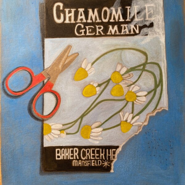
This is fun Faye! I love the torn edge of the tea packet!
Thanks Doug!