Activity
-

Teresa Goetz commented on Katy Lyness's Photo 4 years, 6 months ago
this is lovely…can you tell me which yellows you used? I’m struggling with the Kraft paper and the chalkiness of the yellows? (also working on lemons on Kraft) I’d appreciate it. Thanks, Katy.
-
Teresa Goetz commented on Teresa Goetz's Photo 4 years, 6 months ago
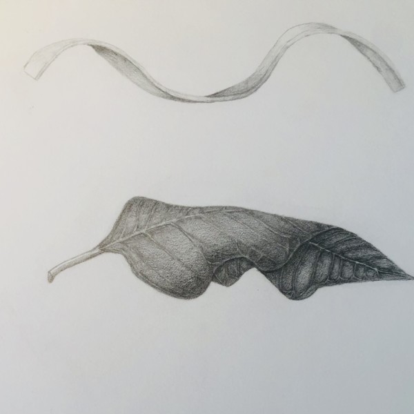
really struggle with getting the secondary veins fine enough, especially with pencil. This is a poinsettia, so very dark and thick veins, but I think still too thick?
-
Teresa Goetz commented on Teresa Goetz's Photo 4 years, 6 months ago
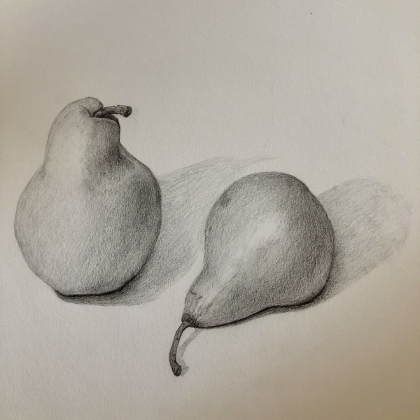
I realize the cast shadows are off…
-
Teresa Goetz commented on Teresa Goetz's Photo 4 years, 6 months ago
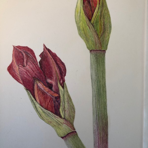
struggling getting the reds right. feels like I can’t saturate enough..
-
Teresa Goetz commented on Teresa Goetz's Photo 4 years, 6 months ago
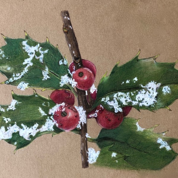
first attempt at snow — on any kind of paper. Wendy suggested adding some grey, which I’ve not done yet. Feels a little bright to me!
-
Teresa Goetz added a Photo 4 years, 6 months ago
-
I realize the cast shadows are off…
-
You could have the cast shadows fade out even more than you have them. The pears are beautifully rendered!
-
thanks, Doub/Vern. good idea re cast shadows…
-
-
Teresa Goetz added 2 Photos 4 years, 6 months ago
-
really struggle with getting the secondary veins fine enough, especially with pencil. This is a poinsettia, so very dark and thick veins, but I think still too thick?
-
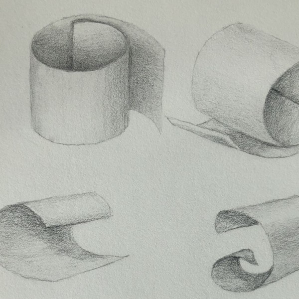
I used a copy of an assignment for a class…just the plain, outlined curled paper, then toned.
-
I just used a blank copy of an assignment – blank outlines of curled paper, then toned them. I’m not even sure if they’re right! just working it out…thanks vern
-
Poinsettias do have very prominent veins, but they still do taper somewhat from the primary center vein out to the edges. Your veins on the top that are the secondary veins to the left of the primary vein seem wider than their counterparts on the right side of your center vein. In some areas you have the secondary vein going directly up to the…[Read more]
-
I struggle so much with veins…I can’t seem to keep my point sharp enough or when I get a point, I then seem to layer too much on and it becomes shiny and harder to bo back. I’m working on my technique but you’re right re veins. the bane of my existence these days 🙂 I’ll keep working…thanks
-

Hi Teresa! We’re you in Laura Vogel’s class? I was there too!
-
YES! you were? we should connect…my email is terigoetz@gmail.com
-
-
-
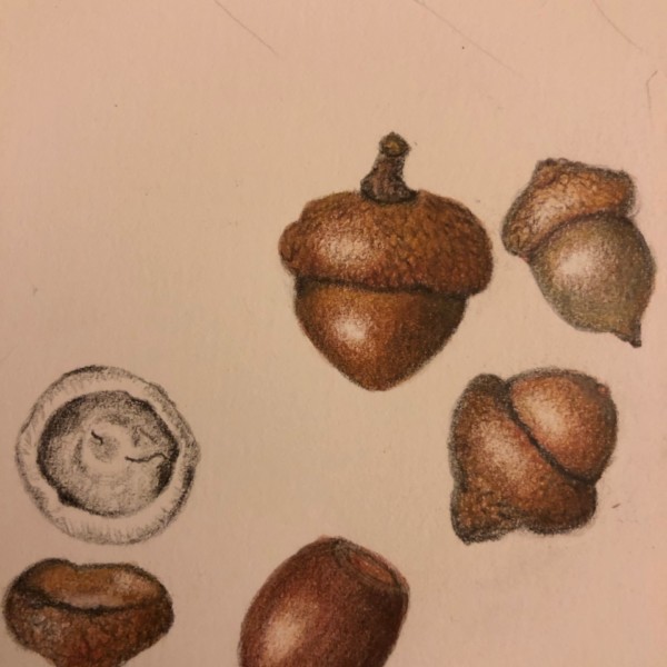
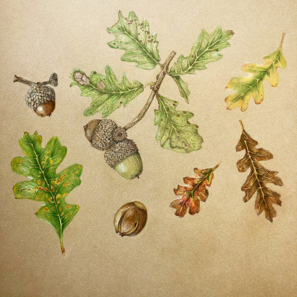
Great color selection and saturation Teresa! I don’t see a lot of detail in these caps especially compared to your other acorn page. Maybe these caps did not have much detail.
-
Thanks Doug- I think they did but they were earlier attempts – I think before I felt confident enough to go to that level of detail.
-
-
Teresa Goetz added a Photo 4 years, 6 months ago
-
thanks, Vern!
-

Lovely!
-
thanks, Sam…
-
Wonderful!
-
wow the acorn caps!
-
-
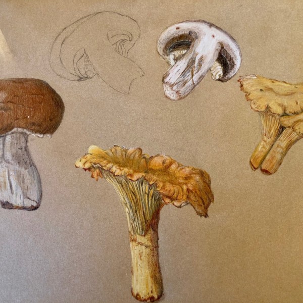
Teresa Goetz added a Photo 4 years, 6 months ago
-
The mushrooms look great on the Kraft paper Teresa! You have really captured the textures! I feel like you could use a little more toning especially the areas under the caps and on the right side of the two outside subjects. Beautiful work!
-

Once again your color is glowing! Very inspiring! Can you share how you’re getting that brightness? Thanks.
-
oh thanks Sheila. I think I started with a yellow watercolor wash and did a ton of layering of lights over darker yellows. I used a fair amount of ivory, white and cream. I really struggle with yellows on the Kraft! Still work to do…
-

Especially love the chanterelle in the middle!
-
Love this page so very much.
-
-
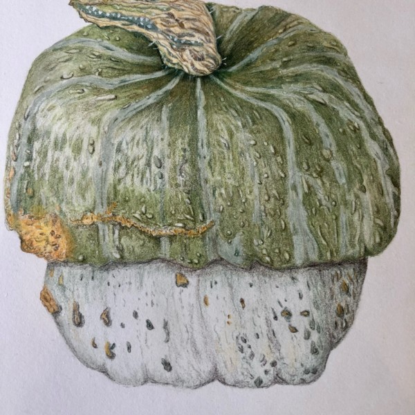
Teresa Goetz added a Photo 4 years, 6 months ago
-
Ok! thanks, Vern. Will do.
-
Wow! Beautiful. What a character!
-
Great range of interesting greens and greys and blues.
-
thank you, sam! this was one of my fave classes!
-
Beautifully done!
-
-
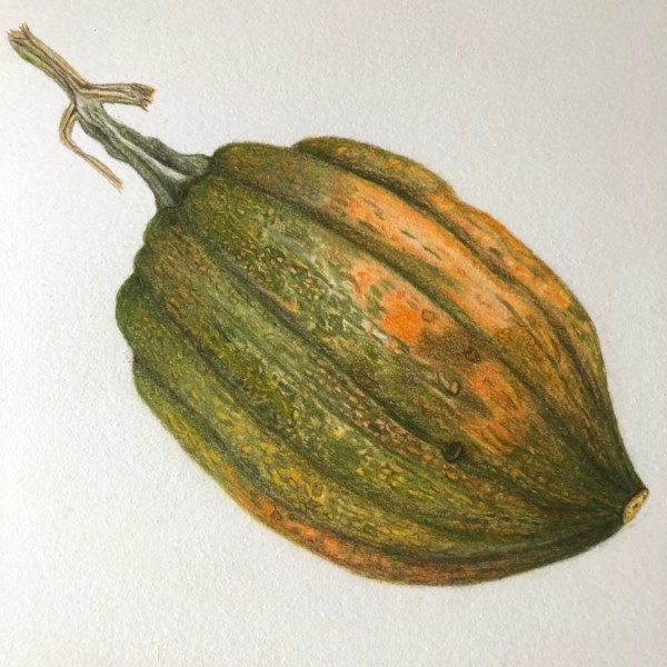
Teresa Goetz added a Photo 4 years, 6 months ago
-
Great colour work! Nailed it.
-
-
Teresa Goetz added a Photo 4 years, 6 months ago
-
struggling getting the reds right. feels like I can’t saturate enough..
-
ok, thanks! I was afraid to do that, but I can do really light washes and layer so I don’t lose the highlights?
-
Try leaving the highlights without water-colour. Go around them, and then dry brush the edges, or smoosh the edges around the highlights if it needs some blending. I think you can go darker on the shaded sides of your stems too – so that the highlighted areas of the greens pop out more too. You can always lift some highlights out too with your…[Read more]
-
good ideas, Sam. thank you! will attempt…
-
-
Teresa Goetz added a Photo 4 years, 6 months ago
-
first attempt at snow — on any kind of paper. Wendy suggested adding some grey, which I’ve not done yet. Feels a little bright to me!
-
Cool! I like the idea of some greys to modulate the whites and give it some more form.
-
Ooooh!! This makes me want to try snow! So cool.
-
-

Carol Smasal commented on Carol Smasal's Photo 4 years, 6 months ago
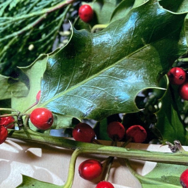
I’m drawing a bit of holly to add as an accent to my holiday cards. I know this needs to go darker still. I’d appreciate any advice you can give me to help me finish this little drawing.
-
Carol Smasal added a Photo 4 years, 6 months ago
-
Is this a photograph ! Wow
-
Hi, Pat,
This is a photograph. It is my photo reference for the little holly drawing I am working on. -
See where those darks are on that leaf? Bust out the blue indigo!
-
-
Carol Smasal added a Photo 4 years, 6 months ago
-
I’m drawing a bit of holly to add as an accent to my holiday cards. I know this needs to go darker still. I’d appreciate any advice you can give me to help me finish this little drawing.
-
Thank you!
-
Hi Carol, we also found in the shiny/fuzzy leaves workshop that using the blue indigo pencil #157 to darken shaded areas on the leaf really improved the shiny “holly” quality of the drawing. The contrast of the dark and the white highlights makes it shine. And I agree – more saturation in the red berries. 🙂
-
-
sheila y. commented on sheila y.'s Photo 4 years, 6 months ago
@sam-mcwilliams
Thanks, Sam. Those questions are spot on. It was fluffy and very hard for me to define. It would look better with the beautiful purple leaves, so I should do that next time. Also, I will try embossing for more definition, even though I have a very heavy hand and my embossing usually becomes “embosser’s remorse” as you guys calle…[Read more] -
Linda TALLEY commented on Linda TALLEY's Photo 4 years, 6 months ago
Thank you for comments, Katy. I know what you mean about right side. I have worked and worked on it and just been unable to make it happen. I think I had more tone on bottom which I erased, but I will try it again, maybe with a different color.
-
Katy Lyness commented on Linda TALLEY's Photo 4 years, 6 months ago
Beautiful subtle drawing. It has the coloring of an old master. The left side is particularly beautiful. I’d put a bit more work on the right side. It seems to flatten out. A bit more tone on the bottom would help. Try to round it more.
- Load More