Activity
-

Linda TALLEY added a Photo 4 years, 6 months ago
-
Kyra Saulnier commented on Kyra Saulnier's Photo 4 years, 6 months ago
Yes. It is hard to get all the tones in such a narrow space. I will practice more! -
Mama Mia commented on Mama Mia's Photo 4 years, 6 months ago
Thank you Doug, great advice!! And I LOVE that bulb.
-
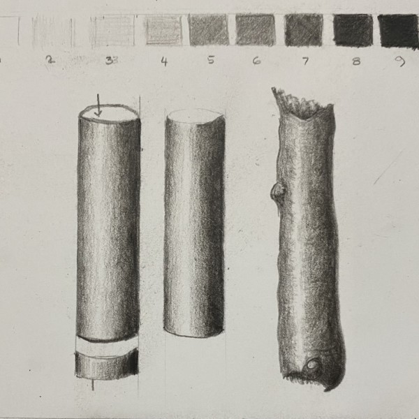
Doug Milne commented on Kyra Saulnier's Photo 4 years, 6 months ago
Hi Kyra- great job on the cylinders and branch segment! You have nice smooth toning. On the branch segment I would lighten the tone on either side of the highlight. It is too strong a jump in tone from the highlight to the tone flanking it. Quite often the highlight on a branch will not be the same from top to bottom. It follows the shape of the…[Read more]
-
Doug Milne commented on Mama Mia's Photo 4 years, 6 months ago
Greetings! Amaryllis bulbs are one of my favorite subjects.!!!! There are two things that strike me right away about your drawing. To begin with I see very little toning so the bulb doesn’t have much form and reads flat. Remember that there should be a range of tones from the highlight thru very dark to convey a subject’s form. Secondly, there nee…[Read more]
-
Pat Schiebold commented on Ishbel Galloway's Photo 4 years, 6 months ago
Love your detail. Someday I hope I will be able to do that:)
-

Ishbel Galloway commented on Ishbel Galloway's Photo 4 years, 6 months ago
Thanks Sam. I watched the webinar last night. Someone asked if it is to scale…it is. I might leave it there…I’ll think about it!
-
Elizabeth Simonson commented on sara stauffer's Photo 4 years, 6 months ago
Wonderful
-
Elizabeth Simonson commented on sara stauffer's Photo 4 years, 6 months ago
WOW love this. You really got the scales of the needles perfectly.
-
Elizabeth Simonson commented on Elizabeth Simonson's Photo 4 years, 6 months ago
Hi Sam, Yes I can see on the scan that it is not defined enough. Very helpful. Thanks. It’s really true that reds are hard. The other thing is the tight buds, at least on this variety, had more blue in them. I had to erase some areas and redo them but that’s the process, right? I’m channeling Georgia O’Keefe on the full frontal view!! -
Mama Mia commented on Katy Lyness's Photo 4 years, 6 months ago
Beautiful!
-
Mama Mia commented on sara stauffer's Photo 4 years, 6 months ago
What a lovely drawing. I had to look up the perpetual journal but what a facinating idea, 1 page a week and adding to it each year. Hmmm… shall I… ? 💕
-
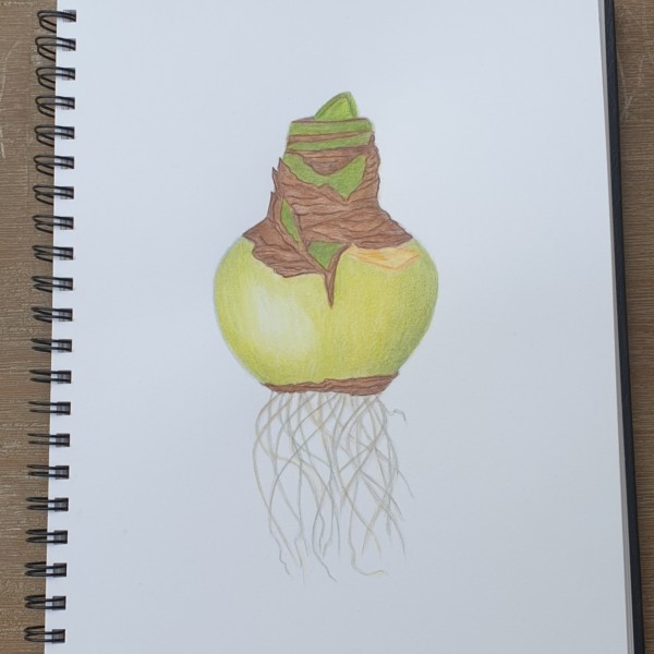
Mama Mia commented on Mama Mia's Photo 4 years, 6 months ago
I sure could use some help making this drawing look less drawn. Something with the darks, or shades. I am not sure but it is not finished. Thanks you!!
-
Mama Mia added a Photo 4 years, 6 months ago
-
I sure could use some help making this drawing look less drawn. Something with the darks, or shades. I am not sure but it is not finished. Thanks you!!
-
Greetings! Amaryllis bulbs are one of my favorite subjects.!!!! There are two things that strike me right away about your drawing. To begin with I see very little toning so the bulb doesn’t have much form and reads flat. Remember that there should be a range of tones from the highlight thru very dark to convey a subject’s form. Secondly, there nee…[Read more]
-
Thank you Doug, great advice!! And I LOVE that bulb.
-
-
Kyra Saulnier added a Photo 4 years, 6 months ago
-
Hi Kyra- great job on the cylinders and branch segment! You have nice smooth toning. On the branch segment I would lighten the tone on either side of the highlight. It is too strong a jump in tone from the highlight to the tone flanking it. Quite often the highlight on a branch will not be the same from top to bottom. It follows the shape of the…[Read more]
-
Yes. It is hard to get all the tones in such a narrow space. I will practice more!
-
-

Sam McWilliams commented on Ishbel Galloway's Photo 4 years, 6 months ago
In the webinar today many of us love this drawing just as it is now, Ishbel. It’s so great to see your process and approach.
-
Sam McWilliams commented on Douglass Reitter's Photo 4 years, 6 months ago
We love this drawing Douglass! Way to go – I also like Katy’s suggestions.
-
Sam McWilliams commented on Elizabeth Simonson's Photo 4 years, 6 months ago
We’ll be so lucky if we get the bonus of seeing another view. 🙂 This is a beautiful drawing. It’s so hard to achieve saturated reds and a great range of values in reds. Beautifully done, and so nice that it offered you flowers in so many stages. Today in the webinar we thought you could still add dark sepia in a few key places to darken and…[Read more]
-
Sam McWilliams commented on sheila y.'s Photo 4 years, 6 months ago
Such great work, Sheila. I haven’t drawn one myself yet so haven’t looked closely at the fibrous/hairy part. Could it use more definition there or would you emboss next time – or is it that light and soft? What do you think?
-
Sam McWilliams commented on Theodora Korasidis's Photo 4 years, 6 months ago
Velvety goodness. 🙂
- Load More

Beautiful subtle drawing. It has the coloring of an old master. The left side is particularly beautiful. I’d put a bit more work on the right side. It seems to flatten out. A bit more tone on the bottom would help. Try to round it more.
Thank you for comments, Katy. I know what you mean about right side. I have worked and worked on it and just been unable to make it happen. I think I had more tone on bottom which I erased, but I will try it again, maybe with a different color.
Thank you for comments–you are absolutely right about the perspective being off. I measured to a fair-thee-well, but perhaps I wasn’t careful enough about my movement. I did some toning on the lower edge and it is better but still not what I would like. I have eaten my model now but will try another this winter and see if I can’t get it right.