Activity
-
Amanda commented on Amanda's Photo 4 years, 11 months ago
Thanks Sam! Yes, I was wondering the same thing, it seems a bit abrupt at the top there. Thanks for mentioning that.
-

Jill Amadei commented on Jill Amadei's Photo 4 years, 11 months ago
Thanks so much @sam-mcwilliams for the positive feedback and the helpful tip. I added a slight bit of light ochre here and there and it’s just what it needed to bring it to life a bit more. Thanks! 🙂
-
Jill Amadei commented on Jill Amadei's Photo 4 years, 11 months ago
Thank you! @lizs
-

Sam McWilliams commented on Elizabeth Simonson's Photo 4 years, 11 months ago
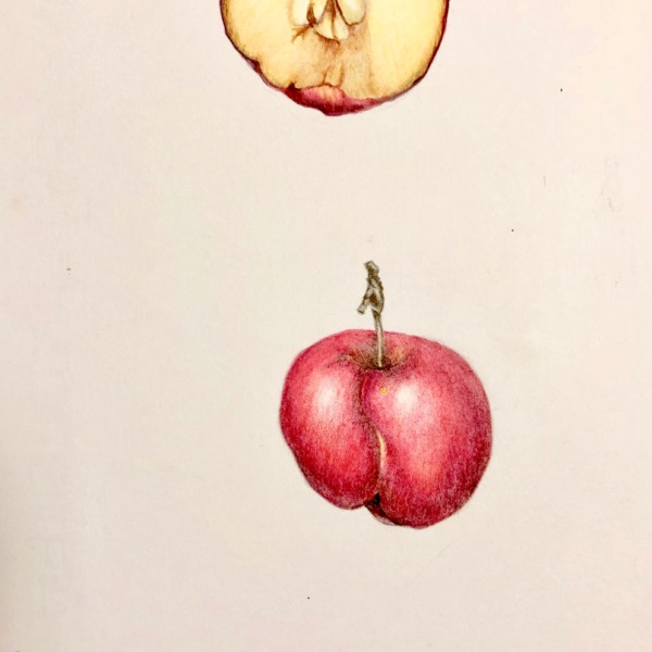
Fantastic! Especially that cross section. And I find myself wanting the skin of the whole fruit to read as smooth/shiny. Should it? Then maybe I’d smooth out those pencil line marks in the reds of the whole fruit.
-
Sam McWilliams commented on Jill Amadei's Photo 4 years, 11 months ago
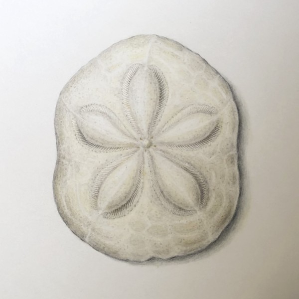
BIscuit and shadow look good to me. 🙂 That sand dollar is stunning. You captured it so well and with such fine detail. I think you could add a bit of warm colours in just a few places, maybe a touch of light ochre or some such applied so lightly. You really nailed the feel of it, Jill. Lovely.
-
Sam McWilliams commented on Amanda's Photo 4 years, 11 months ago
Awesome start, of course. We’ll follow along excitedly to see how your plan goes. I already wonder if you’ll need something sneaking out in the background behind that top cone…
-
Sam McWilliams commented on Elizabeth Simonson's Photo 4 years, 11 months ago
Gorgeous!
-
Sam McWilliams commented on sara stauffer's Photo 4 years, 11 months ago
You are a gem, Sara. I think a book of these will definitely need to be published.
-

Pat Schiebold commented on Pat Schiebold's Photo 4 years, 11 months ago
It’s a rhododendron bud
-
Pat Schiebold commented on Maureen Doram's Photo 4 years, 11 months ago
Very elegant giving off a wonderful softness
-
Elizabeth Simonson added a Photo 4 years, 11 months ago
-
Fantastic! Especially that cross section. And I find myself wanting the skin of the whole fruit to read as smooth/shiny. Should it? Then maybe I’d smooth out those pencil line marks in the reds of the whole fruit.
-
that is a great suggestion about smoothing out the lines on the skin. I did that and added more shadowing on the apple. any thanks!
-
-
Elizabeth Simonson commented on Pat Schiebold's Photo 4 years, 11 months ago
Beautiful
-
Elizabeth Simonson commented on Jill Amadei's Photo 4 years, 11 months ago
Beautiful
-
Elizabeth Simonson commented on Elizabeth Simonson's Photo 4 years, 11 months ago
Okay I’ll use dk sepia in those areas. I was using walnut but I can se with this scan it doesn’t recede enough. Believe it or not these sunflowers are blooming away on Wurts Street in Kingston. It’s at a garden I maintain.
-
Elizabeth Simonson commented on Elizabeth Simonson's Photo 4 years, 11 months ago
Thanks for that suggestion! I think it scanned darker than in actuality BUT I did take out most of the shadow and keep the line only. Much better.
-
Doug Milne commented on sheila y.'s Photo 4 years, 11 months ago
Hi Sheila- a flower and seeds next season would look good. If you don’t get to it I think the drawing is dynamic as it is. I love how you did the trio of cut pieces. Great job!
-
Jill Amadei commented on Jill Amadei's Photo 4 years, 11 months ago
This is one of those puffy sea biscuit sand dollars. It was challenging to try to make it look 3 dimensional without getting too dark. I would appreciate any tips! Also does the cast shadow look ok? Thanks so much!
-
Amanda commented on Amanda's Photo 4 years, 11 months ago
After the composition workshop, I decided to work on the conifer arrangement. I’ve only just started, so a lot of detailing to add to the cones. They will be the focal point, so I’ll keep that area the darkest and perhaps keep the branches and needles lower down the page lighter in general?
-
Jill Amadei added a Photo 4 years, 11 months ago
-
This is one of those puffy sea biscuit sand dollars. It was challenging to try to make it look 3 dimensional without getting too dark. I would appreciate any tips! Also does the cast shadow look ok? Thanks so much!
-
Beautiful
-
BIscuit and shadow look good to me. 🙂 That sand dollar is stunning. You captured it so well and with such fine detail. I think you could add a bit of warm colours in just a few places, maybe a touch of light ochre or some such applied so lightly. You really nailed the feel of it, Jill. Lovely.
-
Thank you! @lizs
-
Thanks so much @sam-mcwilliams for the positive feedback and the helpful tip. I added a slight bit of light ochre here and there and it’s just what it needed to bring it to life a bit more. Thanks! 🙂
-
Beautiful
-
-
Amanda added a Photo 4 years, 11 months ago
-
After the composition workshop, I decided to work on the conifer arrangement. I’ve only just started, so a lot of detailing to add to the cones. They will be the focal point, so I’ll keep that area the darkest and perhaps keep the branches and needles lower down the page lighter in general?
-
Awesome start, of course. We’ll follow along excitedly to see how your plan goes. I already wonder if you’ll need something sneaking out in the background behind that top cone…
-
Thanks Sam! Yes, I was wondering the same thing, it seems a bit abrupt at the top there. Thanks for mentioning that.
-
- Load More