Activity
-

-
-
Great page Douglass! I love the mix of black and white and color. Everything is very nicely rendered! Those roots are wonderful! I would suggest moving your name. Maybe put it under the Preserve line. Right now it looks as if it is connecting the fern and the mushroom. Great job!
-
-
Jody Meese commented on Jody Meese's Photo 4 years, 9 months ago
@sam-mcwilliams Thanks Sam! Luckily I did the lettering in pencil in case I changed my mind!
-
Ingrid Schenk added a Photo 4 years, 9 months ago
-
Hi Ingrid- the branch looks great! I think you could use a little more dark toning on the right side, but you have nice smooth toning and you did a great job capturing the bark texture. The apple is also good, but there are still some things to work on. The color selection and saturation are very good. You also did a nice job with the patterning.…[Read more]
-
@dougmilne thank you so much for your feedback! Yes, I can see what you mean, will train on the range of tones on an object with a pattern, was concentrated too much on the pattern …
-
-

Jill Amadei commented on Jill Amadei's Photo 4 years, 9 months ago
Thanks so much for the positive feedback! I really enjoyed drawing this gourd 🙂 @doug-milne @katylyness @sam-mcwilliams
-

sheila y. commented on sheila y.'s Photo 4 years, 9 months ago
@sam-mcwilliams Thanks, Sam. I was wondering if the greens were too washed out looking, but they really are a variety of light greens. Also, the mid tone of the paper and how much saturation it can take is still something I’m learning about. I hope I can get my hands on some seeds and flowers this season or next. -

Sam McWilliams commented on Ishbel Galloway's Photo 4 years, 9 months ago
Again, what a lovely eye and hand you have, Ishbel. Such a graceful composition and treatment.
-
Sam McWilliams commented on sheila y.'s Photo 4 years, 9 months ago
Stunner! You and Kraft paper are getting to be very good pals. It’s luminous. I’m excited to see flowers and seeds.
-
Sam McWilliams commented on Linda TALLEY's Photo 4 years, 9 months ago
This is lovely, Linda. I think you can still achieve some darker tones in your greens to show the cylinder-ness of those stems and more form in the okra. I like the lettering very much. Next time you could move it down a bit, perhaps leave a bit more space between the lettering and the plant.
-
Sam McWilliams commented on Jill Amadei's Photo 4 years, 9 months ago
GORGEOUS SWAN GOURD! 🙂
-
Sam McWilliams commented on Katy Lyness's Photo 4 years, 9 months ago
Ooh Katy this is awesome. It is SO full of life. I adore it. Well done.
-
Sam McWilliams commented on Jody Meese's Photo 4 years, 9 months ago
Also cool lettering here! Also, leave me a bit more space to breathe in the lettering, ie between the Cap S, between the 2 words, and between Cap K and the i. Love the style of handwriting.
-
Sam McWilliams commented on Jody Meese's Photo 4 years, 9 months ago
Beautiful, Jody. I love your drawings so much. In your lettering – I’d give a bit ore space next time in between your letters so that our eye can move about and through he words easier and not get bunched up. I love the style of lettering. Nicely done. Also, I like how the stem fades out at the top – that supports me leading with my eye to the…[Read more]
-
Sam McWilliams commented on Elizabeth Simonson's Photo 4 years, 9 months ago
I agree – that whitewash technique is a revelation. It really is like applying gesso to a canvas, and we can apply it in different thicknesses and build on top of it with our pencils.
-

Wendy Hollender commented on Katy Lyness's Photo 4 years, 9 months ago
love how this turned out. The shadows are so much better making the apples pop but not trying to compete!
-
sheila y. commented on sheila y.'s Photo 4 years, 9 months ago
I’ve got some small spaces for some possible flowers, seeds and text, but looking for feedback before all my greens die.
-
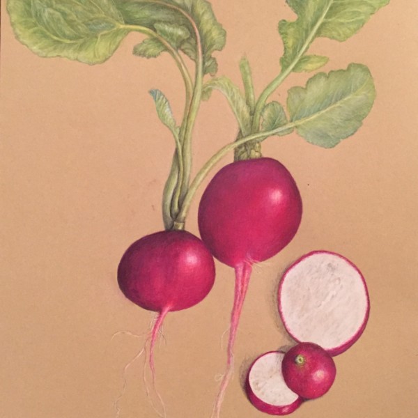
sheila y. added a Photo 4 years, 9 months ago
-
I’ve got some small spaces for some possible flowers, seeds and text, but looking for feedback before all my greens die.
-
Stunner! You and Kraft paper are getting to be very good pals. It’s luminous. I’m excited to see flowers and seeds.
-
@sam-mcwilliams Thanks, Sam. I was wondering if the greens were too washed out looking, but they really are a variety of light greens. Also, the mid tone of the paper and how much saturation it can take is still something I’m learning about. I hope I can get my hands on some seeds and flowers this season or next.
-
So beautiful!
-
I think this is looking awesome Shelia, but I do think you can still get more contrast in your leaves so they don’t look boring by comparison to the amazing vibrancy elsewhere. Look at your stems on the leaves as they connect to the radish, there are good darks and contrast but they still appear to be light green. Push those leaves in the overlaps…[Read more]
-
@wendy Wendy, thanks for the feedback. I’m going back in for more varied greens, as you suggested- looking at what I’ve got and focusing on overlaps. Wish me luck 😎
-
Thanks, Maureen.
-
-
Linda TALLEY added a Photo 4 years, 9 months ago
-
This is lovely, Linda. I think you can still achieve some darker tones in your greens to show the cylinder-ness of those stems and more form in the okra. I like the lettering very much. Next time you could move it down a bit, perhaps leave a bit more space between the lettering and the plant.
-
-
Ingrid Schenk commented on Ingrid Schenk's Photo 4 years, 9 months ago
Thank you Katy for your helpful feedback! Just did the lesson about overlapping objects… still much to learn, so interesting and lot’s of joy.
-
Katy Lyness commented on Ingrid Schenk's Photo 4 years, 9 months ago
Hi Ingrid, I agree with Doug. Your toning is lovely, very sensitive. You just need to push the darks. You are half way there. Looks to me you have only made it to the 6 on the value scale. But be careful where you put those darks, don’t overwhelm the tomatoes. Think of the light source. Where is it coming from. What part of the plant would get…[Read more]
- Load More


Beautiful job Pat! You did a great job capturing the colors and details. There are some little details – like how the main vein has some twists and turns that you have straightened out and also how the bottom of each side of the leaf curves down where it meets the stem. These are small details, but are very important because they are common to…[Read more]
The bottom of each side of the leaf curves down to meet the stem. Good suggestion thanks
Try a cast shadow with verithin gray and black before adding any dark sepia. Also a gray watercolor wash for a cast shadow is a good place to start as well.